Accordion
An accordion is a vertically stacked list of items that can expand or collapse to reveal or hide related content, helping organize information into manageable sections.
Overview
Code
Anatomy
- Container
- Section
- Indicator
- Header
- Content area
Usage Guidelines
Use When
- Grouping related content into multiple sections.
- Breaking down long or complex information.
- Letting users show or hide content as needed.
- Saving vertical space by revealing only what’s relevant.
Best Practices
- Write clear, concise headers.
- Keep the section count manageable.
- Choose one interaction style (single- or multi-open) and stay consistent.
- Apply first and last section variants for rounded corners.
- Use a single accordion only — nesting is not permitted.
Accessibility
This component uses MUI (Material-UI) components, which are open-source and licensed under the MIT License.
Crafted with ❤️ at Zuora
© 2026 Zuora Inc.
Accordion
An accordion is a vertically stacked list of items that can expand or collapse to reveal or hide related content, helping organize information into manageable sections.
Overview
Code
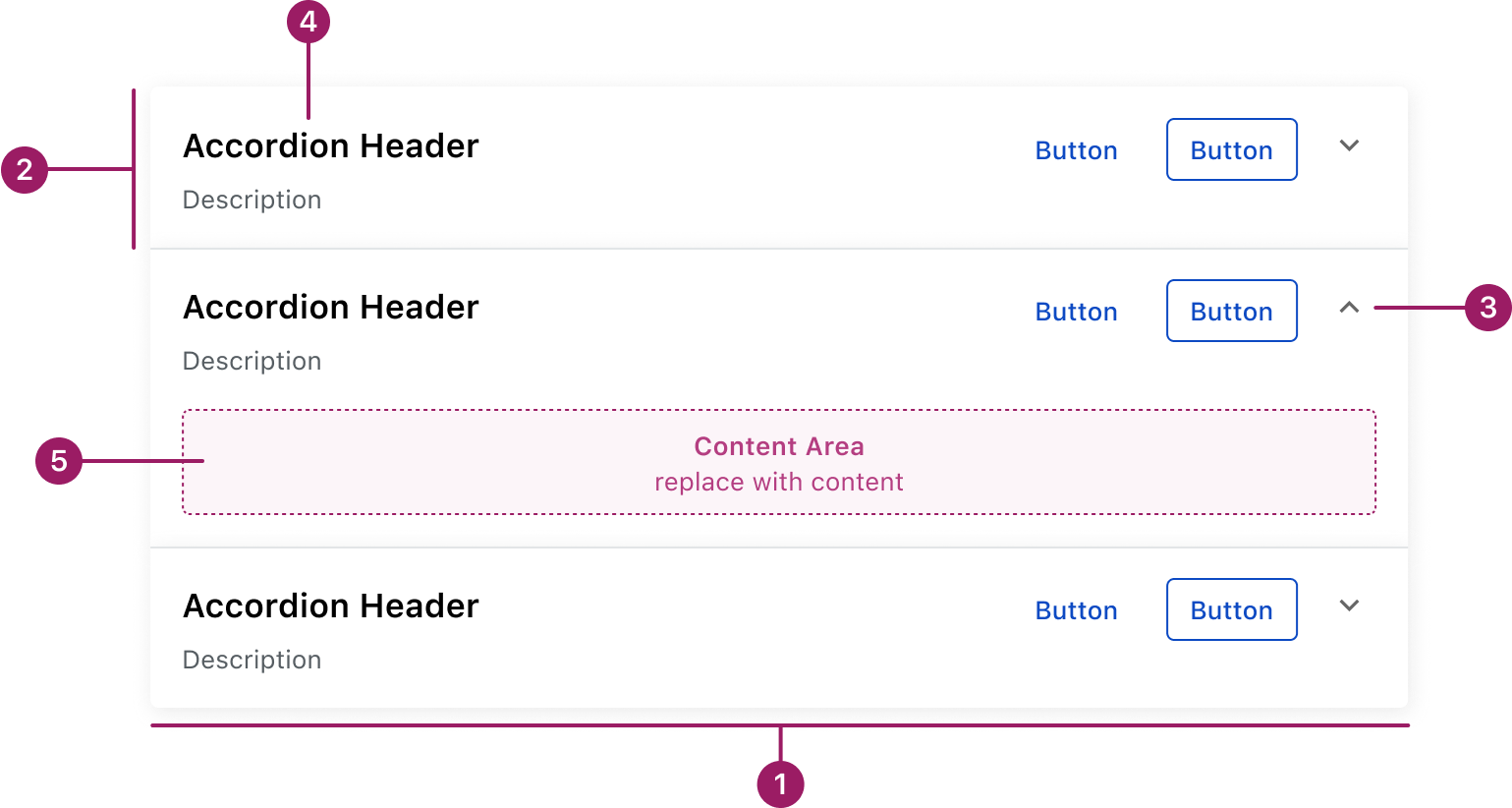
Anatomy
- Container
- Section
- Indicator
- Header
- Content area
Usage Guidelines
Use When
- Grouping related content into multiple sections.
- Breaking down long or complex information.
- Letting users show or hide content as needed.
- Saving vertical space by revealing only what’s relevant.
Best Practices
- Write clear, concise headers.
- Keep the section count manageable.
- Choose one interaction style (single- or multi-open) and stay consistent.
- Apply first and last section variants for rounded corners.
- Use a single accordion only — nesting is not permitted.
Accessibility
This component uses MUI (Material-UI) components, which are open-source and licensed under the MIT License.
Crafted with ❤️ at Zuora
© 2026 Zuora Inc.
On This Page
Accordion
An accordion is a vertically stacked list of items that can expand or collapse to reveal or hide related content, helping organize information into manageable sections.
Overview
Code
Anatomy
- Container
- Section
- Indicator
- Header
- Content area
Usage Guidelines
Use When
- Grouping related content into multiple sections.
- Breaking down long or complex information.
- Letting users show or hide content as needed.
- Saving vertical space by revealing only what’s relevant.
Best Practices
- Write clear, concise headers.
- Keep the section count manageable.
- Choose one interaction style (single- or multi-open) and stay consistent.
- Apply first and last section variants for rounded corners.
- Use a single accordion only — nesting is not permitted.
Accessibility
This component uses MUI (Material-UI) components, which are open-source and licensed under the MIT License.
Crafted with ❤️ at Zuora
© 2026 Zuora Inc.