Alert
The Alert component is used to communicate important, timely information to users, such as success messages, warnings, errors, or general updates. Alerts help draw attention to changes in system status or user actions without interrupting the user’s workflow.
Overview
Code
Anatomy
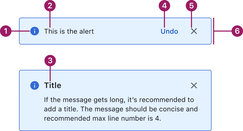
- Status Icon (optional)
- Message text
- Title
- Action button (optional)
- Close/Dismiss button (optional)
- Container
Usage Guidelines
Use When
- Communicate system feedback after user actions, such as form submissions or settings updates.
- Inform users of important changes in system state, like errors, downtime, or successful processes.
- Warn users about potential issues that may require attention, such as unsaved changes or usage limits.
- Display persistent messages at the top of a page, like global notifications or banners.
Best Practices
- Keep content concise and scannable: focus on the key message. Avoid long paragraphs or unnecessary technical jargon.
- Include an action only if necessary.
- Let users close non-critical alerts to reduce noise.
- Avoid using alerts when the content is lengthy or requires user decision-making.
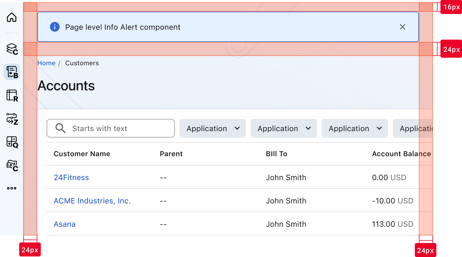
Placement
The Alert component is positioned 16px from the top edge of the page and sits 24px above the breadcrumbs.
Accessibility
This component uses MUI (Material-UI) components, which are open-source and licensed under the MIT License.
Crafted with ❤️ at Zuora
© 2026 Zuora Inc.
Alert
The Alert component is used to communicate important, timely information to users, such as success messages, warnings, errors, or general updates. Alerts help draw attention to changes in system status or user actions without interrupting the user’s workflow.
Overview
Code
Anatomy
- Status Icon (optional)
- Message text
- Title
- Action button (optional)
- Close/Dismiss button (optional)
- Container
Usage Guidelines
Use When
- Communicate system feedback after user actions, such as form submissions or settings updates.
- Inform users of important changes in system state, like errors, downtime, or successful processes.
- Warn users about potential issues that may require attention, such as unsaved changes or usage limits.
- Display persistent messages at the top of a page, like global notifications or banners.
Best Practices
- Keep content concise and scannable: focus on the key message. Avoid long paragraphs or unnecessary technical jargon.
- Include an action only if necessary.
- Let users close non-critical alerts to reduce noise.
- Avoid using alerts when the content is lengthy or requires user decision-making.
Placement
The Alert component is positioned 16px from the top edge of the page and sits 24px above the breadcrumbs.
Accessibility
This component uses MUI (Material-UI) components, which are open-source and licensed under the MIT License.
Crafted with ❤️ at Zuora
© 2026 Zuora Inc.
On This Page
Alert
The Alert component is used to communicate important, timely information to users, such as success messages, warnings, errors, or general updates. Alerts help draw attention to changes in system status or user actions without interrupting the user’s workflow.
Overview
Code
Anatomy
- Status Icon (optional)
- Message text
- Title
- Action button (optional)
- Close/Dismiss button (optional)
- Container
Usage Guidelines
Use When
- Communicate system feedback after user actions, such as form submissions or settings updates.
- Inform users of important changes in system state, like errors, downtime, or successful processes.
- Warn users about potential issues that may require attention, such as unsaved changes or usage limits.
- Display persistent messages at the top of a page, like global notifications or banners.
Best Practices
- Keep content concise and scannable: focus on the key message. Avoid long paragraphs or unnecessary technical jargon.
- Include an action only if necessary.
- Let users close non-critical alerts to reduce noise.
- Avoid using alerts when the content is lengthy or requires user decision-making.
Placement
The Alert component is positioned 16px from the top edge of the page and sits 24px above the breadcrumbs.
Accessibility
This component uses MUI (Material-UI) components, which are open-source and licensed under the MIT License.
Crafted with ❤️ at Zuora
© 2026 Zuora Inc.