Autocomplete
Autocomplete is a text input that suggests options as users type, helping them quickly select from a predefined list.
Overview
Code
Anatomy
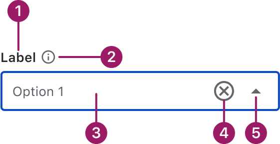
- Label (optional)
- Information icon (optional)
- Input Area
- Clear icon button
- Dropdown icon button
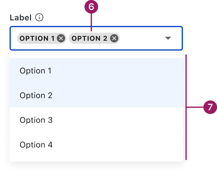
- Selected Chip
- Menu
Usage Guidelines

Use a consistent size for input and selection components within the same form or layout to ensure alignment. Medium is the default, but small is fine if applied
Use When
- Helping users find and select items from a long or complex list.
- Reducing input errors by limiting entries to known values.
- Providing type-ahead suggestions to speed up form completion.
- Supporting multi-select or tag-style inputs.
- Replacing dropdowns when searchability improves usability.
Best Practices
- Use clear, recognizable labels in the option list.
- Limit the number of displayed suggestions to avoid overwhelming users.
- Highlight matching text to improve scannability.
Sizes
Medium (36px)
Label


Placeholder

Helper or Validation text
Small (32px)
Label
Placeholder
Helper or Validation text
This component uses MUI (Material-UI) components, which are open-source and licensed under the MIT License.
Crafted with ❤️ at Zuora
© 2026 Zuora Inc.
Autocomplete
Autocomplete is a text input that suggests options as users type, helping them quickly select from a predefined list.
Overview
Code
Anatomy
- Label (optional)
- Information icon (optional)
- Input Area
- Clear icon button
- Dropdown icon button
- Selected Chip
- Menu
Usage Guidelines
Use a consistent size for input and selection components within the same form or layout to ensure alignment. Medium is the default, but small is fine if applied uniformly.
Use When
- Helping users find and select items from a long or complex list.
- Reducing input errors by limiting entries to known values.
- Providing type-ahead suggestions to speed up form completion.
- Supporting multi-select or tag-style inputs.
- Replacing dropdowns when searchability improves usability.
Best Practices
- Use clear, recognizable labels in the option list.
- Limit the number of displayed suggestions to avoid overwhelming users.
- Highlight matching text to improve scannability.
Sizes
Medium (36px)
Label
Placeholder
Helper or Validation text
Small (32px)
Label
Placeholder
Helper or Validation text
This component uses MUI (Material-UI) components, which are open-source and licensed under the MIT License.
Crafted with ❤️ at Zuora
© 2026 Zuora Inc.
On This Page
Autocomplete
Autocomplete is a text input that suggests options as users type, helping them quickly select from a predefined list.
Overview
Code
Anatomy
- Label (optional)
- Information icon (optional)
- Input Area
- Clear icon button
- Dropdown icon button
- Selected Chip
- Menu
Usage Guidelines
Use a consistent size for input and selection components within the same form or layout to ensure alignment. Medium is the default, but small is fine if applied uniformly.
Use When
- Helping users find and select items from a long or complex list.
- Reducing input errors by limiting entries to known values.
- Providing type-ahead suggestions to speed up form completion.
- Supporting multi-select or tag-style inputs.
- Replacing dropdowns when searchability improves usability.
Best Practices
- Use clear, recognizable labels in the option list.
- Limit the number of displayed suggestions to avoid overwhelming users.
- Highlight matching text to improve scannability.
Sizes
Medium (36px)
Label
Placeholder
Helper or Validation text
Small (32px)
Label
Placeholder
Helper or Validation text
This component uses MUI (Material-UI) components, which are open-source and licensed under the MIT License.
Crafted with ❤️ at Zuora
© 2026 Zuora Inc.