Avatar
A small visual representation of a person or entity, shown as an icon, initials, or logo.
Overview
Code
Anatomy
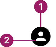
- Container
- Content
Usage Guidelines
Use When
Identifying a user or entity.
Best Practices
- Avoid using avatars for decorative purposes only — they should provide meaning.
- Select the right avatar content for the use case: icon, text, or logo.
- Default to the logo type when no other content is available.
- Keep the shape (circle vs. square) consistent within the product to reinforce recognition.
- Apply the avatar style that matches the active theme (Nebula, Cosmos, or Horizon).
Variants
circular

rounded

Sizes
Small (16px)

Medium (24px)

LARGE (32px)
Types
icon
texT

Zuora logo

Colors
Avatars use the active theme colors (Nebula, Cosmos, Horizon). When no theme is applied, default to the black logo. Other colors may be used, but theme colors and black are recommended.
Nebula
cosmos
horizon
Black (Fallback)
Accessibility
- Provide meaningful alternative text (via alt attribute or aria-label) describing the person or entity.
- If the avatar is decorative only (not conveying essential info), hide it from assistive tech using aria-hidden="true".
- Ensure sufficient color contrast between initials/icon and the avatar background.
This component uses MUI (Material-UI) components, which are open-source and licensed under the MIT License.
Crafted with ❤️ at Zuora
© 2026 Zuora Inc.
Avatar
A small visual representation of a person or entity, shown as an icon, initials, or logo.
Overview
Code
Anatomy
- Container
- Content
Usage Guidelines
Use When
Identifying a user or entity.
Best Practices
- Avoid using avatars for decorative purposes only — they should provide meaning.
- Select the right avatar content for the use case: icon, text, or logo.
- Default to the logo type when no other content is available.
- Keep the shape (circle vs. square) consistent within the product to reinforce recognition.
- Apply the avatar style that matches the active theme (Nebula, Cosmos, or Horizon).
Variants
circular
rounded
Sizes
Small (16px)
Medium (24px)
LARGE (32px)
Types
icon
texT
Zuora logo
Colors
Avatars use the active theme colors (Nebula, Cosmos, Horizon). When no theme is applied, default to the black logo. Other colors may be used, but theme colors and black are recommended.
Nebula
cosmos
horizon
Black (Fallback)
Accessibility
- Provide meaningful alternative text (via alt attribute or aria-label) describing the person or entity.
- If the avatar is decorative only (not conveying essential info), hide it from assistive tech using aria-hidden="true".
- Ensure sufficient color contrast between initials/icon and the avatar background.
This component uses MUI (Material-UI) components, which are open-source and licensed under the MIT License.
Crafted with ❤️ at Zuora
© 2026 Zuora Inc.
On This Page
Avatar
A small visual representation of a person or entity, shown as an icon, initials, or logo.
Overview
Code
Anatomy
- Container
- Content
Usage Guidelines
Use When
Identifying a user or entity.
Best Practices
- Avoid using avatars for decorative purposes only — they should provide meaning.
- Select the right avatar content for the use case: icon, text, or logo.
- Default to the logo type when no other content is available.
- Keep the shape (circle vs. square) consistent within the product to reinforce recognition.
- Apply the avatar style that matches the active theme (Nebula, Cosmos, or Horizon).
Variants
circular
rounded
Sizes
Small (16px)
Medium (24px)
LARGE (32px)
Types
icon
texT
Zuora logo
Colors
Avatars use the active theme colors (Nebula, Cosmos, Horizon). When no theme is applied, default to the black logo. Other colors may be used, but theme colors and black are recommended.
Nebula
cosmos
horizon
Black (Fallback)
Accessibility
- Provide meaningful alternative text (via alt attribute or aria-label) describing the person or entity.
- If the avatar is decorative only (not conveying essential info), hide it from assistive tech using aria-hidden="true".
- Ensure sufficient color contrast between initials/icon and the avatar background.
This component uses MUI (Material-UI) components, which are open-source and licensed under the MIT License.
Crafted with ❤️ at Zuora
© 2026 Zuora Inc.