Badge
A badge is a small status indicator used to display notification counts or highlight updates.
Overview
Code
Anatomy
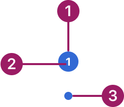
- Container
- Label
- Dot badge
Usage Guidelines
Use When
- Indicating the number of unread items, notifications, or messages.
- Drawing attention to updates or changes in status.
- Providing lightweight indicators without disrupting the main workflow.
Best Practices
- Use system-defined alert colors (blue, red, yellow, and green) for consistency across components.
- Keep badge counts concise; avoid displaying large numbers that overwhelm the user (e.g., use “99+”).
- Ensure badges remain visually distinct but not distracting within their context.
- Use dot badges for subtle indicators where detail is not required.
- Place badges close to the element they relate to, such as an icon, tab, or list item.
Variants
standard
1
dot
Alignment
Badges overlap the underlying element and are positioned at its top-left corner, sitting partially over the edge for visibility without covering key content.

1

Accessibility
Badges must include an aria-label or equivalent description — the badge content alone is not reliably announced by assistive technologies.
This component uses MUI (Material-UI) components, which are open-source and licensed under the MIT License.
Crafted with ❤️ at Zuora
© 2026 Zuora Inc.
Badge
A badge is a small status indicator used to display notification counts or highlight updates.
Overview
Code
Anatomy
- Container
- Label
- Dot badge
Usage Guidelines
Use When
- Indicating the number of unread items, notifications, or messages.
- Drawing attention to updates or changes in status.
- Providing lightweight indicators without disrupting the main workflow.
Best Practices
- Use system-defined alert colors (blue, red, yellow, and green) for consistency across components.
- Keep badge counts concise; avoid displaying large numbers that overwhelm the user (e.g., use “99+”).
- Ensure badges remain visually distinct but not distracting within their context.
- Use dot badges for subtle indicators where detail is not required.
- Place badges close to the element they relate to, such as an icon, tab, or list item.
Variants
standard
1
dot
Alignment
Badges overlap the underlying element and are positioned at its top-left corner, sitting partially over the edge for visibility without covering key content.
1
Accessibility
Badges must include an aria-label or equivalent description — the badge content alone is not reliably announced by assistive technologies.
This component uses MUI (Material-UI) components, which are open-source and licensed under the MIT License.
Crafted with ❤️ at Zuora
© 2026 Zuora Inc.
On This Page
Badge
A badge is a small status indicator used to display notification counts or highlight updates.
Overview
Code
Anatomy
- Container
- Label
- Dot badge
Usage Guidelines
Use When
- Indicating the number of unread items, notifications, or messages.
- Drawing attention to updates or changes in status.
- Providing lightweight indicators without disrupting the main workflow.
Best Practices
- Use system-defined alert colors (blue, red, yellow, and green) for consistency across components.
- Keep badge counts concise; avoid displaying large numbers that overwhelm the user (e.g., use “99+”).
- Ensure badges remain visually distinct but not distracting within their context.
- Use dot badges for subtle indicators where detail is not required.
- Place badges close to the element they relate to, such as an icon, tab, or list item.
Variants
standard
1
dot
Alignment
Badges overlap the underlying element and are positioned at its top-left corner, sitting partially over the edge for visibility without covering key content.
1
Accessibility
Badges must include an aria-label or equivalent description — the badge content alone is not reliably announced by assistive technologies.
This component uses MUI (Material-UI) components, which are open-source and licensed under the MIT License.
Crafted with ❤️ at Zuora
© 2026 Zuora Inc.