Button
Buttons are interactive elements that allow users to trigger an immediate action. They are crucial for guiding users through workflows and providing clear calls to action.
Overview
Code
Anatomy
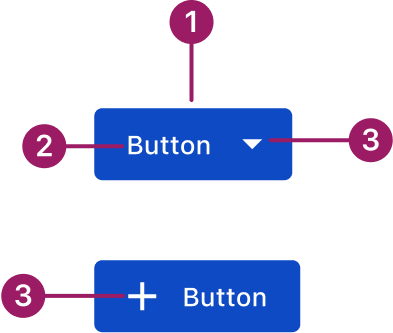
- Container
- Label
- Icon (optional)
Usage Guidelines

Use a consistent size for input and selection components within the same form or layout to ensure alignment. Medium is the default, but small is fine if applied uniformly.
Use When
- Performing an action central to the user’s current task.
- Triggering an immediate action like “Submit,” “Save,” or “Delete.”
- Navigating to a new page or section, such as “View Details.”
- Confirming a decision that requires explicit user consent.
Button Sizes
- Medium (default): Use for most actions across the product.
- Small: Use in tighter spaces like cards or accordions to maintain balance without overwhelming content.
- Extra-small: Use for compact contexts where space is limited. For Example, in data grid row or bulk actions and menu/action icon buttons.
Best Practices
- Button labels should be short, descriptive, and clearly communicate the action they perform. Use strong verbs.
- Maintain consistent hierarchy by using button styles consistently to indicate primary, secondary, and tertiary actions throughout the platform.
- Button text and icons should have adequate color contrast against their background to ensure readability for all users.
- When multiple buttons are present, group them in a way that makes sense to the user and follows established UI patterns.
- Keep button sizes consistent within the same form or layout, especially when paired with input and selection components.
- On any given screen, there should ideally be only one primary call to action to avoid user confusion.
- Ensure there is enough clear space around buttons to prevent clutter and make them easy to distinguish.
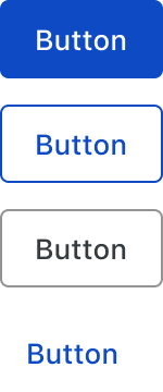
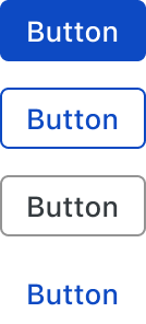
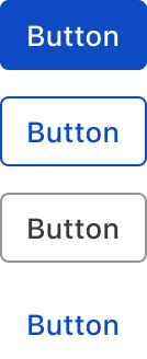
Variants
primary

Secondary

Tertiary
Text

Sizes
medium (36px)
eXTRA small (28px)
small (32px)
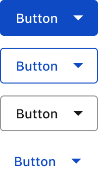
Button with Icon
Start icon
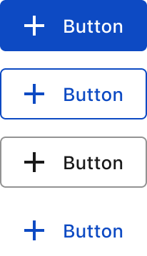
end icon
Accessibility
This component uses MUI (Material-UI) components, which are open-source and licensed under the MIT License.
Crafted with ❤️ at Zuora
© 2026 Zuora Inc.
Button
Buttons are interactive elements that allow users to trigger an immediate action. They are crucial for guiding users through workflows and providing clear calls to action.
Overview
Code
Anatomy
- Container
- Label
- Icon (optional)
Usage Guidelines
Use a consistent size for input and selection components within the same form or layout to ensure alignment. Medium is the default, but small is fine if applied uniformly.
Use When
- Performing an action central to the user’s current task.
- Triggering an immediate action like “Submit,” “Save,” or “Delete.”
- Navigating to a new page or section, such as “View Details.”
- Confirming a decision that requires explicit user consent.
Button Sizes
- Medium (default): Use for most actions across the product.
- Small: Use in tighter spaces like cards or accordions to maintain balance without overwhelming content.
- Extra-small: Use for compact contexts where space is limited. For Example, in data grid row or bulk actions and menu/action icon buttons.
Best Practices
- Button labels should be short, descriptive, and clearly communicate the action they perform. Use strong verbs.
- Maintain consistent hierarchy by using button styles consistently to indicate primary, secondary, and tertiary actions throughout the platform.
- Button text and icons should have adequate color contrast against their background to ensure readability for all users.
- When multiple buttons are present, group them in a way that makes sense to the user and follows established UI patterns.
- Keep button sizes consistent within the same form or layout, especially when paired with input and selection components.
- On any given screen, there should ideally be only one primary call to action to avoid user confusion.
- Ensure there is enough clear space around buttons to prevent clutter and make them easy to distinguish.
Sizes
medium (36px)
small (32px)
eXTRA small (28px)
Variants
primary
Secondary
Tertiary
Text
Button with Icon
Start icon
end icon
Accessibility
This component uses MUI (Material-UI) components, which are open-source and licensed under the MIT License.
Crafted with ❤️ at Zuora
© 2026 Zuora Inc.
On This Page
Button
Buttons are interactive elements that allow users to trigger an immediate action. They are crucial for guiding users through workflows and providing clear calls to action.
Overview
Code
Anatomy
- Container
- Label
- Icon (optional)
Usage Guidelines
Use a consistent size for input and selection components within the same form or layout to ensure alignment. Medium is the default, but small is fine if applied uniformly.
Use When
- Performing an action central to the user’s current task.
- Triggering an immediate action like “Submit,” “Save,” or “Delete.”
- Navigating to a new page or section, such as “View Details.”
- Confirming a decision that requires explicit user consent.
Button Sizes
- Medium (default): Use for most actions across the product.
- Small: Use in tighter spaces like cards or accordions to maintain balance without overwhelming content.
- Extra-small: Use for compact contexts where space is limited. For Example, in data grid row or bulk actions and menu/action icon buttons.
Best Practices
- Button labels should be short, descriptive, and clearly communicate the action they perform. Use strong verbs.
- Maintain consistent hierarchy by using button styles consistently to indicate primary, secondary, and tertiary actions throughout the platform.
- Button text and icons should have adequate color contrast against their background to ensure readability for all users.
- When multiple buttons are present, group them in a way that makes sense to the user and follows established UI patterns.
- Keep button sizes consistent within the same form or layout, especially when paired with input and selection components.
- On any given screen, there should ideally be only one primary call to action to avoid user confusion.
- Ensure there is enough clear space around buttons to prevent clutter and make them easy to distinguish.
Sizes
medium (36px)
small (32px)
eXTRA small (28px)
Variants
primary
Secondary
Tertiary
Text
Button with Icon
Start icon
end icon
Accessibility
This component uses MUI (Material-UI) components, which are open-source and licensed under the MIT License.
Crafted with ❤️ at Zuora
© 2026 Zuora Inc.