Button Group
A button group collects two or more related actions and presents them together with visual and functional cohesion.
Overview
Code
Anatomy
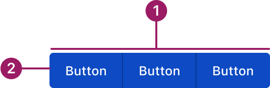
- Container
- Button
Usage Guidelines

Use a consistent size for input and selection components within the same form or layout to ensure alignment. Medium is the default, but small is fine if applied uniformly.
Use When
- Grouping related actions with similar importance.
- Providing segmented controls where only one action can be selected at a time.
- Offering multiple mutually exclusive options in a compact space.
Button Sizes
- Medium (default): Use for most actions across the product.
- Small: Use in tighter spaces like cards or accordions to maintain balance without overwhelming content.
- Extra-small: Use for compact contexts where space is limited. For Example, in data grid row or bulk actions and menu/action icon buttons.
Best Practices
- Use consistent button sizes and variants within the group.
- Limit the number of buttons to avoid visual overload (ideally 2–5).
- Avoid mixing unrelated actions in a single group.
- Clearly indicate the selected or active button when applicable.
- Keep button sizes consistent within the same form or layout, especially when paired with input and selection components.
Sizes
medium (36px)
Button
Button
Button
small (32px)
Button
Button
Button
eXTRA small (28px)
Button
Button
Button
Variants
primary
Button
Button
Button
Secondary
Button
Button
Button
Tertiary
Button
Button
Button
Text
Button
Button
Button
Accessibility
This component uses MUI (Material-UI) components, which are open-source and licensed under the MIT License.
Crafted with ❤️ at Zuora
© 2026 Zuora Inc.
Button Group
A button group collects two or more related actions and presents them together with visual and functional cohesion.
Overview
Code
Anatomy
- Container
- Button
Usage Guidelines
Use a consistent size for input and selection components within the same form or layout to ensure alignment. Medium is the default, but small is fine if applied uniformly.
Use When
- Grouping related actions with similar importance.
- Providing segmented controls where only one action can be selected at a time.
- Offering multiple mutually exclusive options in a compact space.
Button Sizes
- Medium (default): Use for most actions across the product.
- Small: Use in tighter spaces like cards or accordions to maintain balance without overwhelming content.
- Extra-small: Use for compact contexts where space is limited. For Example, in data grid row or bulk actions and menu/action icon buttons.
Best Practices
- Use consistent button sizes and variants within the group.
- Limit the number of buttons to avoid visual overload (ideally 2–5).
- Avoid mixing unrelated actions in a single group.
- Clearly indicate the selected or active button when applicable.
- Keep button sizes consistent within the same form or layout, especially when paired with input and selection components.
Sizes
medium (36px)
Button
Button
Button
small (32px)
Button
Button
Button
eXTRA small (28px)
Button
Button
Button
Variants
primary
Button
Button
Button
Secondary
Button
Button
Button
Tertiary
Button
Button
Button
Text
Button
Button
Button
Accessibility
This component uses MUI (Material-UI) components, which are open-source and licensed under the MIT License.
Crafted with ❤️ at Zuora
© 2026 Zuora Inc.
On This Page
Button Group
A button group collects two or more related actions and presents them together with visual and functional cohesion.
Overview
Code
Anatomy
- Container
- Button
Usage Guidelines
Use a consistent size for input and selection components within the same form or layout to ensure alignment. Medium is the default, but small is fine if applied uniformly. selection components
Use When
- Grouping related actions with similar importance.
- Providing segmented controls where only one action can be selected at a time.
- Offering multiple mutually exclusive options in a compact space.
Button Sizes
- Medium (default): Use for most actions across the product.
- Small: Use in tighter spaces like cards or accordions to maintain balance without overwhelming content.
- Extra-small: Use for compact contexts where space is limited. For Example, in data grid row or bulk actions and menu/action icon buttons.
Best Practices
- Use consistent button sizes and variants within the group.
- Limit the number of buttons to avoid visual overload (ideally 2–5).
- Avoid mixing unrelated actions in a single group.
- Clearly indicate the selected or active button when applicable.
- Keep button sizes consistent within the same form or layout, especially when paired with input and selection components.
Sizes
medium (36px)
Button
Button
Button
small (32px)
Button
Button
Button
eXTRA small (28px)
Button
Button
Button
Variants
primary
Button
Button
Button
Secondary
Button
Button
Button
Tertiary
Button
Button
Button
Text
Button
Button
Button
Accessibility
This component uses MUI (Material-UI) components, which are open-source and licensed under the MIT License.
Crafted with ❤️ at Zuora
© 2026 Zuora Inc.