Card
Cards are versatile containers for displaying content and interactions within the current view.
Overview
Code
Anatomy
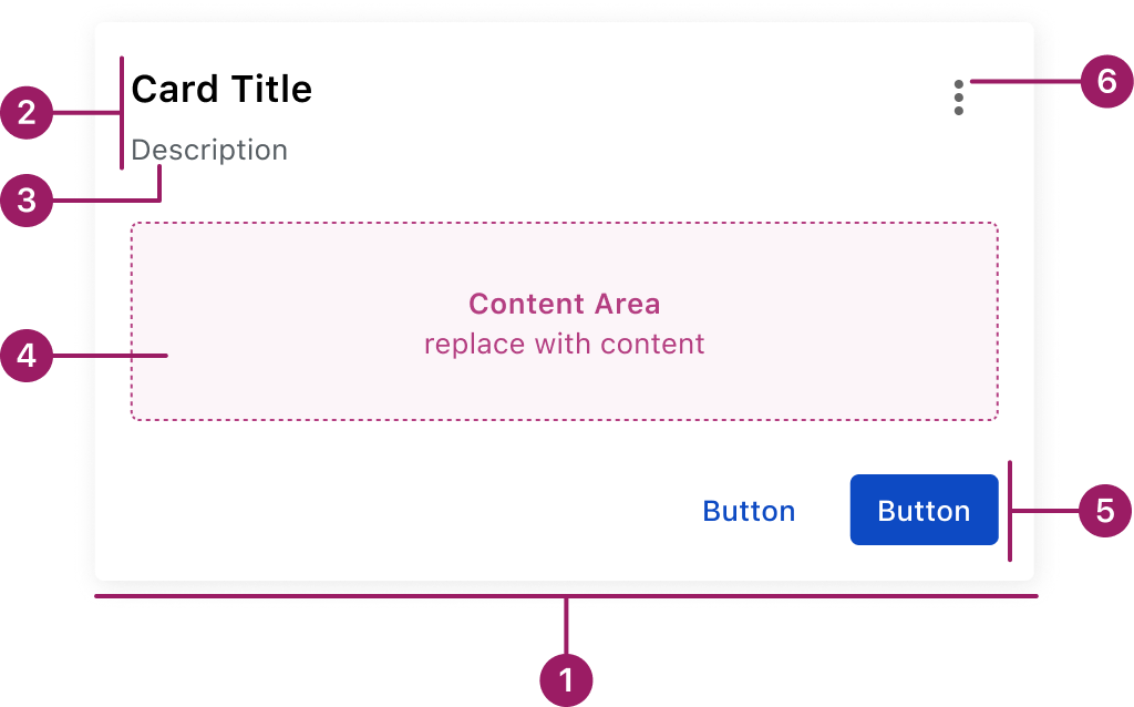
- Container
- Header
- Subtitle (optional)
- Content Area
- Footer (optional)
- Menu Button (optional)
Usage Guidelines
Use When
- Displaying and grouping related content into a clear, scannable block.
- Highlighting information that benefits from being visually separated from the rest of the page.
- Creating modular layouts where cards can be reused across views.
- Presenting details progressively (e.g., drill-down content without leaving the current page).
Best Practices
- Focus each card on a single task, idea, or piece of information.
- Use concise, clear titles that convey the card’s purpose.
- Break up complex content into logical sections.
- Keep button or link placement consistent across cards on the same page.
- Avoid overloading the card body with too many actions or links.
This component uses MUI (Material-UI) components, which are open-source and licensed under the MIT License.
Crafted with ❤️ at Zuora
© 2026 Zuora Inc.
Card
Cards are versatile containers for displaying content and interactions within the current view.
Overview
Code
Anatomy
- Container
- Header
- Subtitle (optional)
- Content Area
- Footer (optional)
- Menu Button (optional)
Usage Guidelines
Use When
- Displaying and grouping related content into a clear, scannable block.
- Highlighting information that benefits from being visually separated from the rest of the page.
- Creating modular layouts where cards can be reused across views.
- Presenting details progressively (e.g., drill-down content without leaving the current page).
Best Practices
- Focus each card on a single task, idea, or piece of information.
- Use concise, clear titles that convey the card’s purpose.
- Break up complex content into logical sections.
- Keep button or link placement consistent across cards on the same page.
- Avoid overloading the card body with too many actions or links.
This component uses MUI (Material-UI) components, which are open-source and licensed under the MIT License.
Crafted with ❤️ at Zuora
© 2026 Zuora Inc.
On This Page
Card
Cards are versatile containers for displaying content and interactions within the current view.
Overview
Code
Anatomy
- Container
- Header
- Subtitle (optional)
- Content Area
- Footer (optional)
- Menu Button (optional)
Usage Guidelines
Use When
- Displaying and grouping related content into a clear, scannable block.
- Highlighting information that benefits from being visually separated from the rest of the page.
- Creating modular layouts where cards can be reused across views.
- Presenting details progressively (e.g., drill-down content without leaving the current page).
Best Practices
- Focus each card on a single task, idea, or piece of information.
- Use concise, clear titles that convey the card’s purpose.
- Break up complex content into logical sections.
- Keep button or link placement consistent across cards on the same page.
- Avoid overloading the card body with too many actions or links.
This component uses MUI (Material-UI) components, which are open-source and licensed under the MIT License.
Crafted with ❤️ at Zuora
© 2026 Zuora Inc.