Checkbox
A checkbox is a simple input control that lets users choose multiple options or toggle a single setting on or off.
Overview
Code
Anatomy
The checkbox component consists of a checkbox input and a corresponding label. A checkbox group includes a group label, a set of checkboxes, and an informational label.
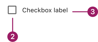
Checkbox Component
- Checkbox label
- Checkbox
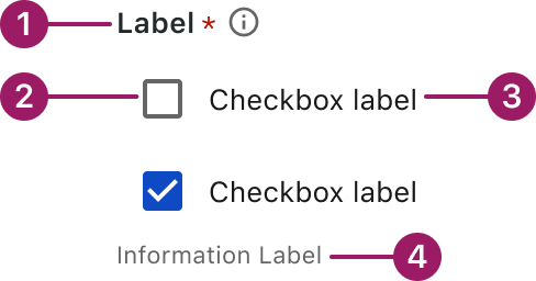
Checkbox Group
- Group label (optional)
- Checkbox
- Checkbox label
- Informational label (optional)
Usage Guidelines

Use a consistent size for input and selection components within the same form or layout to ensure alignment. Medium is the default, but small is fine if applied uniformly.
Use When
- Selecting multiple items from a list.
- Confirming user choices before applying settings.
Best Practices
- Ensure each checkbox has a concise, descriptive label for clarity and accessibility.
- If only one option can be selected, use radio buttons instead of checkboxes.
- For lengthy lists, consider using a multi-select dropdown or grouping options to improve scanability.
- If the selection represents an immediate setting change (e.g., turning a feature on or off), consider using a switch instead of a checkbox.
Sizes
Medium (36px)

Label
SMALL (32px)

Label
Variants
selected / with label

selected / standalone

unselected / with label

unselected / standalone

indeterminate / with label

indeterminate / standalone

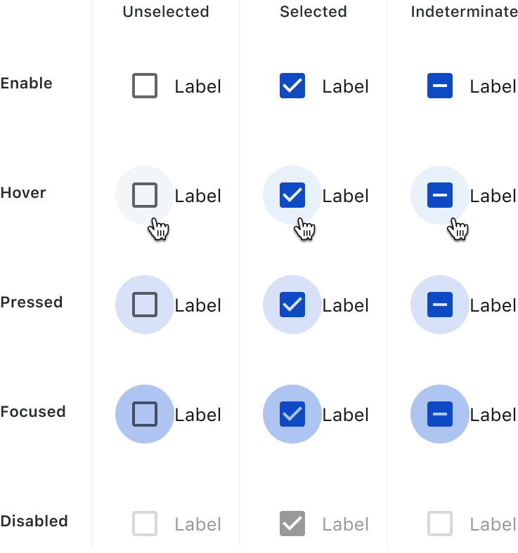
Behaviors and States
Checkboxes can be unselected, selected or indeterminate. Checkboxes have Enabled, Hover, Pressed, Focus and Disable states.
Accessibility
This component uses MUI (Material-UI) components, which are open-source and licensed under the MIT License.
Crafted with ❤️ at Zuora
© 2026 Zuora Inc.
Checkbox
A checkbox is a simple input control that lets users choose multiple options or toggle a single setting on or off.
Overview
Code
Anatomy
The checkbox component consists of a checkbox input and a corresponding label. A checkbox group includes a group label, a set of checkboxes, and an informational label.
Checkbox Component
- Checkbox label
- Checkbox
Checkbox Group
- Group label (optional)
- Checkbox
- Checkbox label
- Informational label (optional)
Usage Guidelines
Use a consistent size for input and selection components within the same form or layout to ensure alignment. Medium is the default, but small is fine if applied uniformly.
Use When
- Selecting multiple items from a list.
- Confirming user choices before applying settings.
Best Practices
- Ensure each checkbox has a concise, descriptive label for clarity and accessibility.
- If only one option can be selected, use radio buttons instead of checkboxes.
- For lengthy lists, consider using a multi-select dropdown or grouping options to improve scanability.
- If the selection represents an immediate setting change (e.g., turning a feature on or off), consider using a switch instead of a checkbox.
Sizes
Medium (36px)
Label
SMALL (32px)
Label
Variants
selected / with label
selected / standalone
unselected / with label
unselected / standalone
indeterminate / with label
indeterminate / standalone
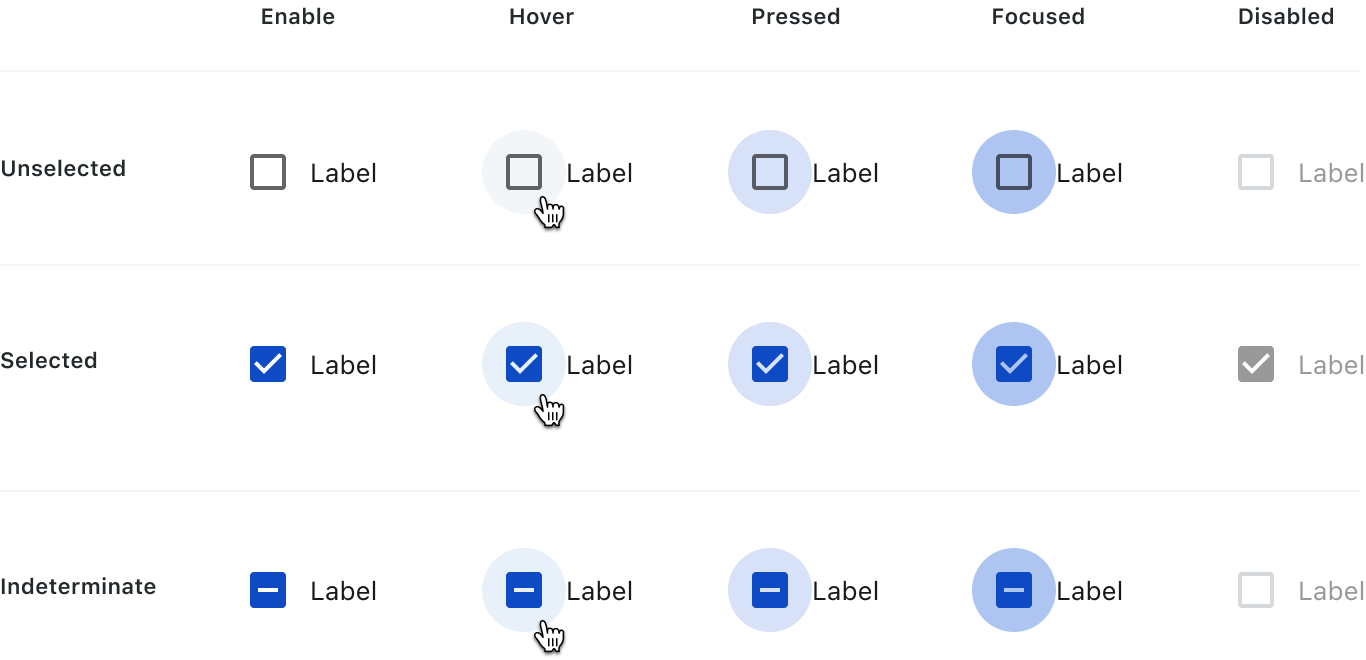
Behaviors and States
Checkboxes can be unselected, selected or indeterminate. Checkboxes have Enabled, Hover, Pressed, Focus and Disable states.
Accessibility
This component uses MUI (Material-UI) components, which are open-source and licensed under the MIT License.
Crafted with ❤️ at Zuora
© 2026 Zuora Inc.
On This Page
Checkbox
A checkbox is a simple input control that lets users choose multiple options or toggle a single setting on or off.
Overview
Code
Anatomy
The checkbox component consists of a checkbox input and a corresponding label. A checkbox group includes a group label, a set of checkboxes, and an informational label.
Checkbox Component
- Checkbox label
- Checkbox
Checkbox Group
- Group label (optional)
- Checkbox
- Checkbox label
- Informational label (optional)
Usage Guidelines
Use a consistent size for input and selection components within the same form or layout to ensure alignment. Medium is the default, but small is fine if applied uniformly.
Use When
- Selecting multiple items from a list.
- Confirming user choices before applying settings.
Best Practices
- Ensure each checkbox has a concise, descriptive label for clarity and accessibility.
- If only one option can be selected, use radio buttons instead of checkboxes.
- For lengthy lists, consider using a multi-select dropdown or grouping options to improve scanability.
- If the selection represents an immediate setting change (e.g., turning a feature on or off), consider using a switch instead of a checkbox.
Sizes
Medium (36px)
Label
SMALL (32px)
Label
Variants
selected / with label
selected / standalone
unselected / with label
unselected / standalone
indeterminate / with label
indeterminate / standalone
Behaviors and States
Checkboxes can be unselected, selected or indeterminate. Checkboxes have Enabled, Hover, Pressed, Focus and Disable states.
Accessibility
This component uses MUI (Material-UI) components, which are open-source and licensed under the MIT License.
Crafted with ❤️ at Zuora
© 2026 Zuora Inc.