Chip
Chips are dynamic compact elements that represent an input, attribute, or action.
Overview
Code
Anatomy
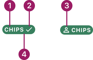
- Label text
- Trailing icon (optional)
- Leading icon (optional)
- Container
Usage Guidelines
Use When
- Representing statuses, selections, or filters in a compact format.
- Displaying tags or categories that help organize content.
Filled Chips Usage
- Best for primary or high-emphasis options.
- Ideal for highlighting selected or important items such as statuses, categories, or tags.
- Provide stronger visual presence and contrast for quick recognition.
Outlined Chips Usage
- Best for secondary or low-emphasis options.
- Useful when you want a lighter visual footprint.
- Work well in dense UIs where you need multiple chips but want to avoid heavy visual weight.
Best Practices
- Keep chip labels concise and meaningful.
- Maintain consistent spacing and alignment with other UI elements.
- Avoid using too many chips in a small space to reduce visual clutter.
- Chips should help users complete tasks more easily and organize or sort content clearly.
- Use filled chips to highlight primary or high-priority statuses, categories, or tags that require strong visual emphasis (e.g., Paid, Active, Errors).
- Use outlined chips for secondary or supporting information where a more subtle visual treatment is preferred (e.g., filters, optional attributes, secondary statuses).
Variants
filled

outline

Chip Colors
Filled - Default

Outlined - Default

Filled - Indeterminate

Outlined - Indeterminate

Filled - success
Outlined - success
Filled - warning

Outlined - warning

Filled - negative

Outlined - negative

Filled - info

Outlined - info

This component uses MUI (Material-UI) components, which are open-source and licensed under the MIT License.
Crafted with ❤️ at Zuora
© 2026 Zuora Inc.
Chip
Chips are dynamic compact elements that represent an input, attribute, or action.
Overview
Code
Anatomy
- Label text
- Trailing icon (optional)
- Leading icon (optional)
- Container
Usage Guidelines
Use When
- Representing statuses, selections, or filters in a compact format.
- Displaying tags or categories that help organize content.
Filled Chips Usage
- Best for primary or high-emphasis options.
- Ideal for highlighting selected or important items such as statuses, categories, or tags.
- Provide stronger visual presence and contrast for quick recognition.
Outlined Chips Usage
- Best for secondary or low-emphasis options.
- Useful when you want a lighter visual footprint.
- Work well in dense UIs where you need multiple chips but want to avoid heavy visual weight.
Best Practices
- Keep chip labels concise and meaningful.
- Maintain consistent spacing and alignment with other UI elements.
- Avoid using too many chips in a small space to reduce visual clutter.
- Chips should help users complete tasks more easily and organize or sort content clearly.
- Use filled chips to highlight primary or high-priority statuses, categories, or tags that require strong visual emphasis (e.g., Paid, Active, Errors).
- Use outlined chips for secondary or supporting information where a more subtle visual treatment is preferred (e.g., filters, optional attributes, secondary statuses).
Variants
filled
outline
Chip Colors
Filled - Default
Outlined - Default
Filled - Indeterminate
Outlined - Indeterminate
Filled - success
Outlined - success
Filled - warning
Outlined - warning
Filled - negative
Outlined - negative
Filled - info
Outlined - info
This component uses MUI (Material-UI) components, which are open-source and licensed under the MIT License.
Crafted with ❤️ at Zuora
© 2026 Zuora Inc.
On This Page
Chip
Chips are dynamic compact elements that represent an input, attribute, or action.
Overview
Code
Anatomy
- Label text
- Trailing icon (optional)
- Leading icon (optional)
- Container
Usage Guidelines
Use When
- Representing statuses, selections, or filters in a compact format.
- Displaying tags or categories that help organize content.
Filled Chips Usage
- Best for primary or high-emphasis options.
- Ideal for highlighting selected or important items such as statuses, categories, or tags.
- Provide stronger visual presence and contrast for quick recognition.
Outlined Chips Usage
- Best for secondary or low-emphasis options.
- Useful when you want a lighter visual footprint.
- Work well in dense UIs where you need multiple chips but want to avoid heavy visual weight.
Best Practices
- Keep chip labels concise and meaningful.
- Maintain consistent spacing and alignment with other UI elements.
- Avoid using too many chips in a small space to reduce visual clutter.
- Chips should help users complete tasks more easily and organize or sort content clearly.
- Use filled chips to highlight primary or high-priority statuses, categories, or tags that require strong visual emphasis (e.g., Paid, Active, Errors).
- Use outlined chips for secondary or supporting information where a more subtle visual treatment is preferred (e.g., filters, optional attributes, secondary statuses).
Variants
filled
outline
Chip Colors
Filled - Default
Outlined - Default
Filled - Indeterminate
Outlined - Indeterminate
Filled - success
Outlined - success
Filled - warning
Outlined - warning
Filled - negative
Outlined - negative
Filled - info
Outlined - info
This component uses MUI (Material-UI) components, which are open-source and licensed under the MIT License.
Crafted with ❤️ at Zuora
© 2026 Zuora Inc.