Data Grid
The Data Grid displays large sets of structured data in rows and columns and supports common data interactions such as sorting, filtering, selection, and pagination.
Overview
Code
Anatomy
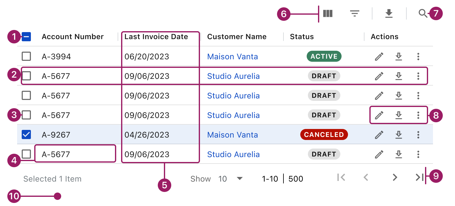
- Header Row
- Row
- Selection controls (optional)
- Cell
- Column
- Table actions (optional)
- Quick Search
- Row actions
- Pagination (optional)
- White Background
Usage Guidelines
Use When
- Users need to view structured data organized into rows and columns.
- Users need to scan or compare multiple records across shared attributes.
- Data sets are large or frequently updated.
- Users need to sort, filter, or paginate data.
- Row-level actions or selection are required to support user workflows.
Key Considerations
- Choose row density intentionally. Use the default density in most cases; use compact density only for large datasets where vertical space is constrained.
- Enable row selection only when it supports a clear next step for the user.
- Keep row-level actions minimal. Move complex or bulk actions outside the data grid.
- Prioritize scannability over completeness. Avoid overcrowding rows with controls or secondary information.
- Provide clear loading and empty states to set expectations and guide users.
Best Practices
- Keep row height and density consistent within the same data grid.
- Avoid horizontal scrolling whenever possible.
- Use row selection only when it supports a clear user action.
- Limit the number of interactive elements within a single row.
- Place the data grid on a white background to ensure sufficient color contrast.
- Use clear, concise column labels that accurately describe the data.
- Order columns by importance, placing primary information first.
- Left-align text and right-align numeric values for readability.
Types
Basic


Account Number
Last Invoice Date
Account Balance
A-9267
04/26/2023
$0.00
A-3994
06/20/2023
$0.00
A-5677
09/06/2023
$282.00


Multi select

Account Number
Last Invoice Date
Account Balance

A-9267
04/26/2023
$0.00

A-3994
06/20/2023
$0.00
A-5677
09/06/2023
$282.00
Master Detail with Grouping
Column Header
Column Header
Column Header

Tree L1
Cell Content
Cell Content
Column Header
Column Header
Column Header
Cell Content
Cell Content
Cell Content
Cell Content
Cell Content
Cell Content
Cell Content
Cell Content
Cell Content

Tree L1
Cell Content
Cell Content
Tree L1
Cell Content
Cell Content
Accessibility
This component uses MUI (Material-UI) components, which are open-source and licensed under the MIT License.
Crafted with ❤️ at Zuora
© 2026 Zuora Inc.
Data Grid
The Data Grid displays large sets of structured data in rows and columns and supports common data interactions such as sorting, filtering, selection, and pagination.
Overview
Code
Anatomy
- Header Row
- Row
- Selection controls (optional)
- Cell
- Column
- Table actions (optional)
- Quick Search
- Row actions
- Pagination (optional)
- White background
Usage Guidelines
Use When
- Users need to view structured data organized into rows and columns.
- Users need to scan or compare multiple records across shared attributes.
- Data sets are large or frequently updated.
- Users need to sort, filter, or paginate data.
- Row-level actions or selection are required to support user workflows.
Key Considerations
- Choose row density intentionally. Use the default density in most cases; use compact density only for large datasets where vertical space is constrained.
- Enable row selection only when it supports a clear next step for the user.
- Keep row-level actions minimal. Move complex or bulk actions outside the data grid.
- Prioritize scannability over completeness. Avoid overcrowding rows with controls or secondary information.
- Provide clear loading and empty states to set expectations and guide users.
Best Practices
- Keep row height and density consistent within the same data grid.
- Avoid horizontal scrolling whenever possible.
- Use row selection only when it supports a clear user action.
- Limit the number of interactive elements within a single row.
- Place the data grid on a white background to ensure sufficient color contrast.
- Use clear, concise column labels that accurately describe the data.
- Order columns by importance, placing primary information first.
- Left-align text and right-align numeric values for readability.
Types
Basic
Account Number
Last Invoice Date
Account Balance
Contracted MRR
Status
Actions
A-9267
04/26/2023
$0.00
$8.00
canceled


A-3994
06/20/2023
$0.00
$3.00
Active
A-5677
09/06/2023
$282.00
$9.00
draft
Show
10

1-10

500
Multi select
Account Number
Last Invoice Date
Account Balance
Contracted MRR
Status
Actions
A-9267
04/26/2023
$0.00
$8.00
canceled
A-3994
06/20/2023
$0.00
$3.00
Active
A-5677
09/06/2023
$282.00
$9.00
draft
Selected 1 Item
Show
10
1-10
500
Master Detail with Grouping
Column Header
Column Header
Column Header
Column Header
Column Header
Tree L1
Cell Content
Cell Content
Cell Content
Cell Content
Column Header
Column Header
Column Header
Column Header
Column Header
Column Header
Column Header
Cell Content
Cell Content
Cell Content
Cell Content
Cell Content
Cell Content
Cell Content
Cell Content
Cell Content
Cell Content
Cell Content
Cell Content
Cell Content
Cell Content
Cell Content
Cell Content
Cell Content
Cell Content
Cell Content
Cell Content
Cell Content
Tree L1
Cell Content
Cell Content
Cell Content
Cell Content
Tree L1
Cell Content
Cell Content
Cell Content
Cell Content
Show
10
1-10
500
Accessibility
This component uses MUI (Material-UI) components, which are open-source and licensed under the MIT License.
Crafted with ❤️ at Zuora
© 2026 Zuora Inc.
Data Grid
The Data Grid displays large sets of structured data in rows and columns and supports common data interactions such as sorting, filtering, selection, and pagination.
Overview
Code
Anatomy
- Header Row
- Row
- Selection controls (optional)
- Cell
- Column
- Table actions (optional)
- Quick Search
- Row actions
- Pagination (optional)
- White background
Usage Guidelines
Use When
- Users need to view structured data organized into rows and columns.
- Users need to scan or compare multiple records across shared attributes.
- Data sets are large or frequently updated.
- Users need to sort, filter, or paginate data.
- Row-level actions or selection are required to support user workflows.
Key Considerations
- Choose row density intentionally. Use the default density in most cases; use compact density only for large datasets where vertical space is constrained.
- Enable row selection only when it supports a clear next step for the user.
- Keep row-level actions minimal. Move complex or bulk actions outside the data grid.
- Prioritize scannability over completeness. Avoid overcrowding rows with controls or secondary information.
- Provide clear loading and empty states to set expectations and guide users.
Best Practices
- Keep row height and density consistent within the same data grid.
- Avoid horizontal scrolling whenever possible.
- Use row selection only when it supports a clear user action.
- Limit the number of interactive elements within a single row.
- Place the data grid on a white background to ensure sufficient color contrast.
- Use clear, concise column labels that accurately describe the data.
- Order columns by importance, placing primary information first.
- Left-align text and right-align numeric values for readability.
Types
Basic
Account Number
Last Invoice Date
Account Balance
Contracted MRR
Status
Actions
A-9267
04/26/2023
$0.00
$8.00
canceled
A-3994
06/20/2023
$0.00
$3.00
Active
A-5677
09/06/2023
$282.00
$9.00
draft
Show
10
1-10
500
Multi select
Account Number
Last Invoice Date
Account Balance
Contracted MRR
Status
Actions
A-9267
04/26/2023
$0.00
$8.00
canceled
A-3994
06/20/2023
$0.00
$3.00
Active
A-5677
09/06/2023
$282.00
$9.00
draft
Selected 1 Item
Show
10
1-10
500
Master Detail with Grouping
Column Header
Column Header
Column Header
Column Header
Column Header
Tree L1
Cell Content
Cell Content
Cell Content
Cell Content
Column Header
Column Header
Column Header
Column Header
Column Header
Column Header
Column Header
Cell Content
Cell Content
Cell Content
Cell Content
Cell Content
Cell Content
Cell Content
Cell Content
Cell Content
Cell Content
Cell Content
Cell Content
Cell Content
Cell Content
Cell Content
Cell Content
Cell Content
Cell Content
Cell Content
Cell Content
Cell Content
Tree L1
Cell Content
Cell Content
Cell Content
Cell Content
Tree L1
Cell Content
Cell Content
Cell Content
Cell Content
Show
10
1-10
500
Accessibility
This component uses MUI (Material-UI) components, which are open-source and licensed under the MIT License.
Crafted with ❤️ at Zuora
© 2026 Zuora Inc.
On This Page
Data Grid
The Data Grid displays large sets of structured data in rows and columns and supports common data interactions such as sorting, filtering, selection, and pagination.
Overview
Code
Anatomy
- Header Row
- Row
- Selection controls (optional)
- Cell
- Column
- Table actions (optional)
- Quick Search
- Row actions
- Pagination (optional)
- White background
Usage Guidelines
Use When
- Users need to view structured data organized into rows and columns.
- Users need to scan or compare multiple records across shared attributes.
- Data sets are large or frequently updated.
- Users need to sort, filter, or paginate data.
- Row-level actions or selection are required to support user workflows.
Key Considerations
- Choose row density intentionally. Use the default density in most cases; use compact density only for large datasets where vertical space is constrained.
- Enable row selection only when it supports a clear next step for the user.
- Keep row-level actions minimal. Move complex or bulk actions outside the data grid.
- Prioritize scanability over completeness. Avoid overcrowding rows with controls or secondary information.
- Provide clear loading and empty states to set expectations and guide users.
Best Practices
- Keep row height and density consistent within the same data grid.
- Avoid horizontal scrolling whenever possible.
- Use row selection only when it supports a clear user action.
- Limit the number of interactive elements within a single row.
- Place the data grid on a white background to ensure sufficient color contrast.
- Use clear, concise column labels that accurately describe the data.
- Order columns by importance, placing primary information first.
- Left-align text and right-align numeric values for readability.
Types
Basic
Account Number
Last Invoice Date
Account Balance
Contracted MRR
Status
Actions
A-9267
04/26/2023
$0.00
$8.00
canceled
A-3994
06/20/2023
$0.00
$3.00
Active
A-5677
09/06/2023
$282.00
$9.00
draft
Show
10
1-10
500
Multi select
Account Number
Last Invoice Date
Account Balance
Contracted MRR
Status
Actions
A-9267
04/26/2023
$0.00
$8.00
canceled
A-3994
06/20/2023
$0.00
$3.00
Active
A-5677
09/06/2023
$282.00
$9.00
draft
Selected 1 Item
Show
10
1-10
500
Master Detail with Grouping
Column Header
Column Header
Column Header
Column Header
Column Header
Tree L1
Cell Content
Cell Content
Cell Content
Cell Content
Column Header
Column Header
Column Header
Column Header
Column Header
Column Header
Column Header
Cell Content
Cell Content
Cell Content
Cell Content
Cell Content
Cell Content
Cell Content
Cell Content
Cell Content
Cell Content
Cell Content
Cell Content
Cell Content
Cell Content
Cell Content
Cell Content
Cell Content
Cell Content
Cell Content
Cell Content
Cell Content
Tree L1
Cell Content
Cell Content
Cell Content
Cell Content
Tree L1
Cell Content
Cell Content
Cell Content
Cell Content
Show
10
1-10
500
Accessibility
This component uses MUI (Material-UI) components, which are open-source and licensed under the MIT License.
Crafted with ❤️ at Zuora
© 2026 Zuora Inc.