Dialog
Dialogs present a message that prompts user actions, informs users about a task, conveys critical information, requests decisions, or handles multiple tasks.
Overview
Code
Anatomy
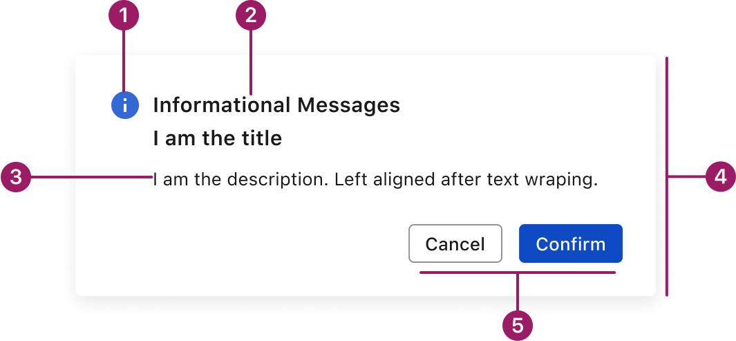
- Icon (optional)
- Title
- Body Text
- Container
- Action Buttons
Usage Guidelines
Use When
- Capturing attention for a focused task or decision.
- Confirming important or potentially destructive actions.
- Displaying critical information that must be acknowledged.
- Collecting short, specific input without leaving the current page.
- Interrupting the user’s flow to present important content.
Best Practices
- Keep dialogs focused and concise — avoid overloading them with content.
- Use clear, descriptive titles and supporting text to explain the purpose.
- Prioritize primary and secondary actions; place them clearly in the action area.
- Always provide a clear dismissal method (e.g., Cancel button or Close icon).
- Don’t stack multiple dialogs — guide users through one clear flow at a time.
- Use drawers or full pages for more complex or multi-step interactions.
Accessibility
This component uses MUI (Material-UI) components, which are open-source and licensed under the MIT License.
Crafted with ❤️ at Zuora
© 2026 Zuora Inc.
Dialog
Dialogs present a message that prompts user actions, informs users about a task, conveys critical information, requests decisions, or handles multiple tasks.
Overview
Code
Anatomy
- Icon (optional)
- Title
- Body Text
- Container
- Action Buttons
Usage Guidelines
Use When
- Capturing attention for a focused task or decision.
- Confirming important or potentially destructive actions.
- Displaying critical information that must be acknowledged.
- Collecting short, specific input without leaving the current page.
- Interrupting the user’s flow to present important content.
Best Practices
- Keep dialogs focused and concise — avoid overloading them with content.
- Use clear, descriptive titles and supporting text to explain the purpose.
- Prioritize primary and secondary actions; place them clearly in the action area.
- Always provide a clear dismissal method (e.g., Cancel button or Close icon).
- Don’t stack multiple dialogs — guide users through one clear flow at a time.
- Use drawers or full pages for more complex or multi-step interactions.
Accessibility
This component uses MUI (Material-UI) components, which are open-source and licensed under the MIT License.
Crafted with ❤️ at Zuora
© 2026 Zuora Inc.
On This Page
Dialog
Dialogs present a message that prompts user actions, informs users about a task, conveys critical information, requests decisions, or handles multiple tasks.
Overview
Code
Anatomy
- Icon (optional)
- Title
- Body Text
- Container
- Action Buttons
Usage Guidelines
Use When
- Capturing attention for a focused task or decision.
- Confirming important or potentially destructive actions.
- Displaying critical information that must be acknowledged.
- Collecting short, specific input without leaving the current page.
- Interrupting the user’s flow to present important content.
Best Practices
- Keep dialogs focused and concise — avoid overloading them with content.
- Use clear, descriptive titles and supporting text to explain the purpose.
- Prioritize primary and secondary actions; place them clearly in the action area.
- Always provide a clear dismissal method (e.g., Cancel button or Close icon).
- Don’t stack multiple dialogs — guide users through one clear flow at a time.
- Use drawers or full pages for more complex or multi-step interactions.
Accessibility
This component uses MUI (Material-UI) components, which are open-source and licensed under the MIT License.
Crafted with ❤️ at Zuora
© 2026 Zuora Inc.