Drawer
A drawer is a panel that slides in from the side of the screen to present related content or tasks while keeping the underlying page visible.
Overview
Code [coming soon]
Anatomy
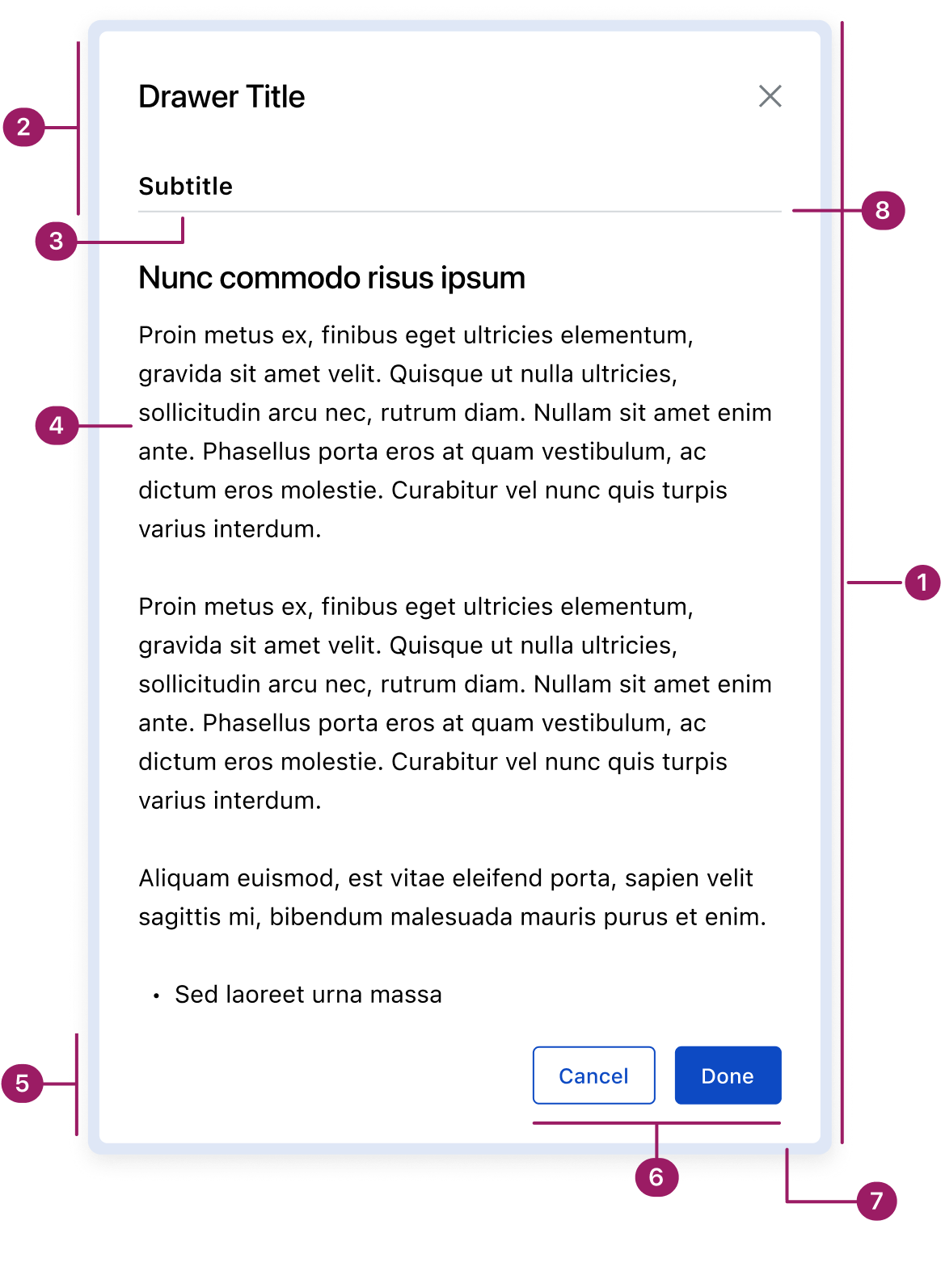
- Container
- Header
- Subtitle (optional)
- Content area
- Footer
- Action buttons
- Glass Effect
- Divider (optional)
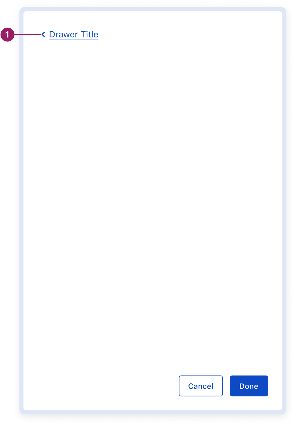
Multi-page Drawer
- Drawer router
Usage Guidelines
Use When
- Displaying supplemental or contextual tasks without disrupting the main workflow (e.g., data entry or setting properties).
- Allowing users to reference or edit information while still viewing the underlying content.
- Collecting input or settings that affect the underlying page in real time.
- Showing secondary details or references alongside the main task.
- Handling tasks that can be paused or dismissed without losing progress.
- Supporting ongoing or repeat interactions where persistence is helpful.
- Navigating between multiple views within the drawer context, achieved through router-based stacked drawers.
Best Practices
- Drawers always slide in from the right side of the browser window.
- Keep content focused and concise—drawers should not replace full-page layouts.
- Use appropriate drawer width for the content; avoid overly wide panels.
- Provide clear close options inside the drawer and support the Esc key for accessibility.
- Avoid overlays—drawers are meant to maintain visibility of the underlying page.
- Use persistence thoughtfully: drawers can remain open, but in some cases they may temporarily hide when the user interacts with the page.
- Reserve drawers for tasks that benefit from maintaining context with the underlying page.
Key Differences between Modal vs. Drawer
Placement
Modal
Centered on screen
Drawer
Slides in from screen edge of the screen
Background
Modal
Fully obscures the underlying page with an overlay
Drawer
Keeps the underlying page partially visible
Primary Use Case
Modal
Short, focused tasks or important information that requires full attention
Drawer
Supplemental tasks, data entry, or property settings that benefit from maintaining context with the page
Frequency
Modal
Used sparingly to avoid interruption
Drawer
Can remain open for ongoing interactions, but may also collapse when interacting with the underlying page, depending on context
Placement
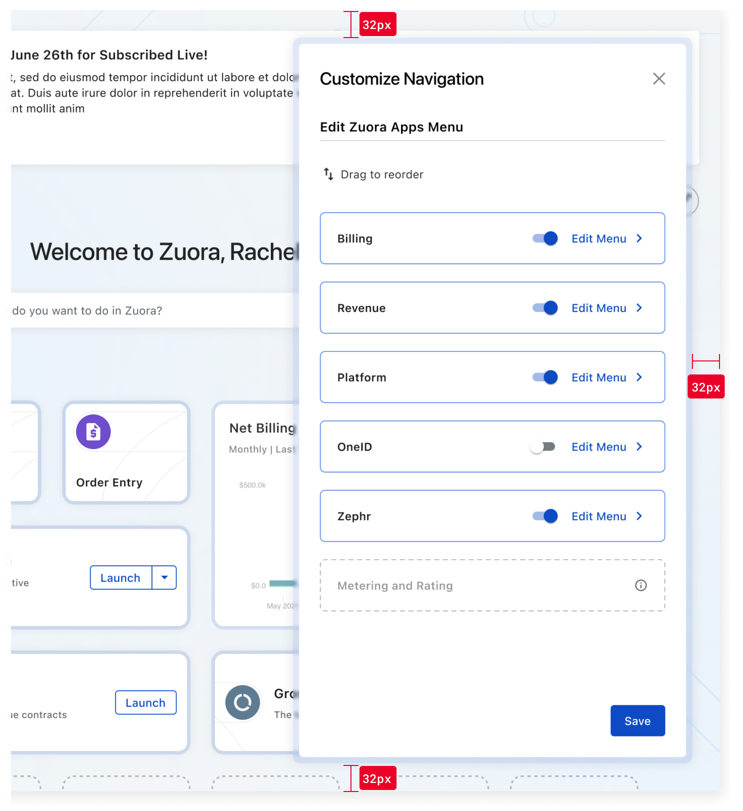
Drawers slide in from the right edge of the screen. They are positioned 32px from the top, bottom, and right edges of the screen. This spacing ensures visual balance and prevents overlap with fixed actions or UI elements near the screen edges.
Accessibility
Crafted with ❤️ at Zuora
© 2026 Zuora Inc.
Drawer
A drawer is a panel that slides in from the side of the screen to present related content or tasks while keeping the underlying page visible.
Overview
Code [coming soon]
Anatomy
- Container
- Header
- Subtitle (optional)
- Content area
- Footer
- Action buttons
- Glass Effect
- Divider (optional)
Multi-page Drawer
- Drawer router
Usage Guidelines
Use When
- Displaying supplemental or contextual tasks without disrupting the main workflow (e.g., data entry or setting properties).
- Allowing users to reference or edit information while still viewing the underlying content.
- Collecting input or settings that affect the underlying page in real time.
- Showing secondary details or references alongside the main task.
- Handling tasks that can be paused or dismissed without losing progress.
- Supporting ongoing or repeat interactions where persistence is helpful.
- Navigating between multiple views within the drawer context, achieved through router-based stacked drawers.
Best Practices
- Drawers always slide in from the right side of the browser window.
- Keep content focused and concise—drawers should not replace full-page layouts.
- Use appropriate drawer width for the content; avoid overly wide panels.
- Provide clear close options inside the drawer and support the Esc key for accessibility.
- Avoid overlays—drawers are meant to maintain visibility of the underlying page.
- Use persistence thoughtfully: drawers can remain open, but in some cases they may temporarily hide when the user interacts with the page.
- Reserve drawers for tasks that benefit from maintaining context with the underlying page.
Key Differences between Modal vs. Drawer
Aspect
Modal
Drawer
Placement
Centered on screen
Slides in from screen edge of the screen
Background
Fully obscures the underlying page with an overlay
Keeps the underlying page partially visible
Primary Use Case
Short, focused tasks or important information that requires full attention
Supplemental tasks, data entry, or property settings that benefit from maintaining context with the page
Frequency
Used sparingly to avoid interruption
Can remain open for ongoing interactions, but may also collapse when interacting with the underlying page, depending on context
Placement
Drawers slide in from the right edge of the screen. They are positioned 32px from the top, bottom, and right edges of the screen. This spacing ensures visual balance and prevents overlap with fixed actions or UI elements near the screen edges.
Accessibility
Crafted with ❤️ at Zuora
© 2026 Zuora Inc.
On This Page
Drawer
A drawer is a panel that slides in from the side of the screen to present related content or tasks while keeping the underlying page visible.
Overview
Code [coming soon]
Anatomy
- Container
- Header
- Subtitle (optional)
- Content area
- Footer
- Action buttons
- Glass Effect
- Divider (optional)
Multi-page Drawer
- Drawer router
Usage Guidelines
Use When
- Displaying supplemental or contextual tasks without disrupting the main workflow (e.g., data entry or setting properties).
- Allowing users to reference or edit information while still viewing the underlying content.
- Collecting input or settings that affect the underlying page in real time.
- Showing secondary details or references alongside the main task.
- Handling tasks that can be paused or dismissed without losing progress.
- Supporting ongoing or repeat interactions where persistence is helpful.
- Navigating between multiple views within the drawer context, achieved through router-based stacked drawers.
Best Practices
- Drawers always slide in from the right side of the browser window.
- Keep content focused and concise—drawers should not replace full-page layouts.
- Use appropriate drawer width for the content; avoid overly wide panels.
- Provide clear close options inside the drawer and support the Esc key for accessibility.
- Avoid overlays—drawers are meant to maintain visibility of the underlying page.
- Use persistence thoughtfully: drawers can remain open, but in some cases they may temporarily hide when the user interacts with the page.
- Reserve drawers for tasks that benefit from maintaining context with the underlying page.
Key Differences between Modal vs. Drawer
Aspect
Modal
Drawer
Placement
Centered on screen
Slides in from screen edge of the screen
Background
Fully obscures the underlying page with an overlay
Keeps the underlying page partially visible
Primary Use Case
Short, focused tasks or important information that requires full attention
Supplemental tasks, data entry, or property settings that benefit from maintaining context with the page
Frequency
Used sparingly to avoid interruption
Can remain open for ongoing interactions, but may also collapse when interacting with the underlying page, depending on context
Placement
Drawers slide in from the right edge of the screen. They are positioned 32px from the top, bottom, and right edges of the screen. This spacing ensures visual balance and prevents overlap with fixed actions or UI elements near the screen edges.
Accessibility
Crafted with ❤️ at Zuora
© 2026 Zuora Inc.