Floating Action Button
Floating Action Buttons (FABs) are visually prominent actions that float above UI content and remain easily accessible within a screen or context. They appear above UI content and remain easily accessible.
Overview
Code
Anatomy
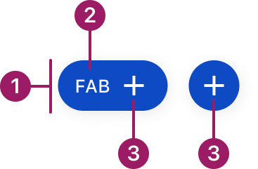
- Container
- Label (optional)
- Icon (required)
Usage Guidelines

Only use one FAB per screen to represent the most important action. Multiple FABs can cause confusion and reduce their effectiveness.
Use When
- Performing an action central to the user’s current task.
- Supporting frequent or repeatable actions that benefit from persistent visibility
- Providing quick access to actions that should remain available while interacting with content
Best Practices
- Use only one primary FAB per screen
- Use recognizable, widely understood icons to ensure immediate comprehension
- Choose an extended FAB when additional label a is required
- Maintain consistent placement across similar screens
- Avoid using a FAB when a primary button already clearly represents the action within the layout
- Prefer FABs when the action needs to float above scrolling content
Sizes
medium (36px)

small (32px)

extra small (28px)

Types
circular
extended
FAB
Variants
medium (36px)
FAB
secondary

FAB
Tertiary

FAB
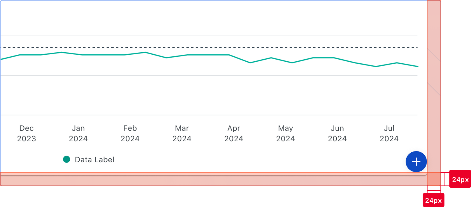
Placement
Floating Action Buttons (FABs) are positioned relative to the viewport and remain fixed as content scrolls. Placement must be consistent across similar screens to ensure predictability.
Default placement
- Bottom-right corner of the viewport
- Offset aligns with layout spacing:
- 24px from the right edge
- 24px from the bottom edge
- The FAB should visually align with the page margins and grid
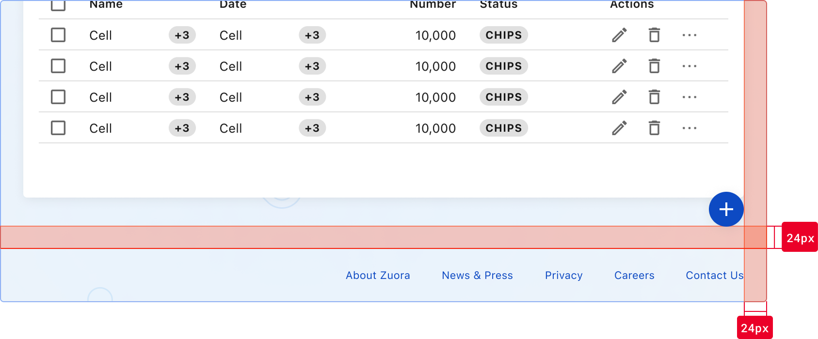
Bottom offset behavior
The bottom offset is relative to the nearest available edge, not strictly the viewport.
- Default: 24px from the viewport bottom
- If a persistent bottom element is present (e.g., footer, bottom navigation):
- Position the FAB above the element
- Maintain 24px spacing from the top of that element
Adjustment rules
- Adjust placement only when the default position conflicts with persistent UI elements.
- Prefer vertical repositioning (move upward) to avoid overlap
- Maintain a minimum of 16px spacing from adjacent UI elements
- Use bottom-left placement only when right-side placement is not viable
Accessibility
Always include an aria-label attribute to describe the action for screen readers.
Ensure sufficient color contrast between the icon and background (minimum 3:1 ratio).
The FAB should be keyboard accessible with visible focus indicators.
This component uses MUI (Material-UI) components, which are open-source and licensed under the MIT License.
Crafted with ❤️ at Zuora
© 2026 Zuora Inc.
Floating Action Button
Floating Action Buttons (FABs) are visually prominent actions that float above UI content and remain easily accessible within a screen or context. They appear above UI content and remain easily accessible.
Overview
Code
Anatomy
- Container
- Label (optional)
- Icon (required)
Usage Guidelines
Only use one FAB per screen to represent the most important action. Multiple FABs can cause confusion and reduce their effectiveness.
Use When
- Performing an action central to the user’s current task.
- Supporting frequent or repeatable actions that benefit from persistent visibility
- Providing quick access to actions that should remain available while interacting with content
Best Practices
- Use only one primary FAB per screen
- Use recognizable, widely understood icons to ensure immediate comprehension
- Choose an extended FAB when additional label a is required
- Maintain consistent placement across similar screens
- Avoid using a FAB when a primary button already clearly represents the action within the layout
- Prefer FABs when the action needs to float above scrolling content
Sizes
medium (36px)
small (32px)
extra small (28px)
Types
circular
extended
FAB
Variants
medium (36px)
FAB
secondary
FAB
Tertiary
FAB
Placement
Floating Action Buttons (FABs) are positioned relative to the viewport and remain fixed as content scrolls. Placement must be consistent across similar screens to ensure predictability.
Default placement
- Bottom-right corner of the viewport
- Offset aligns with layout spacing:
- 24px from the right edge
- 24px from the bottom edge
- The FAB should visually align with the page margins and grid
Bottom offset behavior
The bottom offset is relative to the nearest available edge, not strictly the viewport.
- Default: 24px from the viewport bottom
- If a persistent bottom element is present (e.g., footer, bottom navigation):
- Position the FAB above the element
- Maintain 24px spacing from the top of that element
Adjustment rules
- Adjust placement only when the default position conflicts with persistent UI elements.
- Prefer vertical repositioning (move upward) to avoid overlap
- Maintain a minimum of 16px spacing from adjacent UI elements
- Use bottom-left placement only when right-side placement is not viable
Always include an aria-label attribute to describe the action for screen readers.
Accessibility
Always include an aria-label attribute to describe the action for screen readers.
This component uses MUI (Material-UI) components, which are open-source and licensed under the MIT License.
Crafted with ❤️ at Zuora
© 2026 Zuora Inc.
Floating Action Button
Floating Action Buttons (FABs) are visually prominent actions that float above UI content and remain easily accessible within a screen or context. They appear above UI content and remain easily accessible.
Overview
Code
Anatomy
- Container
- Label (optional)
- Icon (required)
Usage Guidelines
Only use one FAB per screen to represent the most important action. Multiple FABs can cause confusion and reduce their effectiveness.
Use When
- Performing an action central to the user’s current task.
- Supporting frequent or repeatable actions that benefit from persistent visibility
- Providing quick access to actions that should remain available while interacting with content
Best Practices
- Use only one primary FAB per screen
- Use recognizable, widely understood icons to ensure immediate comprehension
- Choose an extended FAB when additional label a is required
- Maintain consistent placement across similar screens
- Avoid using a FAB when a primary button already clearly represents the action within the layout
- Prefer FABs when the action needs to float above scrolling content
Sizes
medium (36px)
small (32px)
extra small (28px)
Types
circular
extended
FAB
Variants
medium (36px)
FAB
secondary
FAB
Tertiary
FAB
Placement
Floating Action Buttons (FABs) are positioned relative to the viewport and remain fixed as content scrolls. Placement must be consistent across similar screens to ensure predictability.
Default placement
- Bottom-right corner of the viewport
- Offset aligns with layout spacing:
- 24px from the right edge
- 24px from the bottom edge
- The FAB should visually align with the page margins and grid
Bottom offset behavior
The bottom offset is relative to the nearest available edge, not strictly the viewport.
- Default: 24px from the viewport bottom
- If a persistent bottom element is present (e.g., footer, bottom navigation):
- Position the FAB above the element
- Maintain 24px spacing from the top of that element
Adjustment rules
- Adjust placement only when the default position conflicts with persistent UI elements.
- Prefer vertical repositioning (move upward) to avoid overlap
- Maintain a minimum of 16px spacing from adjacent UI elements
- Use bottom-left placement only when right-side placement is not viable
Accessibility
Always include an aria-label attribute to describe the action for screen readers.
Ensure sufficient color contrast between the icon and background (minimum 3:1 ratio).
The FAB should be keyboard accessible with visible focus indicators.
This component uses MUI (Material-UI) components, which are open-source and licensed under the MIT License.
Crafted with ❤️ at Zuora
© 2026 Zuora Inc.
On This Page
Floating Action Button
Floating Action Buttons (FABs) are visually prominent actions that float above UI content and remain easily accessible within a screen or context. They appear above UI content and remain easily accessible.
Overview
Code
Anatomy
- Container
- Label (optional)
- Icon (required)
Usage Guidelines
Only use one FAB per screen to represent the most important action. Multiple FABs can cause confusion and reduce their effectiveness.
Use When
- Performing an action central to the user’s current task.
- Supporting frequent or repeatable actions that benefit from persistent visibility
- Providing quick access to actions that should remain available while interacting with content
Best Practices
- Use only one primary FAB per screen
- Use recognizable, widely understood icons to ensure immediate comprehension
- Choose an extended FAB when additional label a is required
- Maintain consistent placement across similar screens
- Avoid using a FAB when a primary button already clearly represents the action within the layout
- Prefer FABs when the action needs to float above scrolling content
Sizes
medium (36px)
small (32px)
extra small (28px)
Types
circular
extended
FAB
Variants
medium (36px)
FAB
secondary
FAB
Tertiary
FAB
Placement
Floating Action Buttons (FABs) are positioned relative to the viewport and remain fixed as content scrolls. Placement must be consistent across similar screens to ensure predictability.
Default placement
- Bottom-right corner of the viewport
- Offset aligns with layout spacing:
- 24px from the right edge
- 24px from the bottom edge
- The FAB should visually align with the page margins and grid
Bottom offset behavior
The bottom offset is relative to the nearest available edge, not strictly the viewport.
- Default: 24px from the viewport bottom
- If a persistent bottom element is present (e.g., footer, bottom navigation):
- Position the FAB above the element
- Maintain 24px spacing from the top of that element
Adjustment rules
- Adjust placement only when the default position conflicts with persistent UI elements.
- Prefer vertical repositioning (move upward) to avoid overlap
- Maintain a minimum of 16px spacing from adjacent UI elements
- Use bottom-left placement only when right-side placement is not viable
Always include an aria-label attribute to describe the action for screen readers.
Accessibility
Always include an aria-label attribute to describe the action for screen readers.
This component uses MUI (Material-UI) components, which are open-source and licensed under the MIT License.
Crafted with ❤️ at Zuora
© 2026 Zuora Inc.
On This Page
Floating Action Button
Floating Action Buttons (FABs) are visually prominent actions that float above UI content and remain easily accessible within a screen or context. They appear above UI content and remain easily accessible.
Overview
Code
Anatomy
- Container
- Label (optional)
- Icon (required)
Usage Guidelines
Only use one FAB per screen to represent the most important action. Multiple FABs can cause confusion and reduce their effectiveness.
Use When
- Highlighting a prominent or high-importance action within a screen or workflow
- Supporting frequent or repeatable actions that benefit from persistent visibility
- Providing quick access to actions that should remain available while interacting with content
Best Practices
- Use only one primary FAB per screen
- Use recognizable, widely understood icons to ensure immediate comprehension
- Choose an extended FAB when additional label a is required
- Maintain consistent placement across similar screens
- Avoid using a FAB when a primary button already clearly represents the action within the layout
- Prefer FAB when the action needs to float above scrolling content
Sizes
medium (36px)
small (32px)
extra small (28px)
Types
circular
extended
FAB
Variants
Primary
FAB
secondary
FAB
Tertiary
FAB
Placement
Floating Action Buttons (FABs) are positioned relative to the viewport and remain fixed as content scrolls. Placement must be consistent across similar screens to ensure predictability.
Default placement
- Bottom-right corner of the viewport
- Offset aligns with layout spacing:
- 24px from the right edge
- 24px from the bottom edge
- The FAB should visually align with the page margins and grid
Bottom offset behavior
The bottom offset is relative to the nearest available edge, not strictly the viewport.
- Default: 24px from the viewport bottom
- If a persistent bottom element is present (e.g., footer, bottom navigation):
- Position the FAB above the element
- Maintain 24px spacing from the top of that element
Adjustment rules
- Adjust placement only when the default position conflicts with persistent UI elements.
- Prefer vertical repositioning (move upward) to avoid overlap
- Maintain a minimum of 16px spacing from adjacent UI elements
- Use bottom-left placement only when right-side placement is not viable
Accessibility
Always include an aria-label attribute to describe the action for screen readers.
Ensure sufficient color contrast between the icon and background (minimum 3:1 ratio).
The FAB should be keyboard accessible with visible focus indicators.
This component uses MUI (Material-UI) components, which are open-source and licensed under the MIT License.
Crafted with ❤️ at Zuora
© 2026 Zuora Inc.