Icon Button
An icon button is a compact button that contains only an icon, offering a concise, touch-friendly way to trigger actions.
Overview
Code
Anatomy
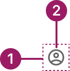
- Container
- Icon
Usage Guidelines

Use a consistent size for input and selection components within the same form or layout to ensure alignment. Medium is the default, but small is fine if applied uniformly.
Use When
- Performing an action that can be conveyed clearly by an icon alone.
- Providing a space-saving option, such as in toolbars or dense UI areas.
- Offering a single, specific action (e.g., close, expand, delete).
- Creating toggle interactions (e.g., favorite/unfavorite).
- Supporting touch or keyboard interactions in compact contexts.
Button Sizes
- Medium (default): Use for most actions across the product.
- Small: Use in tighter spaces like cards or accordions to maintain balance without overwhelming content.
- Extra-small: Use for compact contexts where space is limited. For Example, in data grid row or bulk actions and menu/action icon buttons.
Best Practices
- Use a clear, recognizable icon to represent the action.
- Keep button sizes consistent within the same form or layout, especially when paired with input and selection components.
Sizes
medium (36px)

small (32px)

eXTRA small (28px)

Accessibility
This component uses MUI (Material-UI) components, which are open-source and licensed under the MIT License.
Crafted with ❤️ at Zuora
© 2026 Zuora Inc.
Icon Button
An icon button is a compact button that contains only an icon, offering a concise, touch-friendly way to trigger actions.
Overview
Code
Anatomy
- Container
- Icon
Usage Guidelines
Use a consistent size for input and selection components within the same form or layout to ensure alignment. Medium is the default, but small is fine if applied uniformly.
Use When
- Performing an action that can be conveyed clearly by an icon alone.
- Providing a space-saving option, such as in toolbars or dense UI areas.
- Offering a single, specific action (e.g., close, expand, delete).
- Creating toggle interactions (e.g., favorite/unfavorite).
- Supporting touch or keyboard interactions in compact contexts.
Button Sizes
- Medium (default): Use for most actions across the product.
- Small: Use in tighter spaces like cards or accordions to maintain balance without overwhelming content.
- Extra-small: Use for compact contexts where space is limited. For Example, in data grid row or bulk actions and menu/action icon buttons.
Best Practices
- Use a clear, recognizable icon to represent the action.
- Keep button sizes consistent within the same form or layout, especially when paired with input and selection components.
Sizes
medium (36px)
small (32px)
eXTRA small (28px)
Accessibility
This component uses MUI (Material-UI) components, which are open-source and licensed under the MIT License.
Crafted with ❤️ at Zuora
© 2026 Zuora Inc.
On This Page
Icon Button
An icon button is a compact button that contains only an icon, offering a concise, touch-friendly way to trigger actions.
Overview
Code
Anatomy
- Container
- Icon
Usage Guidelines
Use a consistent size for input and selection components within the same form or layout to ensure alignment. Medium is the default, but small is fine if applied uniformly.
Use When
- Performing an action that can be conveyed clearly by an icon alone.
- Providing a space-saving option, such as in toolbars or dense UI areas.
- Offering a single, specific action (e.g., close, expand, delete).
- Creating toggle interactions (e.g., favorite/unfavorite).
- Supporting touch or keyboard interactions in compact contexts.
Button Sizes
- Medium (default): Use for most actions across the product.
- Small: Use in tighter spaces like cards or accordions to maintain balance without overwhelming content.
- Extra-small: Use for compact contexts where space is limited. For Example, in data grid row or bulk actions and menu/action icon buttons.
Best Practices
- Use a clear, recognizable icon to represent the action.
- Keep button sizes consistent within the same form or layout, especially when paired with input and selection components.
Sizes
medium (36px)
small (32px)
eXTRA small (28px)
Accessibility
This component uses MUI (Material-UI) components, which are open-source and licensed under the MIT License.
Crafted with ❤️ at Zuora
© 2026 Zuora Inc.