Link
A Link is a text-based component used to navigate users to other pages, sections, or external resources. It provides a clear, accessible way to connect related content, supporting seamless exploration within and beyond the product.
Overview
Code
Anatomy
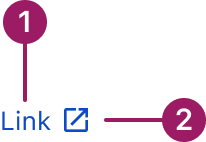
- Link Label
- External Link Icon (optional)
Usage Guidelines
Use When
- Navigating to another page, section, or resource.
- Linking to external websites or documentation.
- Providing inline navigation within text content.
- Highlighting actions that don’t require a button.
- Indicating supporting information without disrupting the main task.
Best Practices
- Use clear, descriptive link label avoid vague labels like "Click here."
- Use the external link variant for links that open outside the current site/app.
- Avoid overloading text with too many inline links, which can confuse users.
- Do not employ URLs as link text. Instead, use specific descriptions that inform users about the linked content.
- If a link is at the end of a sentence, the period should not be part of the link.
Variants
Always underlined
Link
no underline
Link
Dotted
Link
External
Link

Always Underlined
Always underlined is the default link style. These links are used on their own, within content, or directly following content, and they always include underlines.
No Underline
These links are used within the List View as well as for Navigation elements such as breadcrumbs, footer, and the "back to previous page" functionality. They DO NOT use underlines. They can have an icon.
Dotted
The dotted link triggers a popover when hovered over.
External
An external link is a link that takes users to a different website or web page.
Accessibility
This component uses MUI (Material-UI) components, which are open-source and licensed under the MIT License.
Crafted with ❤️ at Zuora
© 2026 Zuora Inc.
Link
A Link is a text-based component used to navigate users to other pages, sections, or external resources. It provides a clear, accessible way to connect related content, supporting seamless exploration within and beyond the product.
Overview
Code
Anatomy
- Link Label
- External Link Icon (optional)
Usage Guidelines
Use When
- Navigating to another page, section, or resource.
- Linking to external websites or documentation.
- Providing inline navigation within text content.
- Highlighting actions that don’t require a button.
- Indicating supporting information without disrupting the main task.
Best Practices
- Use clear, descriptive link label avoid vague labels like "Click here."
- Use the external link variant for links that open outside the current site/app.
- Avoid overloading text with too many inline links, which can confuse users.
- Do not employ URLs as link text. Instead, use specific descriptions that inform users about the linked content.
- If a link is at the end of a sentence, the period should not be part of the link.
Variants
Always underlined
Link
no underline
Link
Dotted
Link
External
Link
Variant
Characteristics
Always Underlined
Always underlined is the default link style. These links are used on their own, within content, or directly following content, and they always include underlines.
No Underline
These links are used within the List View as well as for Navigation elements such as breadcrumbs, footer, and the "back to previous page" functionality. They DO NOT use underlines. They can have an icon.
Dotted
The dotted link triggers a popover when hovered over.
External
An external link is a link that takes users to a different website or web page.
Accessibility
This component uses MUI (Material-UI) components, which are open-source and licensed under the MIT License.
Crafted with ❤️ at Zuora
© 2026 Zuora Inc.
On This Page
Link
A Link is a text-based component used to navigate users to other pages, sections, or external resources. It provides a clear, accessible way to connect related content, supporting seamless exploration within and beyond the product.
Overview
Code
Anatomy
- Link Label
- External Link Icon (optional)
Usage Guidelines
Use When
- Navigating to another page, section, or resource.
- Linking to external websites or documentation.
- Providing inline navigation within text content.
- Highlighting actions that don’t require a button.
- Indicating supporting information without disrupting the main task.
Best Practices
- Use clear, descriptive link label avoid vague labels like "Click here."
- Use the external link variant for links that open outside the current site/app.
- Avoid overloading text with too many inline links, which can confuse users.
- Do not employ URLs as link text. Instead, use specific descriptions that inform users about the linked content.
- If a link is at the end of a sentence, the period should not be part of the link.
Variants
Always underlined
Link
no underline
Link
Dotted
Link
External
Link
Variant
Characteristics
Always Underlined
Always underlined is the default link style. These links are used on their own, within content, or directly following content, and they always include underlines.
No Underline
These links are used within the List View as well as for Navigation elements such as breadcrumbs, footer, and the "back to previous page" functionality. They DO NOT use underlines. They can have an icon.
Dotted
The dotted link triggers a popover when hovered over.
External
An external link is a link that takes users to a different website or web page.
Accessibility
This component uses MUI (Material-UI) components, which are open-source and licensed under the MIT License.
Crafted with ❤️ at Zuora
© 2026 Zuora Inc.