List
List displays related items in a vertical, easy-to-scan layout. It’s often used for navigation, settings, and action menus, with support for text, icons, and secondary labels.
Overview
Code
Anatomy
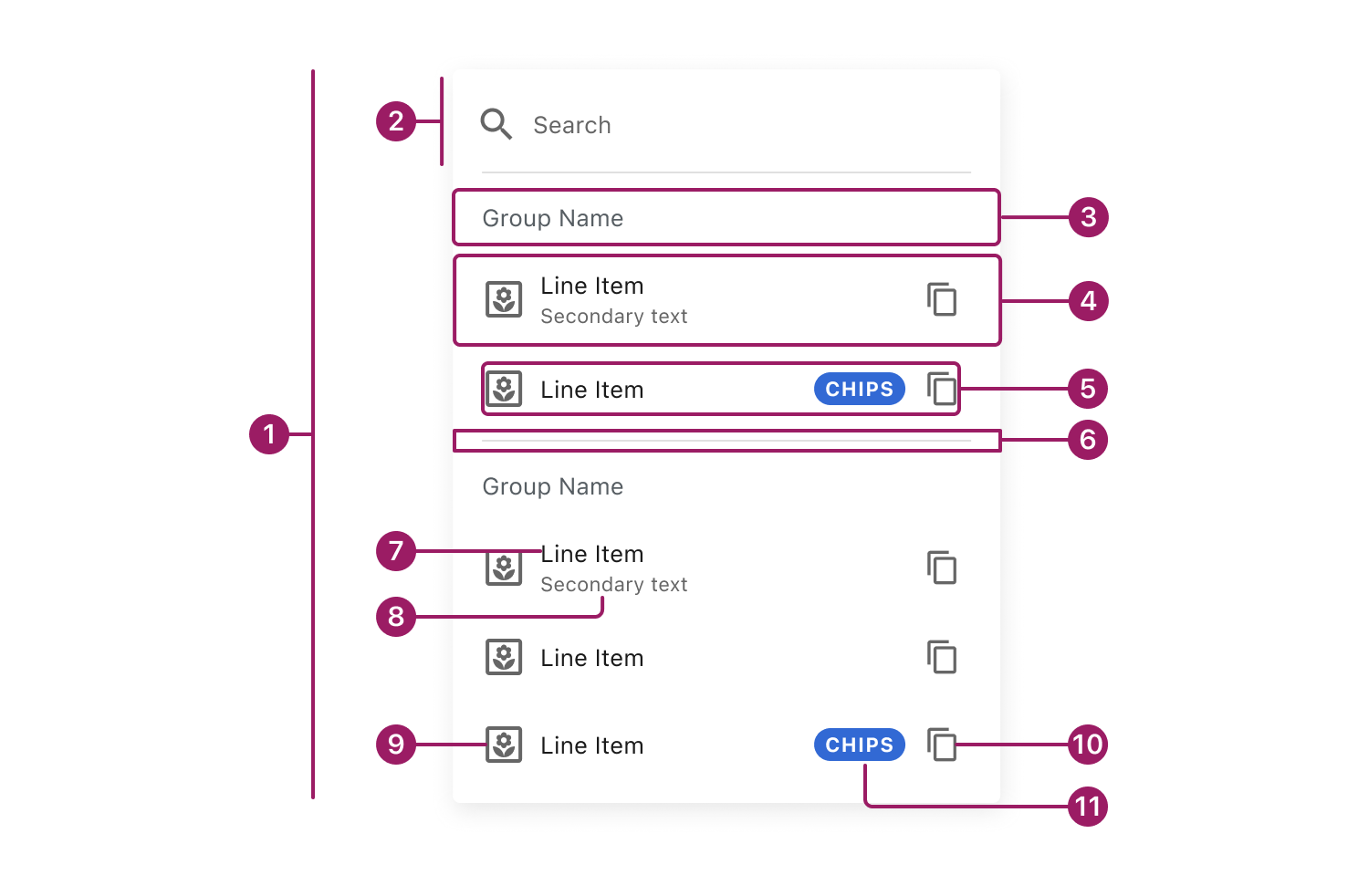
- List
- Search (optional)
- Group Header (optional)
- List Item
- Content
- Divider (optional)
- Title
- Secondary Text (optional)
- Icon (optional)
- Icon Button (optional)
- Chip (optional)
Usage Guidelines
Use When
- Users need to quickly scan and choose from related items in a clear vertical order.
- Present navigation options, such as menus, sidebars, or settings pages.
- Show actions or options where each item represents a single action or destination.
Best Practices
- Keep list items concise and scannable; prioritize the primary label.
- Use a consistent list item height within the same menu to maintain visual alignment and scanability.
- Group related items with group headers rather than visual styling alone.
- Use icons consistently and only when they add meaning or aid recognition.
- Limit the number of actions per list item to avoid cognitive overload.
- Use dividers selectively to separate distinct sections, not every item.
- Maintain consistent alignment and spacing across all list items.
Types

Hierarchical Lists support simple visual nesting and drill-down navigation. For complex data structures or advanced tree interactions, use TreeView.
Default List

List Item

List Item
List Item
List Item
List Item
Searchable List

Search
List Item
List Item
List Item
List Item
List with Switch Controls
Search
List Item

List Item

List Item
List Item
List Item
Selectable List
Search

Line Item
Line Item
Line Item

Line Item
Line Item
Grouped List
Search
Group Name
List Item
List Item
Group Name
List Item
List Item
Hierarchical List
Group Name

List Item
List Item
List Item
List Item
List Item
List Item
Accessibility
This component uses MUI (Material-UI) components, which are open-source and licensed under the MIT License.
Crafted with ❤️ at Zuora
© 2026 Zuora Inc.
List
List displays related items in a vertical, easy-to-scan layout. It’s often used for navigation, settings, and action menus, with support for text, icons, and secondary labels.
Overview
Code
Anatomy
- List
- Search (optional)
- Group Header (optional)
- List Item
- Content
- Divider (optional)
- Title
- Secondary Text (optional)
- Icon (optional)
- Icon Button (optional)
- Chip (optional)
Usage Guidelines
Use When
- Users need to quickly scan and choose from related items in a clear vertical order.
- Present navigation options, such as menus, sidebars, or settings pages.
- Show actions or options where each item represents a single action or destination.
Best Practices
- Keep list items concise and scannable; prioritize the primary label.
- Use a consistent list item height within the same menu to maintain visual alignment and scanability.
- Group related items with group headers rather than visual styling alone.
- Use icons consistently and only when they add meaning or aid recognition.
- Limit the number of actions per list item to avoid cognitive overload.
- Use dividers selectively to separate distinct sections, not every item.
- Maintain consistent alignment and spacing across all list items.
Types
Hierarchical Lists support simple visual nesting and drill-down navigation. For complex data structures or advanced tree interactions, use TreeView.
Default List
List Item
List Item
List Item
List Item
List Item
Searchable List
Search
List Item
List Item
List Item
List Item
List with Switch Controls
Search
List Item
List Item
List Item
List Item
List Item
Selectable List
Search
Line Item
Line Item
Line Item
Line Item
Line Item
Grouped List
Search
Group Name
List Item
List Item
Group Name
List Item
List Item
Hierarchical List
Group Name
List Item
List Item
List Item
List Item
List Item
List Item
Accessibility
This component uses MUI (Material-UI) components, which are open-source and licensed under the MIT License.
Crafted with ❤️ at Zuora
© 2026 Zuora Inc.
On This Page
List
List displays related items in a vertical, easy-to-scan layout. It’s often used for navigation, settings, and action menus, with support for text, icons, and secondary labels.
Overview
Code
Anatomy
- List
- Search (optional)
- Group Header (optional)
- List Item
- Content
- Divider (optional)
- Title
- Secondary Text (optional)
- Icon (optional)
- Icon Button (optional)
- Chip (optional)
Usage Guidelines
Use When
- Users need to quickly scan and choose from related items in a clear vertical order.
- Present navigation options, such as menus, sidebars, or settings pages.
- Show actions or options where each item represents a single action or destination.
Best Practices
- Keep list items concise and scannable; prioritize the primary label.
- Use a consistent list item height within the same menu to maintain visual alignment and scanability.
- Group related items with group headers rather than visual styling alone.
- Use icons consistently and only when they add meaning or aid recognition.
- Limit the number of actions per list item to avoid cognitive overload.
- Use dividers selectively to separate distinct sections, not every item.
- Maintain consistent alignment and spacing across all list items.
Types
Hierarchical Lists support simple visual nesting and drill-down navigation. For complex data structures or advanced tree interactions, use TreeView.
Default List
List Item
List Item
List Item
List Item
List Item
Searchable List
Search
List Item
List Item
List Item
List Item
List with Switch Controls
Search
List Item
List Item
List Item
List Item
List Item
Selectable List
Search
Line Item
Line Item
Line Item
Line Item
Line Item
Grouped List
Search
Group Name
List Item
List Item
Group Name
List Item
List Item
Hierarchical List
Group Name
List Item
List Item
List Item
List Item
List Item
List Item
Accessibility
This component uses MUI (Material-UI) components, which are open-source and licensed under the MIT License.
Crafted with ❤️ at Zuora
© 2026 Zuora Inc.