Modal
A modal is an overlay that interrupts the current workflow to present important information or request input, blocking interaction with the underlying content until dismissed or completed.
Overview
Code [coming soon]
Anatomy
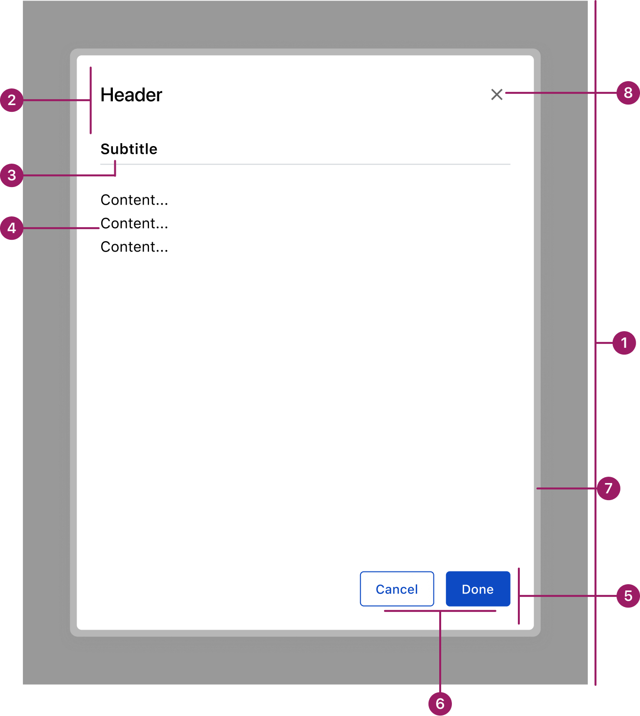
- Overlay
- Header
- Subtitle (optional)
- Content area
- Footer
- Action buttons
- Glass Effect
- Divider (optional)
Usage Guidelines
Use When
- Displaying critical or additional information that intentionally interrupts the current workflow.
- Performing quick, supplemental tasks related to the underlying page without losing context.
- Displaying critical or additional information that intentionally interrupts the current workflow.
- Performing quick, supplemental tasks related to the underlying page without losing context.
- Confirming, editing, or managing data tied to the underlying page.
- Requiring the user to take an action before returning to the main workflow.
Best Practices
- Always include an overlay to focus attention and reduce distractions.
- Keep content concise and focused on a single, clear purpose.
- Use descriptive titles and supporting text to explain the modal’s intent.
- Provide clear primary and secondary actions, with the primary action visually emphasized.
- Ensure modals can be closed using a visible control and the Esc key for accessibility.
Key Differences between Modal
vs. Drawer
Placement
Modal
Centered on screen
Drawer
Slides in from screen edge of the screen
Background
Modal
Fully obscures the underlying page with an overlay
Drawer
Keeps the underlying page partially visible
Primary Use Case
Modal
Short, focused tasks or important information that requires full attention
Drawer
Supplemental tasks, data entry, or property settings that benefit from maintaining context with the page
Frequency
Modal
Used sparingly to avoid interruption
Drawer
Can remain open for ongoing interactions, but may also collapse when interacting with the underlying page, depending on context
Placement
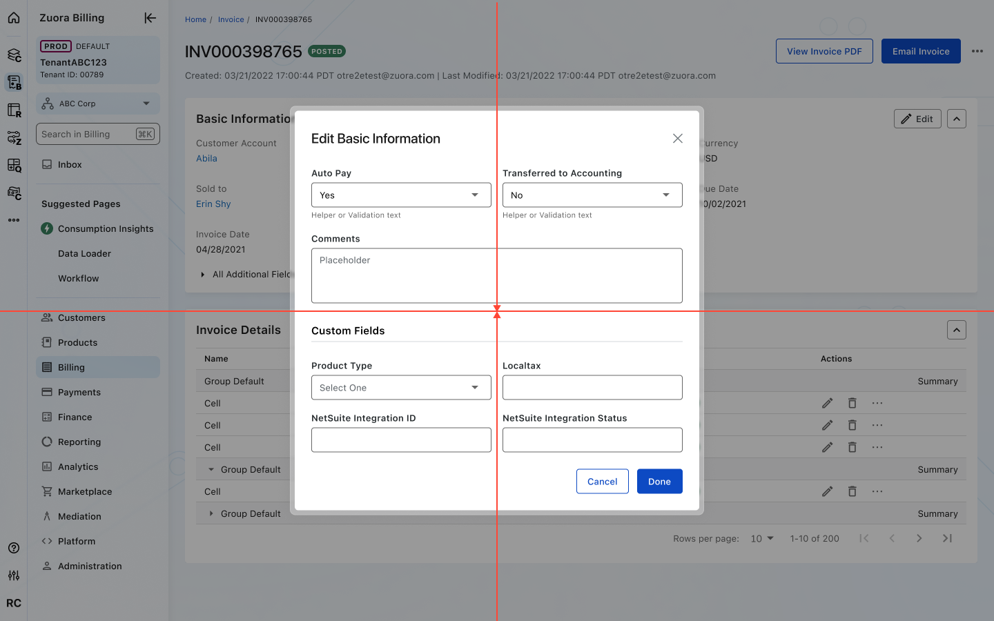
Modals are positioned at the center of the viewport for maximum visibility.
Accessibility
Crafted with ❤️ at Zuora
© 2026 Zuora Inc.
Modal
A modal is an overlay that interrupts the current workflow to present important information or request input, blocking interaction with the underlying content until dismissed or completed.
Overview
Code [coming soon]
Anatomy
- Overlay
- Header
- Subtitle (optional)
- Content area
- Footer
- Action buttons
- Glass Effect
- Divider (optional)
Usage Guidelines
Use When
- Displaying critical or additional information that intentionally interrupts the current workflow.
- Performing quick, supplemental tasks related to the underlying page without losing context.
- Displaying critical or additional information that intentionally interrupts the current workflow.
- Performing quick, supplemental tasks related to the underlying page without losing context.
- Confirming, editing, or managing data tied to the underlying page.
- Requiring the user to take an action before returning to the main workflow.
- Displaying critical or additional information that intentionally interrupts the current workflow.
- Performing quick, supplemental tasks related to the underlying page without losing context.
- Confirming, editing, or managing data tied to the underlying page.
- Requiring the user to take an action before returning to the main workflow.
Best Practices
- Always include an overlay to focus attention and reduce distractions.
- Keep content concise and focused on a single, clear purpose.
- Use descriptive titles and supporting text to explain the modal’s intent.
- Provide clear primary and secondary actions, with the primary action visually emphasized.
- Ensure modals can be closed using a visible control and the Esc key for accessibility.
Key Differences between Modal vs. Drawer
Aspect
Modal
Drawer
Placement
Centered on screen
Slides in from screen edge of the screen
Background
Fully obscures the underlying page with an overlay
Keeps the underlying page partially visible
Primary Use Case
Short, focused tasks or important information that requires full attention
Supplemental tasks, data entry, or property settings that benefit from maintaining context with the page
Frequency
Used sparingly to avoid interruption
Can remain open for ongoing interactions, but may also collapse when interacting with the underlying page, depending on context
Placement
Modals are positioned at the center of the viewport for maximum visibility.
Accessibility
Crafted with ❤️ at Zuora
© 2026 Zuora Inc.
On This Page
Modal
A modal is an overlay that interrupts the current workflow to present important information or request input, blocking interaction with the underlying content until dismissed or completed.
Overview
Code [coming soon]
Anatomy
- Overlay
- Header
- Subtitle (optional)
- Content area
- Footer
- Action buttons
- Glass Effect
- Divider (optional)
Usage Guidelines
Use When
- Displaying critical or additional information that intentionally interrupts the current workflow.
- Performing quick, supplemental tasks related to the underlying page without losing context.
- Confirming, editing, or managing data tied to the underlying page.
- Requiring the user to take an action before returning to the main workflow.
Best Practices
- Always include an overlay to focus attention and reduce distractions.
- Keep content concise and focused on a single, clear purpose.
- Use descriptive titles and supporting text to explain the modal’s intent.
- Provide clear primary and secondary actions, with the primary action visually emphasized.
- Ensure modals can be closed using a visible control and the Esc key for accessibility.
- Avoid making modals full screen — they should feel lightweight, not like a new page.
- Reserve modals for important or disruptive actions; avoid overuse.
Key Differences between Modal vs. Drawer
Aspect
Modal
Drawer
Placement
Centered on screen
Slides in from screen edge of the screen
Background
Fully obscures the underlying page with an overlay
Keeps the underlying page partially visible
Primary Use Case
Short, focused tasks or important information that requires full attention
Supplemental tasks, data entry, or property settings that benefit from maintaining context with the page
Frequency
Used sparingly to avoid interruption
Can remain open for ongoing interactions, but may also collapse when interacting with the underlying page, depending on context
Placement
Modals are positioned at the center of the viewport for maximum visibility.
Accessibility
Crafted with ❤️ at Zuora
© 2026 Zuora Inc.