Popover
A Popover is a floating container that appears near a trigger element to display related information, actions, or options without disrupting the main interface.
Overview
Code
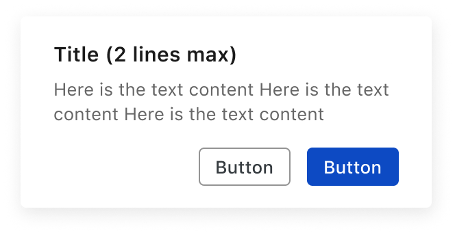
Anatomy
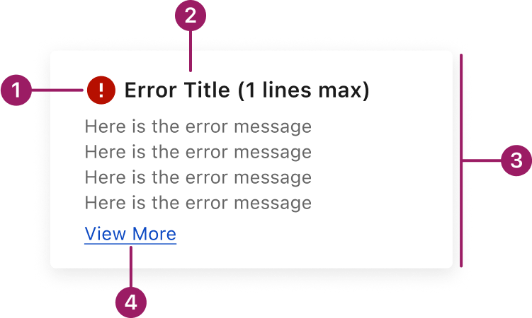
- Status icon
- Popover title
- Close icon (optional)
- Content area
- Actions (optional)
Usage Guidelines
Use When
- Presenting additional details or actions in a lightweight format.
- Displaying contextual content related to a specific UI element without navigating away.
Best Practices
- Use popovers for short, focused content.
- Only display content that is directly related to the trigger element.
- Avoid scrollable content or large layouts—modals are better suited for that.
- Make sure the popover doesn’t obscure important content or controls.
- Avoid using too many popovers on one screen, which can overwhelm users and complicate navigation.
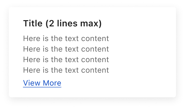
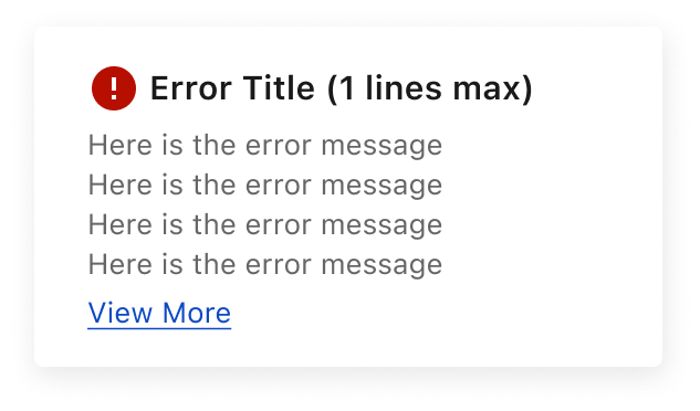
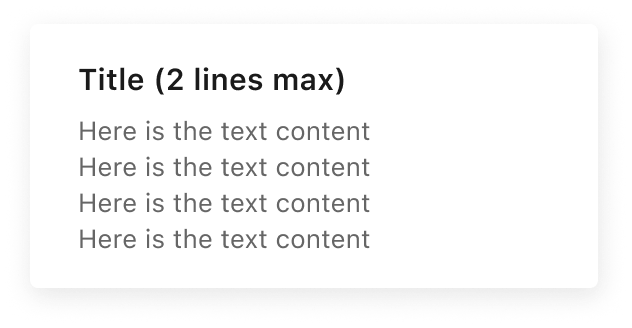
Variants
Default
Error Popover
Text-Based
With Buttons
Placement
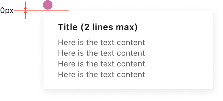
There’s no spacing (0px) between the trigger and the popover.
Position
Example of bottom RIGHT POSITION
Title
Here is the text content

Popovers can be positioned relative to their trigger element. The alignment defines which part of the trigger (top, center, bottom, left, right) connects with which part of the popover, ensuring the content appears in the intended position.
This component uses MUI (Material-UI) components, which are open-source and licensed under the MIT License.
Crafted with ❤️ at Zuora
© 2026 Zuora Inc.
Popover
A Popover is a floating container that appears near a trigger element to display related information, actions, or options without disrupting the main interface.
Overview
Code
Anatomy
- Status icon
- Popover title
- Close icon (optional)
- Content area
- Actions (optional)
Usage Guidelines
Use When
- Presenting additional details or actions in a lightweight format.
- Displaying contextual content related to a specific UI element without navigating away.
Best Practices
- Use popovers for short, focused content.
- Only display content that is directly related to the trigger element.
- Avoid scrollable content or large layouts—modals are better suited for that.
- Make sure the popover doesn’t obscure important content or controls.
- Avoid using too many popovers on one screen, which can overwhelm users and complicate navigation.
Variants
Default
Error Popover
Text-Based
With Buttons
Placement
There’s no spacing (0px) between the trigger and the popover.
Position
Example of bottom RIGHT POSITION
Title
Here is the text content
Popovers can be positioned relative to their trigger element. The alignment defines which part of the trigger (top, center, bottom, left, right) connects with which part of the popover, ensuring the content appears in the intended position.
This component uses MUI (Material-UI) components, which are open-source and licensed under the MIT License.
Crafted with ❤️ at Zuora
© 2026 Zuora Inc.
On This Page
Popover
A Popover is a floating container that appears near a trigger element to display related information, actions, or options without disrupting the main interface.
Overview
Code
Anatomy
- Status icon
- Popover title
- Close icon (optional)
- Content area
- Actions (optional)
Usage Guidelines
Use When
- Presenting additional details or actions in a lightweight format.
- Displaying contextual content related to a specific UI element without navigating away.
Best Practices
- Use popovers for short, focused content.
- Only display content that is directly related to the trigger element.
- Avoid scrollable content or large layouts—modals are better suited for that.
- Make sure the popover doesn’t obscure important content or controls.
- Avoid using too many popovers on one screen, which can overwhelm users and complicate navigation.
Variants
Default
Error Popover
Text-Based
With Buttons
Placement
There’s no spacing (0px) between the trigger and the popover.
Position
Example of bottom RIGHT POSITION
Title
Here is the text content
Popovers can be positioned relative to their trigger element. The alignment defines which part of the trigger (top, center, bottom, left, right) connects with which part of the popover, ensuring the content appears in the intended position.
This component uses MUI (Material-UI) components, which are open-source and licensed under the MIT License.
Crafted with ❤️ at Zuora
© 2026 Zuora Inc.