Progress
A progress indicator communicates the status of ongoing operations by displaying the length or state of a process through motion or fill.
Overview
Code
Anatomy
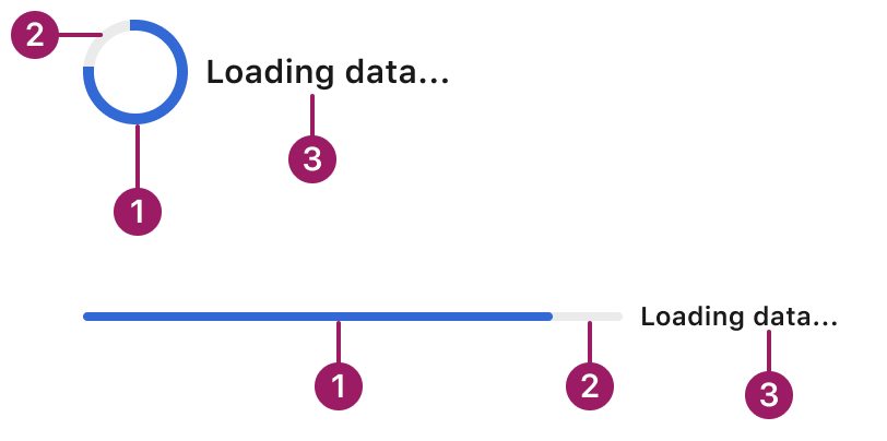
- Active indicator
- Track
- Label (optional)
Usage Guidelines
Use When
- Indicating that content or data is loading or being processed.
- Showing the completion status of tasks like file uploads, form submissions, or page transitions.
- Providing feedback for operations that take more than a few hundred milliseconds.
- Reassuring users that a background task is actively running.
- Use circular indicators for tasks where the duration is unknown or indefinite (e.g. loading state, background sync).
- Use linear indicators when progress can be measured (e.g. file upload, form completion).
Best Practices
- Use linear progress for full-width, inline, or page-level actions; use circular progress for compact or inline loading states.
- Place the indicator close to the element or area it relates to (e.g., near a button or inside a card).
- Avoid using both circular and linear indicators at the same time for the same task.
- Provide contextual messaging (e.g., “Saving…” or “Uploading…”) to improve clarity when progress isn’t self-evident.
- Avoid animation loops for long processes—users may think it’s stuck. Use determinate progress if possible.
Sizes
extra small

small

medium

large

Variants
circular
Loading data...
linear

Loading data...
This component uses MUI (Material-UI) components, which are open-source and licensed under the MIT License.
Crafted with ❤️ at Zuora
© 2026 Zuora Inc.
Progress
A progress indicator communicates the status of ongoing operations by displaying the length or state of a process through motion or fill.
Overview
Code
Anatomy
- Active indicator
- Track
- Label (optional)
Usage Guidelines
Use When
- Indicating that content or data is loading or being processed.
- Showing the completion status of tasks like file uploads, form submissions, or page transitions.
- Providing feedback for operations that take more than a few hundred milliseconds.
- Reassuring users that a background task is actively running.
- Use circular indicators for tasks where the duration is unknown or indefinite (e.g. loading state, background sync).
- Use linear indicators when progress can be measured (e.g. file upload, form completion).
Best Practices
- Use linear progress for full-width, inline, or page-level actions; use circular progress for compact or inline loading states.
- Place the indicator close to the element or area it relates to (e.g., near a button or inside a card).
- Avoid using both circular and linear indicators at the same time for the same task.
- Provide contextual messaging (e.g., “Saving…” or “Uploading…”) to improve clarity when progress isn’t self-evident.
- Avoid animation loops for long processes—users may think it’s stuck. Use determinate progress if possible.
Sizes
extra small
small
medium
large
Variants
circular
Loading data...
linear
Loading data...
This component uses MUI (Material-UI) components, which are open-source and licensed under the MIT License.
Crafted with ❤️ at Zuora
© 2026 Zuora Inc.
On This Page
Progress
A progress indicator communicates the status of ongoing operations by displaying the length or state of a process through motion or fill.
Overview
Code
Anatomy
- Active indicator
- Track
- Label (optional)
Usage Guidelines
Use When
- Indicating that content or data is loading or being processed.
- Showing the completion status of tasks like file uploads, form submissions, or page transitions.
- Providing feedback for operations that take more than a few hundred milliseconds.
- Reassuring users that a background task is actively running.
- Use circular indicators for tasks where the duration is unknown or indefinite (e.g. loading state, background sync).
- Use linear indicators when progress can be measured (e.g. file upload, form completion).
Best Practices
- Use linear progress for full-width, inline, or page-level actions; use circular progress for compact or inline loading states.
- Place the indicator close to the element or area it relates to (e.g., near a button or inside a card).
- Avoid using both circular and linear indicators at the same time for the same task.
- Provide contextual messaging (e.g., “Saving…” or “Uploading…”) to improve clarity when progress isn’t self-evident.
- Avoid animation loops for long processes—users may think it’s stuck. Use determinate progress if possible.
Sizes
extra small
small
medium
large
Variants
circular
Loading data...
linear

Loading data...
This component uses MUI (Material-UI) components, which are open-source and licensed under the MIT License.
Crafted with ❤️ at Zuora
© 2026 Zuora Inc.