Radio Group
Radio group allow users to select one option from a set. Radio selection is best used for items that are equal or less than 6 items. User can choose one item at a time.
Overview
Code
Anatomy
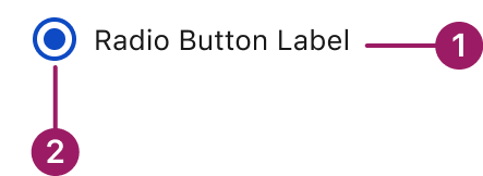
Radio Button Component
- Radio Button label
- Radio Button input
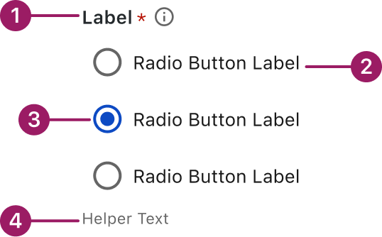
Radio Button Group
- Group label
- Radio Button label
- Radio Button input
- Helper text
Usage Guidelines

Use a consistent size for input and selection components within the same form or layout to ensure alignment. Medium is the default, but small is fine if applied uniformly.
Use When
- Selecting only one option from a list of two or more.
- Reducing interaction cost by displaying all choices upfront.
Best Practices
- Use clear, concise labels for each option.
- Stick to a manageable number (ideally 2–5). Too many options overwhelm users and reduce clarity.
- Always provide a default selection if one option is recommended or if it prevents a null state.
- Do not use radio buttons for toggling a single option – use a checkbox instead.
Sizes
Medium (36px)

Small (32px)

Variants
checked
unchecked

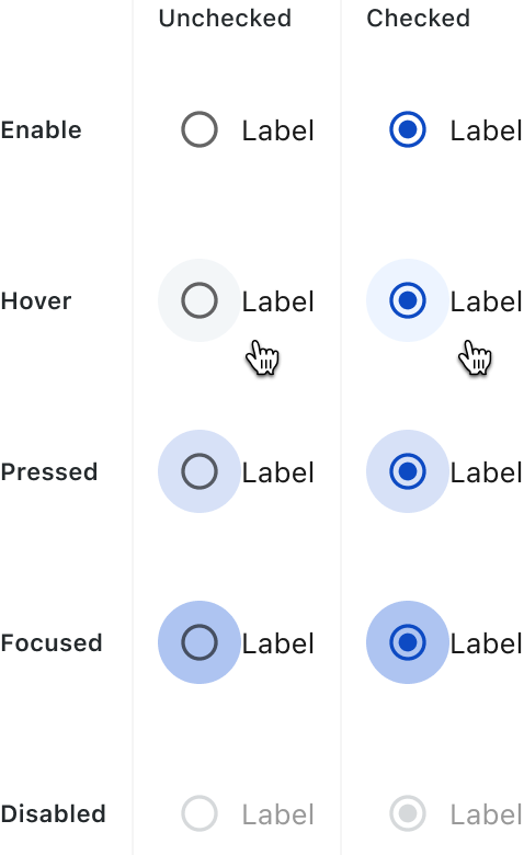
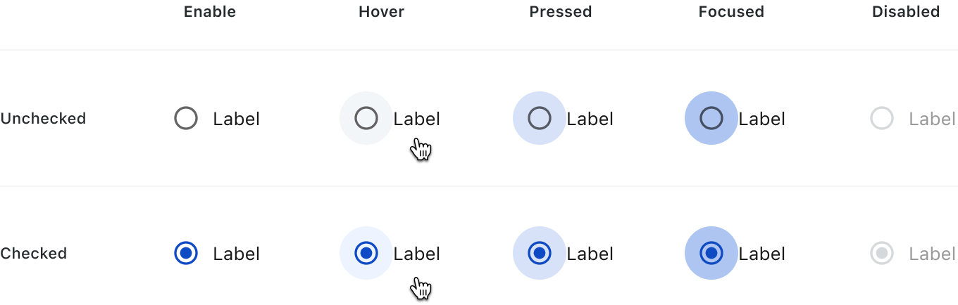
States
Radio buttons have the following states: Enabled, Hover, Pressed, Focused, and Disabled.
Accessibility
This component uses MUI (Material-UI) components, which are open-source and licensed under the MIT License.
Crafted with ❤️ at Zuora
© 2026 Zuora Inc.
Radio Group
Radio group allow users to select one option from a set. Radio selection is best used for items that are equal or less than 6 items. User can choose one item at a time.
Overview
Code
Anatomy
Radio Button Component
- Radio Button label
- Radio Button input
Radio Button Group
- Group label
- Radio Button label
- Radio Button input
- Helper text
Usage Guidelines
Use a consistent size for input and selection components within the same form or layout to ensure alignment. Medium is the default, but small is fine if applied uniformly.
Use When
- Selecting only one option from a list of two or more.
- Reducing interaction cost by displaying all choices upfront.
Best Practices
- Use clear, concise labels for each option.
- Stick to a manageable number (ideally 2–5). Too many options overwhelm users and reduce clarity.
- Always provide a default selection if one option is recommended or if it prevents a null state.
- Do not use radio buttons for toggling a single option – use a checkbox instead.
Sizes
Medium (36px)
Small (32px)
Variants
checked
unchecked
States
Radio buttons have the following states: Enabled, Hover, Pressed, Focused, and Disabled.
Accessibility
This component uses MUI (Material-UI) components, which are open-source and licensed under the MIT License.
Crafted with ❤️ at Zuora
© 2026 Zuora Inc.
On This Page
Radio Group
Radio group allow users to select one option from a set. Radio selection is best used for items that are equal or less than 6 items. User can choose one item at a time.
Overview
Code
Anatomy
Radio Button Component
- Radio Button label
- Radio Button input
Radio Button Group
- Group label
- Radio Button label
- Radio Button input
- Helper text
Usage Guidelines
Use a consistent size for input and selection components within the same form or layout to ensure alignment. Medium is the default, but small is fine if applied uniformly.
Use When
- Selecting only one option from a list of two or more.
- Reducing interaction cost by displaying all choices upfront.
Best Practices
- Use clear, concise labels for each option.
- Stick to a manageable number (ideally 2–5). Too many options overwhelm users and reduce clarity.
- Always provide a default selection if one option is recommended or if it prevents a null state.
- Do not use radio buttons for toggling a single option – use a checkbox instead.
Sizes
Medium (36px)
Small (32px)
Variants
checked
unchecked
States
Radio buttons have the following states: Enabled, Hover, Pressed, Focused, and Disabled.
Accessibility
This component uses MUI (Material-UI) components, which are open-source and licensed under the MIT License.
Crafted with ❤️ at Zuora
© 2026 Zuora Inc.