Select
Select lets users choose from a list of predefined options
Overview
Code
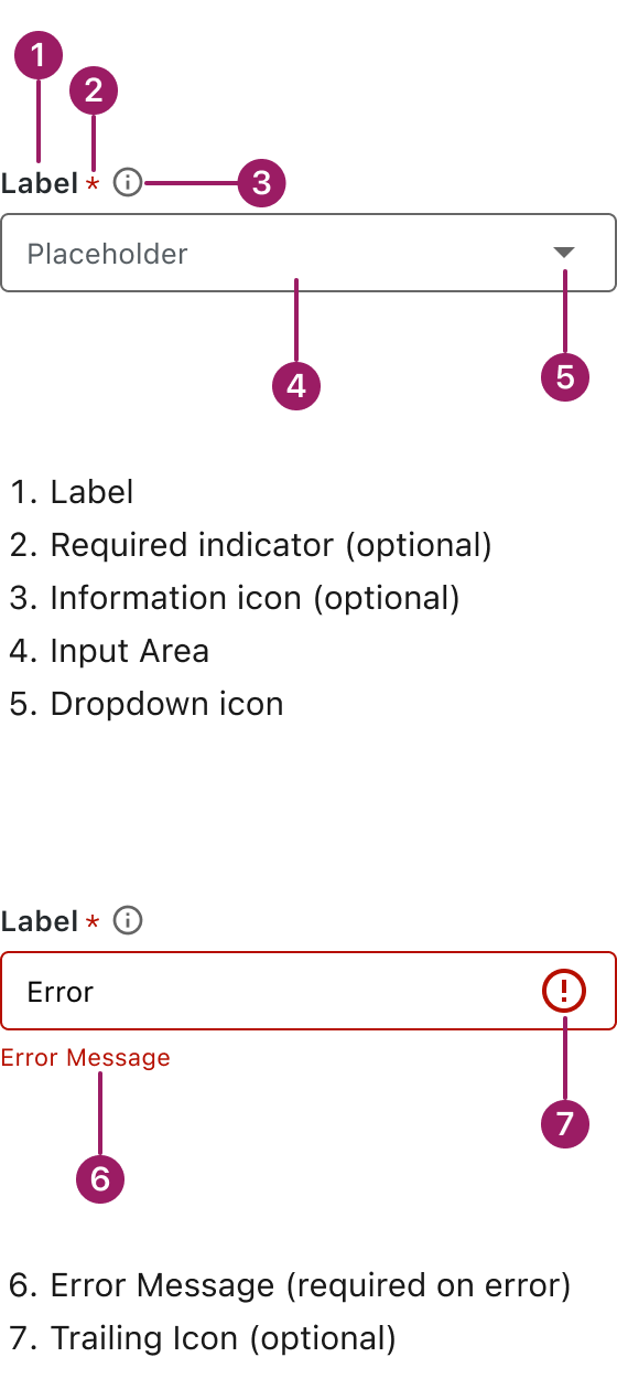
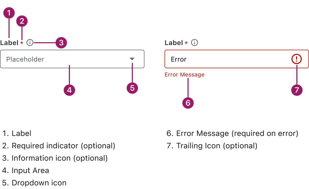
Anatomy
Usage Guidelines

Use a consistent size for input and selection components within the same form or layout to ensure alignment. Medium is the default, but small is fine if applied uniformly.
Use When
- Offering users a list of predefined options.
- Keeping forms clean and compact.
- Supporting single- or multi-select interactions.
- Presenting choices that don’t need much explanation.
- Reducing input errors compared to free-form text fields.
Best Practices
- Use clear, descriptive labels that explain the purpose of the field.
- Include a helpful placeholder to guide users before selection.
- Limit the number of options to avoid overwhelming users (ideally < 10).
- Group or sort options logically for easier scanning.
- Avoid using a select if there are only 2 options. Use radio buttons or a toggle instead.
- Use an information icon or helper text if extra context is needed.
- Go to the first menu option starting with the typed letter for quicker navigation.
Sizes
Medium (36px)
Label


Placeholder

small (32px)
Label
Placeholder
This component uses MUI (Material-UI) components, which are open-source and licensed under the MIT License.
Crafted with ❤️ at Zuora
© 2026 Zuora Inc.
Select
Select lets users choose from a list of predefined options
Overview
Code
Anatomy
Usage Guidelines
Use a consistent size for input and selection components within the same form or layout to ensure alignment. Medium is the default, but small is fine if applied uniformly.
Use When
- Offering users a list of predefined options.
- Keeping forms clean and compact.
- Supporting single- or multi-select interactions.
- Presenting choices that don’t need much explanation.
- Reducing input errors compared to free-form text fields.
Best Practices
- Use clear, descriptive labels that explain the purpose of the field.
- Include a helpful placeholder to guide users before selection.
- Limit the number of options to avoid overwhelming users (ideally < 10).
- Group or sort options logically for easier scanning.
- Avoid using a select if there are only 2 options. Use radio buttons or a toggle instead.
- Use an information icon or helper text if extra context is needed.
- Go to the first menu option starting with the typed letter for quicker navigation.
Sizes
Medium (36px)
Label
Placeholder
small (32px)
Label
Placeholder
This component uses MUI (Material-UI) components, which are open-source and licensed under the MIT License.
Crafted with ❤️ at Zuora
© 2026 Zuora Inc.
On This Page
Select
Select lets users choose from a list of predefined options
Overview
Code
Anatomy
Usage Guidelines
Use a consistent size for input and selection components within the same form or layout to ensure alignment. Medium is the default, but small is fine if applied uniformly.
Use When
- Offering users a list of predefined options.
- Keeping forms clean and compact.
- Supporting single- or multi-select interactions.
- Presenting choices that don’t need much explanation.
- Reducing input errors compared to free-form text fields.
Best Practices
- Use clear, descriptive labels that explain the purpose of the field.
- Include a helpful placeholder to guide users before selection.
- Limit the number of options to avoid overwhelming users (ideally < 10).
- Group or sort options logically for easier scanning.
- Avoid using a select if there are only 2 options. Use radio buttons or a toggle instead.
- Use an information icon or helper text if extra context is needed.
Sizes
Medium (36px)
Label
Placeholder
small (32px)
Label
Placeholder
This component uses MUI (Material-UI) components, which are open-source and licensed under the MIT License.
Crafted with ❤️ at Zuora
© 2026 Zuora Inc.