Skeleton
Skeletons are placeholder elements that mimic the shape and size of content, providing a visual cue that data is loading and helping maintain layout stability.
Overview
Code
Anatomy
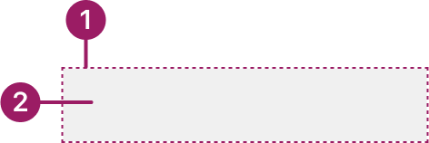
- Container: Defines the shape where the skeleton appears.
- Animation: Shimmer effect to signal loading or fetching activity.
Usage Guidelines
Use When
- Fetching and displaying content asynchronously.
- Showing a skeleton when content takes noticeable time to load helps users feel the system is responsive.
- Using skeletons when the final layout of the content is predictable.
Best Practices
- Matching skeleton shapes and sizes to the expected content (e.g., text lines for paragraphs, rectangles for cards).
- Using animation to show active loading; avoid static skeletons that feel broken.
- Keeping skeletons simple—avoid filling the screen with too many placeholders.
- Transitioning smoothly from skeleton to real content to prevent jarring changes.
- Limiting skeleton visibility to about 5 seconds and providing a fallback if loading takes longer or fails.
- Go to the first menu option starting with the typed letter for quicker navigation.
Accessibility
- Hiding skeletons from screen readers using aria-hidden="true".
- Providing accessible loading feedback separately (e.g., with aria-busy="true" on the container).
- Ensuring transitions from skeleton to real content are clear and not confusing.
- Avoiding infinite skeleton states—always provide a resolution or fallback for loading errors.
- Go to the first menu option starting with the typed letter for quicker navigation.
This component uses MUI (Material-UI) components, which are open-source and licensed under the MIT License.
Crafted with ❤️ at Zuora
© 2026 Zuora Inc.
Skeleton
Skeletons are placeholder elements that mimic the shape and size of content, providing a visual cue that data is loading and helping maintain layout stability.
Overview
Code
Anatomy
- Container: Defines the shape where the skeleton appears.
- Animation: Shimmer effect to signal loading or fetching activity.
Usage Guidelines
Use When
- Fetching and displaying content asynchronously.
- Showing a skeleton when content takes noticeable time to load helps users feel the system is responsive.
- Using skeletons when the final layout of the content is predictable.
Best Practices
- Matching skeleton shapes and sizes to the expected content (e.g., text lines for paragraphs, rectangles for cards).
- Using animation to show active loading; avoid static skeletons that feel broken.
- Keeping skeletons simple—avoid filling the screen with too many placeholders.
- Transitioning smoothly from skeleton to real content to prevent jarring changes.
- Limiting skeleton visibility to about 5 seconds and providing a fallback if loading takes longer or fails.
- Go to the first menu option starting with the typed letter for quicker navigation.
Accessibility
- Hiding skeletons from screen readers using aria-hidden="true".
- Providing accessible loading feedback separately (e.g., with aria-busy="true" on the container).
- Ensuring transitions from skeleton to real content are clear and not confusing.
- Avoiding infinite skeleton states—always provide a resolution or fallback for loading errors.
- Go to the first menu option starting with the typed letter for quicker navigation.
This component uses MUI (Material-UI) components, which are open-source and licensed under the MIT License.
Crafted with ❤️ at Zuora
© 2026 Zuora Inc.
On This Page
Skeleton
Skeletons are placeholder elements that mimic the shape and size of content, providing a visual cue that data is loading and helping maintain layout stability.
Overview
Code
Anatomy
- Container: Defines the shape where the skeleton appears.
- Animation: Shimmer effect to signal loading or fetching activity.
Usage Guidelines
Use When
- Fetching and displaying content asynchronously.
- Showing a skeleton when content takes noticeable time to load helps users feel the system is responsive.
- Using skeletons when the final layout of the content is predictable.
Best Practices
- Matching skeleton shapes and sizes to the expected content (e.g., text lines for paragraphs, rectangles for cards).
- Using animation to show active loading; avoid static skeletons that feel broken.
- Keeping skeletons simple—avoid filling the screen with too many placeholders.
- Transitioning smoothly from skeleton to real content to prevent jarring changes.
- Limiting skeleton visibility to about 5 seconds and providing a fallback if loading takes longer or fails.
Accessibility
- Hiding skeletons from screen readers using aria-hidden="true".
- Providing accessible loading feedback separately (e.g., with aria-busy="true" on the container).
- Ensuring transitions from skeleton to real content are clear and not confusing.
- Avoiding infinite skeleton states—always provide a resolution or fallback for loading errors.
This component uses MUI (Material-UI) components, which are open-source and licensed under the MIT License.
Crafted with ❤️ at Zuora
© 2026 Zuora Inc.