Snackbar
Snackbars are temporary, non-intrusive notifications that provide feedback after user actions.
Overview
Code
Anatomy
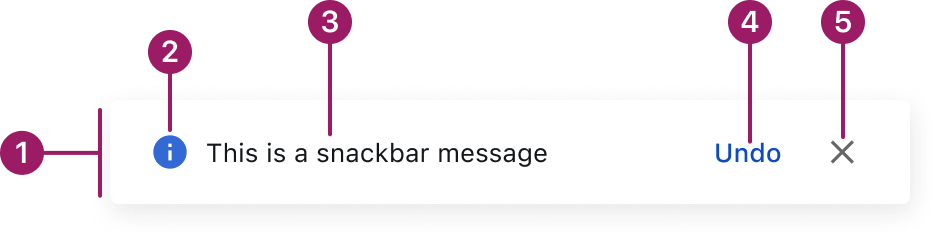
- Container
- Icon
- Message text
- Action button (optional)
- Close button (optional)
Usage Guidelines
Use When
- Confirming a successful action, such as saving or submitting a form.
- Communicating non-blocking system updates or background activity.
- Alerting users to transient issues that don’t require immediate attention.
- Displaying lightweight notifications without interrupting the current task.
- Providing brief guidance or contextual feedback following user input.
Best Practices
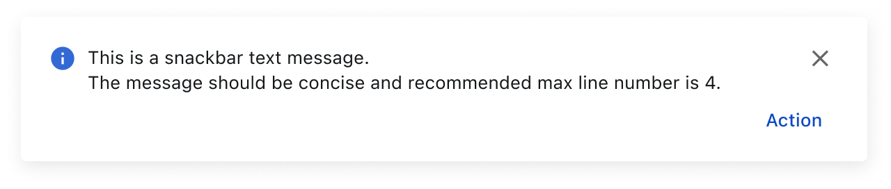
- Keep messages short and focused — ideally one line of text.
- Use clear, direct language that reflects the message type (e.g., success, warning, error).
- Set the default auto-dismiss duration to 4 seconds and allow custom durations; always provide a manual or system-defined way to close the snackbar.
- Stack multiple snackbars vertically with 16px spacing, displaying the newest message on top.
- Limit to one visible snackbar when possible to reduce distraction. Use an action button to direct users to a page instead of flooding the UI with repeated messages.
- Use snackbar notifications for non-blocking feedback, not for persistent or critical alerts.
Variants
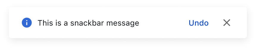
basic
multi-line
Types
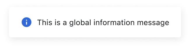
INFORMATION
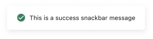
success
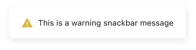
warning
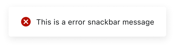
error
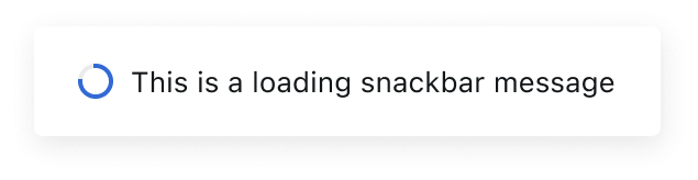
loading
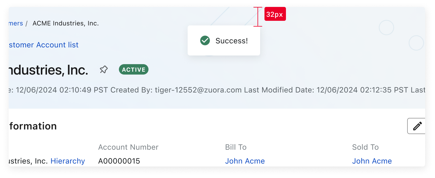
Placement
Snackbars are center-aligned at the top of the screen, positioned 32px from the top edge. This spacing acts as a visual buffer between the snackbar and the viewport edge.
This component uses MUI (Material-UI) components, which are open-source and licensed under the MIT License.
Crafted with ❤️ at Zuora
© 2026 Zuora Inc.
Snackbar
Snackbars are temporary, non-intrusive notifications that provide feedback after user actions.
Overview
Code
Anatomy
- Container
- Icon
- Message text
- Action button (optional)
- Close button (optional)
Usage Guidelines
Use When
- Confirming a successful action, such as saving or submitting a form.
- Communicating non-blocking system updates or background activity.
- Alerting users to transient issues that don’t require immediate attention.
- Displaying lightweight notifications without interrupting the current task.
- Providing brief guidance or contextual feedback following user input.
Best Practices
- Keep messages short and focused — ideally one line of text.
- Use clear, direct language that reflects the message type (e.g., success, warning, error).
- Set the default auto-dismiss duration to 4 seconds and allow custom durations; always provide a manual or system-defined way to close the snackbar.
- Stack multiple snackbars vertically with 16px spacing, displaying the newest message on top.
- Limit to one visible snackbar when possible to reduce distraction. Use an action button to direct users to a page instead of flooding the UI with repeated messages.
- Use snackbar notifications for non-blocking feedback, not for persistent or critical alerts.
Variants
basic
multi-line
Types
INFORMATION
success
warning
error
loading
Placement
Snackbars are center-aligned at the top of the screen, positioned 32px from the top edge. This spacing acts as a visual buffer between the snackbar and the viewport edge.
This component uses MUI (Material-UI) components, which are open-source and licensed under the MIT License.
Crafted with ❤️ at Zuora
© 2026 Zuora Inc.
On This Page
Snackbar
Snackbars are temporary, non-intrusive notifications that provide feedback after user actions.
Overview
Code
Anatomy
- Container
- Icon
- Message text
- Action button (optional)
- Close button (optional)
Usage Guidelines
Use When
- Confirming a successful action, such as saving or submitting a form.
- Communicating non-blocking system updates or background activity.
- Alerting users to transient issues that don’t require immediate attention.
- Displaying lightweight notifications without interrupting the current task.
- Providing brief guidance or contextual feedback following user input.
Best Practices
- Keep messages short and focused — ideally one line of text.
- Use clear, direct language that reflects the message type (e.g., success, warning, error).
- Set the default auto-dismiss duration to 4 seconds and allow custom durations; always provide a manual or system-defined way to close the snackbar.
- Stack multiple snackbars vertically with 16px spacing, displaying the newest message on top.
- Limit to one visible snackbar when possible to reduce distraction. Use an action button to direct users to a page instead of flooding the UI with repeated messages.
- Use snackbar notifications for non-blocking feedback, not for persistent or critical alerts.
Variants
basic
multi-line
Types
INFORMATION
success
warning
error
loading
Placement
Snackbars are center-aligned at the top of the screen, positioned 32px from the top edge. This spacing acts as a visual buffer between the snackbar and the viewport edge.
This component uses MUI (Material-UI) components, which are open-source and licensed under the MIT License.
Crafted with ❤️ at Zuora
© 2026 Zuora Inc.