Stepper
Stepper displays progress through a sequence of logical steps.The stepper is non-linear, which means steps may be completed in any order.
Overview
Code
Anatomy
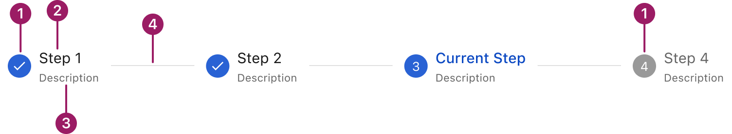
- Step indicator icon
- Step label
- Step description (optional)
- Connector line
Usage Guidelines
Use When
- Breaking down complex workflows into manageable steps.
- Guiding users through multi-step forms, wizards, or setups.
- Showing progress and helping users understand their place in a process.
- Enforcing a task sequence (linear) or allowing flexible navigation (non-linear).
- Reducing cognitive load by displaying only relevant information at each step.
Best Practices
- Use clear, descriptive titles and optional descriptions for each step.
- Choose the layout (horizontal or vertical) based on available space and content complexity.
- Use linear steppers for processes with required, sequential steps.
- Use non-linear steppers when users need flexibility to move between steps freely.
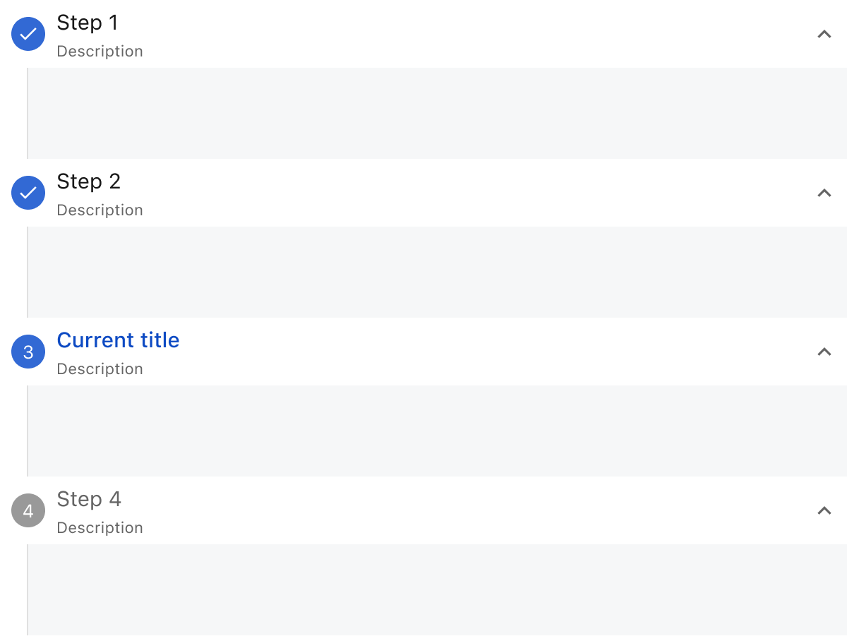
Types
To suit different contexts, the Stepper supports two layout types: horizontal and vertical. It can be linear, requiring users to complete steps in order, or non-linear, allowing users to navigate freely between steps.
Horizontal stepper

Vertical stepper
Error Step

Label Alignment
The Stepper supports two types of label alignment: Left and Center. By default, the Stepper is left-aligned. Use the center-aligned option when there are many steps and space is limited to ensure better readability and layout balance.
Horizontal stepper
Vertical stepper

This component uses MUI (Material-UI) components, which are open-source and licensed under the MIT License.
Crafted with ❤️ at Zuora
© 2026 Zuora Inc.
Stepper
Stepper displays progress through a sequence of logical steps.The stepper is non-linear, which means steps may be completed in any order.
Overview
Code
Anatomy
- Step indicator icon
- Step label
- Step description (optional)
- Connector line
Usage Guidelines
Use When
- Breaking down complex workflows into manageable steps.
- Guiding users through multi-step forms, wizards, or setups.
- Showing progress and helping users understand their place in a process.
- Enforcing a task sequence (linear) or allowing flexible navigation (non-linear).
- Reducing cognitive load by displaying only relevant information at each step.
Best Practices
- Use clear, descriptive titles and optional descriptions for each step.
- Choose the layout (horizontal or vertical) based on available space and content complexity.
- Use linear steppers for processes with required, sequential steps.
- Use non-linear steppers when users need flexibility to move between steps freely.
Types
To suit different contexts, the Stepper supports two layout types: horizontal and vertical. It can be linear, requiring users to complete steps in order, or non-linear, allowing users to navigate freely between steps.
Horizontal stepper
Vertical stepper
Error Step
Label Alignment
The Stepper supports two types of label alignment: Left and Center. By default, the Stepper is left-aligned. Use the center-aligned option when there are many steps and space is limited to ensure better readability and layout balance.
Horizontal stepper
Vertical stepper
This component uses MUI (Material-UI) components, which are open-source and licensed under the MIT License.
Crafted with ❤️ at Zuora
© 2026 Zuora Inc.
On This Page
Stepper
Stepper displays progress through a sequence of logical steps.The stepper is non-linear, which means steps may be completed in any order.
Overview
Code
Anatomy
- Step indicator icon
- Step label
- Step description (optional)
- Connector line
Usage Guidelines
Use When
- Breaking down complex workflows into manageable steps.
- Guiding users through multi-step forms, wizards, or setups.
- Showing progress and helping users understand their place in a process.
- Enforcing a task sequence (linear) or allowing flexible navigation (non-linear).
- Reducing cognitive load by displaying only relevant information at each step.
Best Practices
- Use clear, descriptive titles and optional descriptions for each step.
- Choose the layout (horizontal or vertical) based on available space and content complexity.
- Use linear steppers for processes with required, sequential steps.
- Use non-linear steppers when users need flexibility to move between steps freely.
Types
To suit different contexts, the Stepper supports two layout types: horizontal and vertical. It can be linear, requiring users to complete steps in order, or non-linear, allowing users to navigate freely between steps.
Horizontal stepper
Vertical stepper
Error Step
Label Alignment
The Stepper supports two types of label alignment: Left and Center. By default, the Stepper is left-aligned. Use the center-aligned option when there are many steps and space is limited to ensure better readability and layout balance.
Horizontal stepper
Vertical stepper
This component uses MUI (Material-UI) components, which are open-source and licensed under the MIT License.
Crafted with ❤️ at Zuora
© 2026 Zuora Inc.