Switch
Switch is a control that toggles a single setting on or off. It represents a binary state and is used to enable or disable a specific option or feature instantly.
Overview
Code
Anatomy
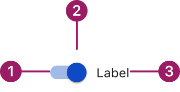
- Track
- Thumb
- Switch label
Usage Guidelines

Use a consistent size for input and selection components within the same form or layout to ensure alignment. Medium is the default, but small is fine if applied uniformly.
Use When
- Toggling a setting or feature between two states (on/off).
- Applying changes immediately without confirmation.
- Letting users enable or disable settings directly in context.
- Communicating the current state at a glance.
Best Practices
- Label the switch clearly to indicate what it controls.
- Place switches inline with related content for clarity and context.
- Avoid using switches for actions that require confirmation or multiple steps.
- Provide appropriate feedback when the state changes.
Sizes
small Medium (36px)

Label
small (32PX)

Label
Label Placement
Start
Label
end
Label
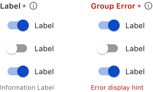
Form Group
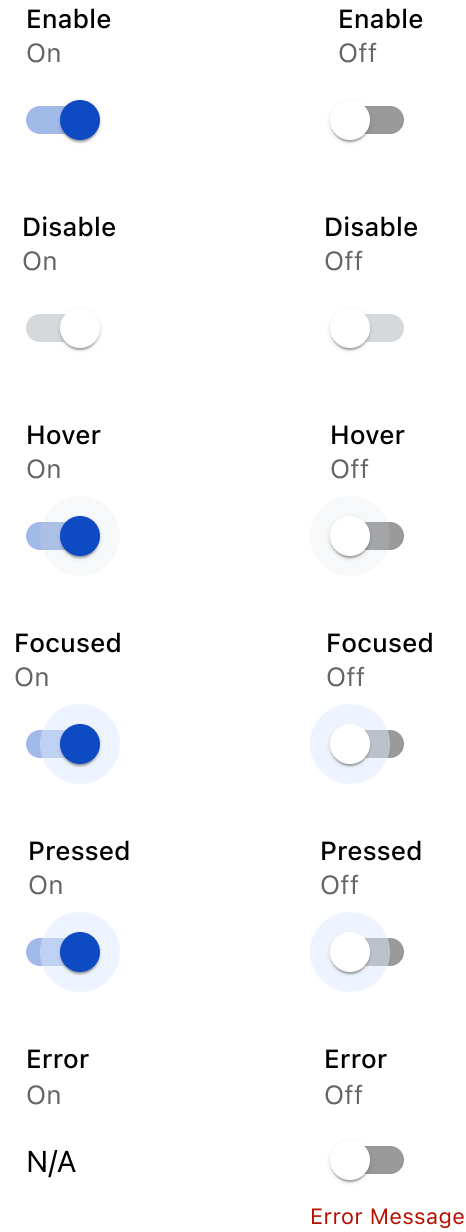
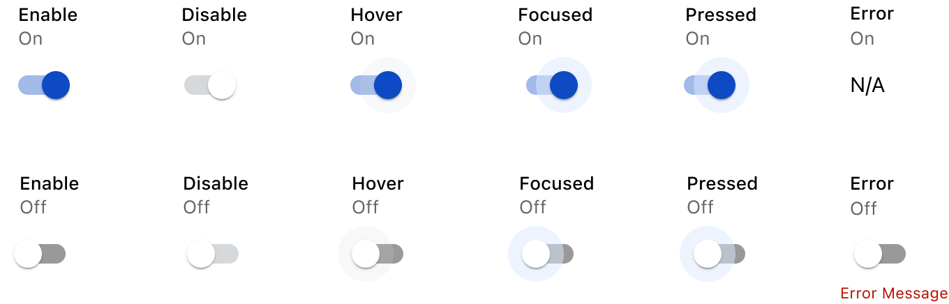
States
This component uses MUI (Material-UI) components, which are open-source and licensed under the MIT License.
Crafted with ❤️ at Zuora
© 2026 Zuora Inc.
Switch
Switch is a control that toggles a single setting on or off. It represents a binary state and is used to enable or disable a specific option or feature instantly.
Overview
Code
Anatomy
- Track
- Thumb
- Switch label
Usage Guidelines
Use a consistent size for input and selection components within the same form or layout to ensure alignment. Medium is the default, but small is fine if applied uniformly.
Use When
- Toggling a setting or feature between two states (on/off).
- Applying changes immediately without confirmation.
- Letting users enable or disable settings directly in context.
- Communicating the current state at a glance.
Best Practices
- Label the switch clearly to indicate what it controls.
- Place switches inline with related content for clarity and context.
- Avoid using switches for actions that require confirmation or multiple steps.
- Provide appropriate feedback when the state changes.
Sizes
small Medium (36px)
Label
small (32PX)
Label
Label Placement
Start
Label
end
Label
Form Group
States
This component uses MUI (Material-UI) components, which are open-source and licensed under the MIT License.
Crafted with ❤️ at Zuora
© 2026 Zuora Inc.
On This Page
Switch
Switch is a control that toggles a single setting on or off. It represents a binary state and is used to enable or disable a specific option or feature instantly.
Overview
Code
Anatomy
- Track
- Thumb
- Switch label
Usage Guidelines
Use a consistent size for input and selection components within the same form or layout to ensure alignment. Medium is the default, but small is fine if applied uniformly.
Use When
- Toggling a setting or feature between two states (on/off).
- Applying changes immediately without confirmation.
- Letting users enable or disable settings directly in context.
- Communicating the current state at a glance.
Best Practices
- Label the switch clearly to indicate what it controls.
- Place switches inline with related content for clarity and context.
- Avoid using switches for actions that require confirmation or multiple steps.
- Provide appropriate feedback when the state changes.
Sizes
Medium (36px)
Label
small (32PX)
Label
Label Placement
Start
Label
end
Label
Form Group
States
This component uses MUI (Material-UI) components, which are open-source and licensed under the MIT License.
Crafted with ❤️ at Zuora
© 2026 Zuora Inc.