Tabs
Tabs organize and allow navigation between groups of related content at the same hierarchy level, making it easy to explore and switch between different views.
Overview
Code
Anatomy
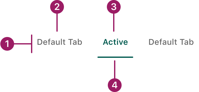
- Container
- Inactive text label
- Active text label
- Active tab indicator
Usage Guidelines
Use When
- Displaying different groups of content within the same view to reduce clutter.
- Organizing distinct but related content in a single interface.
- Managing a limited number of content sections (usually fewer than 7).
Best Practices
- Keep tab labels short, clear, and descriptive so users can quickly understand the content they lead to.
Orientation
horizontal
Default Tab
Active
Default Tab
Vertical

Default Tab

Active Tab

Default Tab
Default Tab
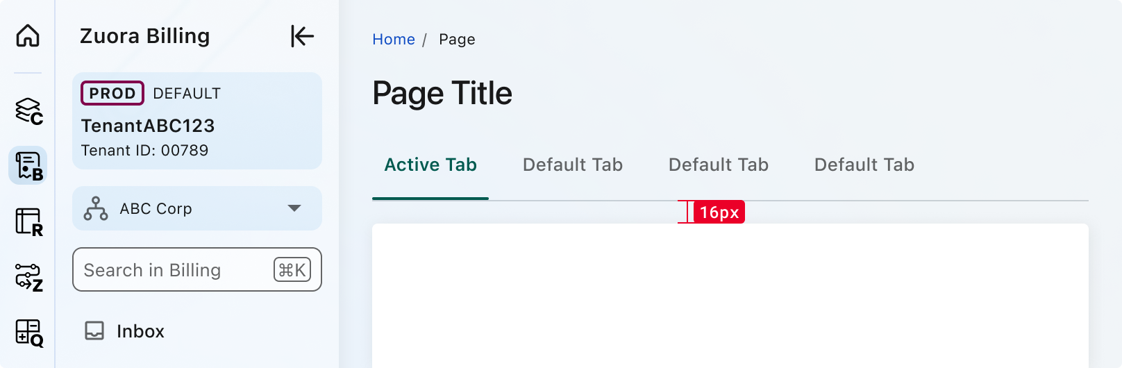
Spacing
Accessibility
This component uses MUI (Material-UI) components, which are open-source and licensed under the MIT License.
Crafted with ❤️ at Zuora
© 2026 Zuora Inc.
Tabs
Tabs organize and allow navigation between groups of related content at the same hierarchy level, making it easy to explore and switch between different views.
Overview
Code
Anatomy
- Container
- Inactive text label
- Active text label
- Active tab indicator
Usage Guidelines
Use When
- Displaying different groups of content within the same view to reduce clutter.
- Organizing distinct but related content in a single interface.
- Managing a limited number of content sections (usually fewer than 7).
Best Practices
- Keep tab labels short, clear, and descriptive so users can quickly understand the content they lead to.
Orientation
horizontal
Default Tab
Active
Default Tab
Vertical
Default Tab
Active Tab
Default Tab
Default Tab
Spacing
Accessibility
This component uses MUI (Material-UI) components, which are open-source and licensed under the MIT License.
Crafted with ❤️ at Zuora
© 2026 Zuora Inc.
On This Page
Tabs
Tabs organize and allow navigation between groups of related content at the same hierarchy level, making it easy to explore and switch between different views.
Overview
Code
Anatomy
- Container
- Inactive text label
- Active text label
- Active tab indicator
Usage Guidelines
Use When
- Displaying different groups of content within the same view to reduce clutter.
- Organizing distinct but related content in a single interface.
- Managing a limited number of content sections (usually fewer than 7).
Best Practices
- Keep tab labels short, clear, and descriptive so users can quickly understand the content they lead to.
Orientation
horizontal
Default Tab
Active
Default Tab
Vertical
Default Tab
Active Tab
Default Tab
Default Tab
Spacing
Accessibility
This component uses MUI (Material-UI) components, which are open-source and licensed under the MIT License.
Crafted with ❤️ at Zuora
© 2026 Zuora Inc.