Text Field
Text fields collect user input by allowing them to enter and edit text.
Overview
Code
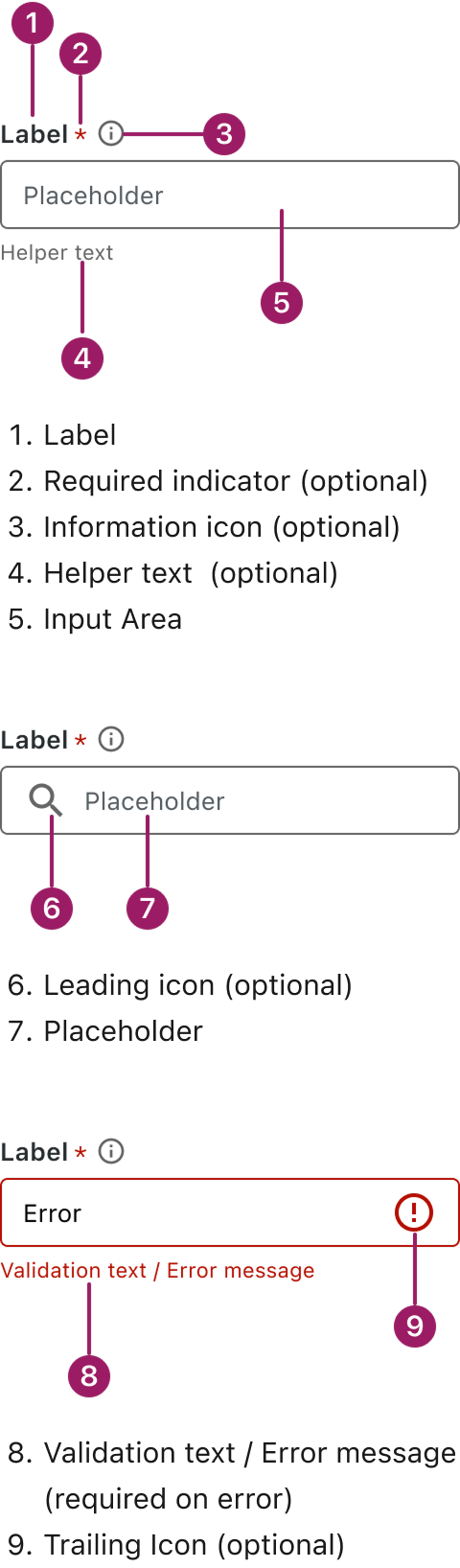
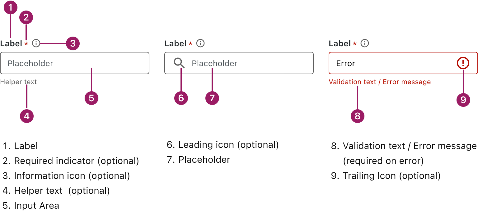
Anatomy
Usage Guidelines

Use a consistent size for input and selection components within the same form or layout to ensure alignment. Medium is the default, but small is fine if applied uniformly.
Use When
- Capturing short, structured input like names, emails, or phone numbers.
- Collecting precise or formatted information.
- Enabling search functionality through typed queries.
- Supporting forms or workflows that require user input.
Best Practices
- Use clear and descriptive labels for each text field, and avoid overusing placeholder text.
- Use the correct input type (e.g., email, number, password) to trigger appropriate mobile keyboards and browser validation.
- Provide visual feedback, such as clear error or success messages, to guide users and prevent mistakes.
- Limit character input where appropriate, especially for fields requiring specific formatting (e.g., phone numbers).
Sizes
Medium (36px)
Label


Placeholder
Helper or Validation text
SMALL (32px)
Label
Placeholder
Helper or Validation text
This component uses MUI (Material-UI) components, which are open-source and licensed under the MIT License.
Crafted with ❤️ at Zuora
© 2026 Zuora Inc.
Text Field
Text fields collect user input by allowing them to enter and edit text.
Overview
Code
Anatomy
Usage Guidelines
Use a consistent size for input and selection components within the same form or layout to ensure alignment. Medium is the default, but small is fine if applied uniformly.
Use When
- Capturing short, structured input like names, emails, or phone numbers.
- Collecting precise or formatted information.
- Enabling search functionality through typed queries.
- Supporting forms or workflows that require user input.
Best Practices
- Use clear and descriptive labels for each text field, and avoid overusing placeholder text.
- Use the correct input type (e.g., email, number, password) to trigger appropriate mobile keyboards and browser validation.
- Provide visual feedback, such as clear error or success messages, to guide users and prevent mistakes.
- Limit character input where appropriate, especially for fields requiring specific formatting (e.g., phone numbers).
Sizes
Medium (36px)
Label
Placeholder
Helper or Validation text
SMALL (32px)
Label
Placeholder
Helper or Validation text
This component uses MUI (Material-UI) components, which are open-source and licensed under the MIT License.
Crafted with ❤️ at Zuora
© 2026 Zuora Inc.
On This Page
Text Field
Text fields collect user input by allowing them to enter and edit text.
Overview
Code
Anatomy
Usage Guidelines
Use a consistent size for input and selection components within the same form or layout to ensure alignment. Medium is the default, but small is fine if applied uniformly.
Use When
- Capturing short, structured input like names, emails, or phone numbers.
- Collecting precise or formatted information.
- Enabling search functionality through typed queries.
- Supporting forms or workflows that require user input.
Best Practices
- Use clear and descriptive labels for each text field, and avoid overusing placeholder text.
- Use the correct input type (e.g., email, number, password) to trigger appropriate mobile keyboards and browser validation.
- Provide visual feedback, such as clear error or success messages, to guide users and prevent mistakes.
- Limit character input where appropriate, especially for fields requiring specific formatting (e.g., phone numbers).
Sizes
Medium (36px)
Label
Placeholder
Helper or Validation text
SMALL (32px)
Label
Placeholder
Helper or Validation text
This component uses MUI (Material-UI) components, which are open-source and licensed under the MIT License.
Crafted with ❤️ at Zuora
© 2026 Zuora Inc.