Tooltip
Tooltips provide brief, contextual information when users hover over, focus on, or tap an element. They help clarify the purpose of an interface element without cluttering the UI. Tooltips are most commonly used for icon buttons, truncated text, or elements that may need additional explanation.
Overview
Code
Anatomy
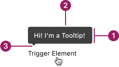
- Container
- Supporting text
- Pointer
Usage Guidelines
Use When
- Provide brief, supplemental information without crowding the UI.
- Clarifying the purpose of an icon, button, or interactive element.
- Revealing full content for truncated text.
- Offering non-critical help or guidance.
Best Practices
- Use tooltips to supplement, not replace, critical information.
- Keep tooltip content concise, ideally one sentence or less.
- Position tooltips so they don’t obscure the related element or important content.
- Don’t rely on tooltips as the only method for delivering important information.
- Ensure tooltips appear on hover (mouse), focus (keyboard), or tap (touch, if supported).
- Avoid using tooltips when the content is interactive or actionable.
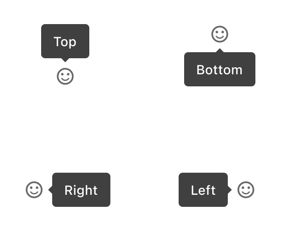
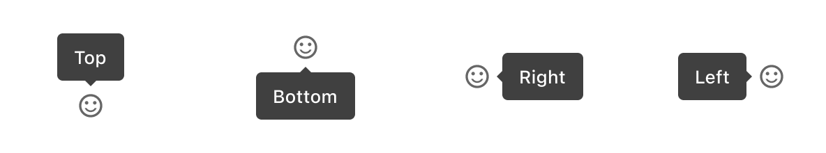
Placement
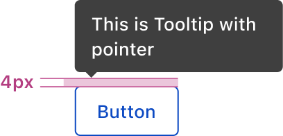
The offset (distance between the end of the tip and the target) is 4px.
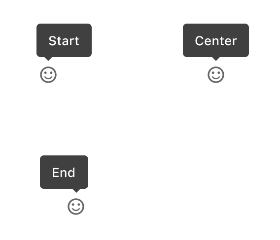
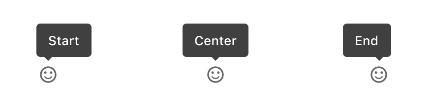
Alignment
Accessibility
This component uses MUI (Material-UI) components, which are open-source and licensed under the MIT License.
Crafted with ❤️ at Zuora
© 2026 Zuora Inc.
Tooltip
Tooltips provide brief, contextual information when users hover over, focus on, or tap an element. They help clarify the purpose of an interface element without cluttering the UI. Tooltips are most commonly used for icon buttons, truncated text, or elements that may need additional explanation.
Overview
Code
Anatomy
- Container
- Supporting text
- Pointer
Usage Guidelines
Use When
- Provide brief, supplemental information without crowding the UI.
- Clarifying the purpose of an icon, button, or interactive element.
- Revealing full content for truncated text.
- Offering non-critical help or guidance.
Best Practices
- Use tooltips to supplement, not replace, critical information.
- Keep tooltip content concise, ideally one sentence or less.
- Position tooltips so they don’t obscure the related element or important content.
- Don’t rely on tooltips as the only method for delivering important information.
- Ensure tooltips appear on hover (mouse), focus (keyboard), or tap (touch, if supported).
- Avoid using tooltips when the content is interactive or actionable.
Placement
The offset (distance between the end of the tip and the target) is 4px.
Alignment
Accessibility
This component uses MUI (Material-UI) components, which are open-source and licensed under the MIT License.
Crafted with ❤️ at Zuora
© 2026 Zuora Inc.
On This Page
Tooltip
Tooltips provide brief, contextual information when users hover over, focus on, or tap an element. They help clarify the purpose of an interface element without cluttering the UI. Tooltips are most commonly used for icon buttons, truncated text, or elements that may need additional explanation.
Overview
Code
Anatomy
- Container
- Supporting text
- Pointer
Usage Guidelines
Use When
- Provide brief, supplemental information without crowding the UI.
- Clarifying the purpose of an icon, button, or interactive element.
- Revealing full content for truncated text.
- Offering non-critical help or guidance.
Best Practices
- Use tooltips to supplement, not replace, critical information.
- Keep tooltip content concise, ideally one sentence or less.
- Position tooltips so they don’t obscure the related element or important content.
- Don’t rely on tooltips as the only method for delivering important information.
- Ensure tooltips appear on hover (mouse), focus (keyboard), or tap (touch, if supported).
- Avoid using tooltips when the content is interactive or actionable.
Placement
The offset (distance between the end of the tip and the target) is 4px.
Alignment
Accessibility
This component uses MUI (Material-UI) components, which are open-source and licensed under the MIT License.
Crafted with ❤️ at Zuora
© 2026 Zuora Inc.