Widget
A Widget displays related content or actions in a rectangular frame, often including a title, description, key data, and call-to-action buttons. Use Widget to organize and personalize information in dashboards.
Overview
Code [coming soon]
Anatomy
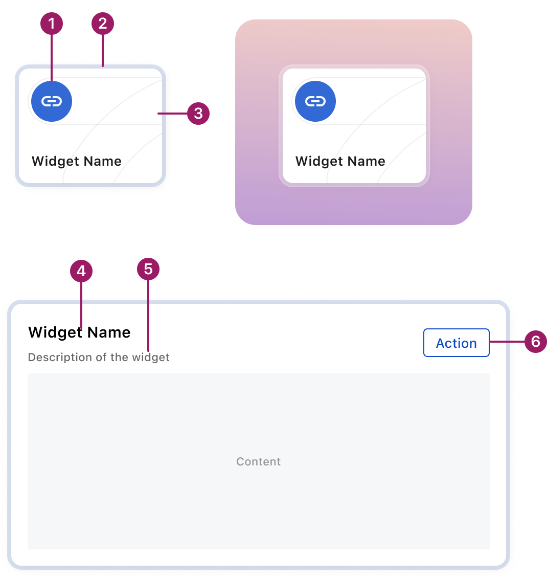
- Widget icon (optional)
- Glass border
- Illustration (optional)
- Widget title
- Description (optional)
- Action button (optional)
Usage Guidelines
Use When
- Use Widget in widget grid to display data and actions from the Zuora system, such as charts, quick links, or historical records of business processes. Users can quickly access the information and features they need.
Best Practices
- Display the most important data or actions, ensuring users can grasp the purpose of the widget quickly.
- Allow user to launch process or access more detailed data by clicking on the widget directly or action buttons in the widget.
- Offer different sizes for the widget when it benefits the users, and include clear descriptions to help users choose the best fit for their needs
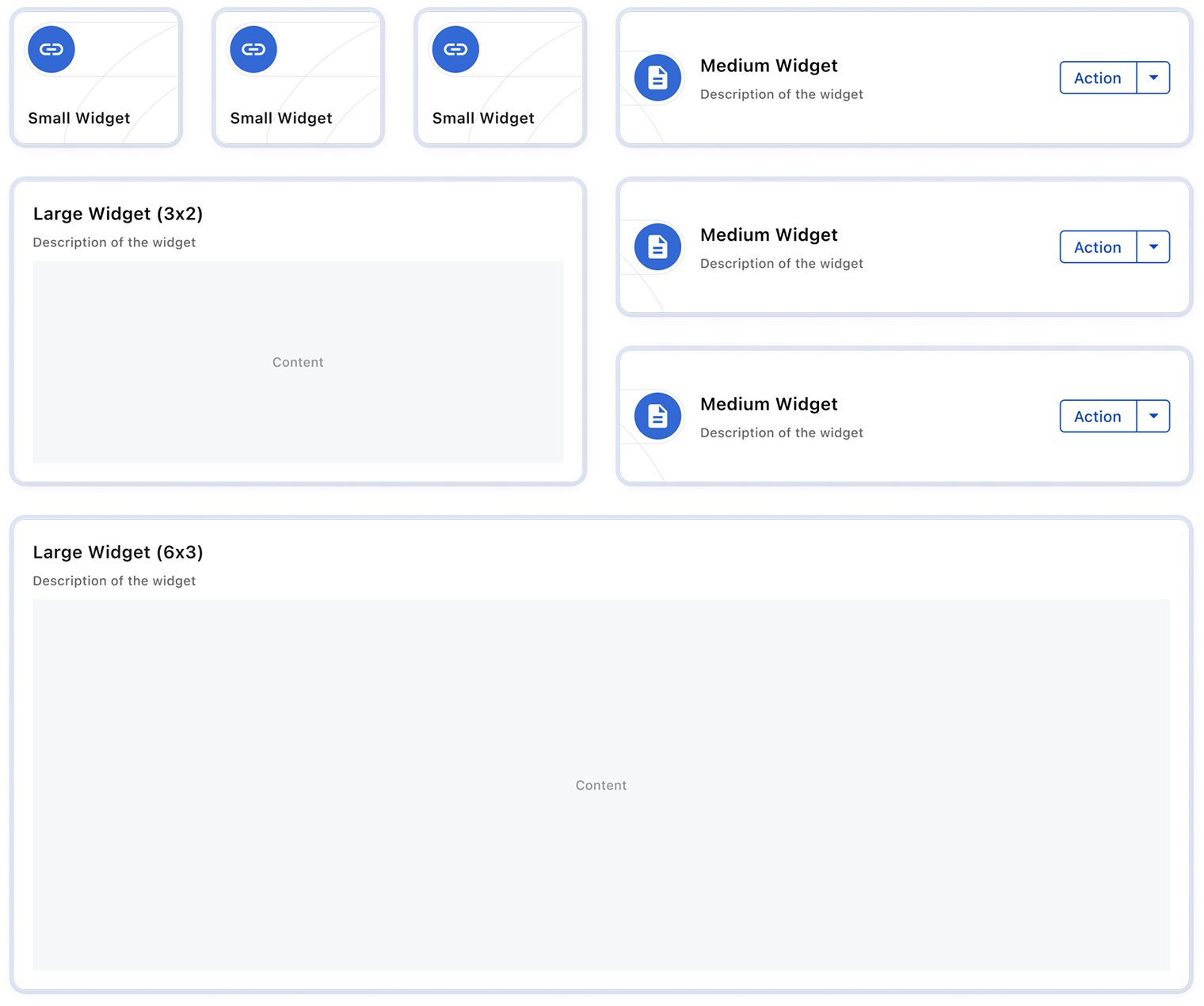
Sizes
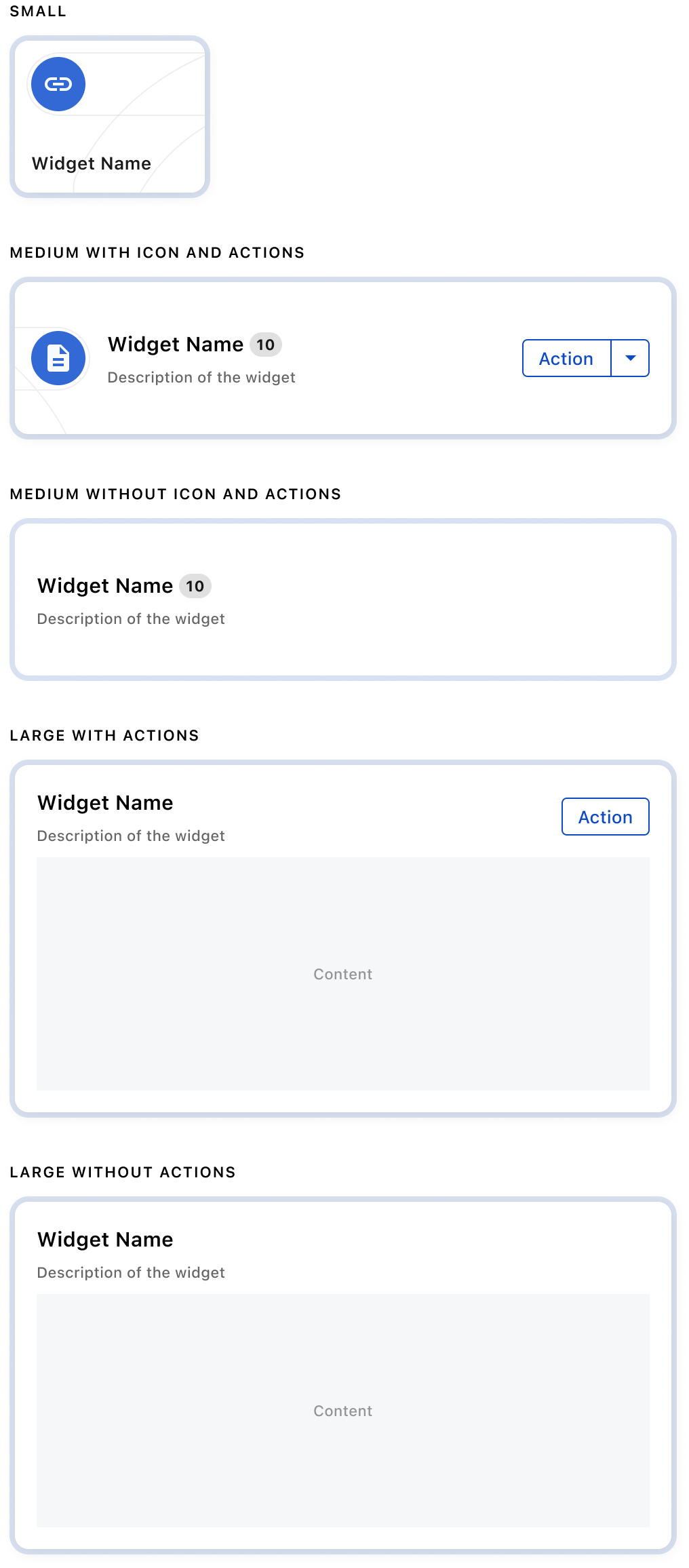
Variants
Crafted with ❤️ at Zuora
© 2026 Zuora Inc.
Widget
A Widget displays related content or actions in a rectangular frame, often including a title, description, key data, and call-to-action buttons. Use Widget to organize and personalize information in dashboards.
Overview
Code [coming soon]
Anatomy
- Widget icon (optional)
- Glass border
- Illustration (optional)
- Widget title
- Description (optional)
- Action button (optional)
Usage Guidelines
Use When
- Use Widget in widget grid to display data and actions from the Zuora system, such as charts, quick links, or historical records of business processes. Users can quickly access the information and features they need.
Best Practices
- Display the most important data or actions, ensuring users can grasp the purpose of the widget quickly.
- Allow user to launch process or access more detailed data by clicking on the widget directly or action buttons in the widget.
- Offer different sizes for the widget when it benefits the users, and include clear descriptions to help users choose the best fit for their needs
Sizes
Variants
Crafted with ❤️ at Zuora
© 2026 Zuora Inc.
On This Page
Widget
A Widget displays related content or actions in a rectangular frame, often including a title, description, key data, and call-to-action buttons. Use Widget to organize and personalize information in dashboards.
Overview
Code [coming soon]
Anatomy
- Widget icon (optional)
- Glass border
- Illustration (optional)
- Widget title
- Description (optional)
- Action button (optional)
Usage Guidelines
Use When
- Use Widget in widget grid to display data and actions from the Zuora system, such as charts, quick links, or historical records of business processes. Users can quickly access the information and features they need.
Best Practices
- Display the most important data or actions, ensuring users can grasp the purpose of the widget quickly.
- Allow user to launch process or access more detailed data by clicking on the widget directly or action buttons in the widget.
- Offer different sizes for the widget when it benefits the users, and include clear descriptions to help users choose the best fit for their needs
Sizes
Variants
Crafted with ❤️ at Zuora
© 2026 Zuora Inc.