Global Navigation
The global navigation component is a foundational element of the Zuora interface, created to unify the user experience across all Zuora applications. It provides a consistent and streamlined interface for users to effortlessly switch between apps and access their most important pages, reducing clutter and improving overall efficiency.
Overview
Code
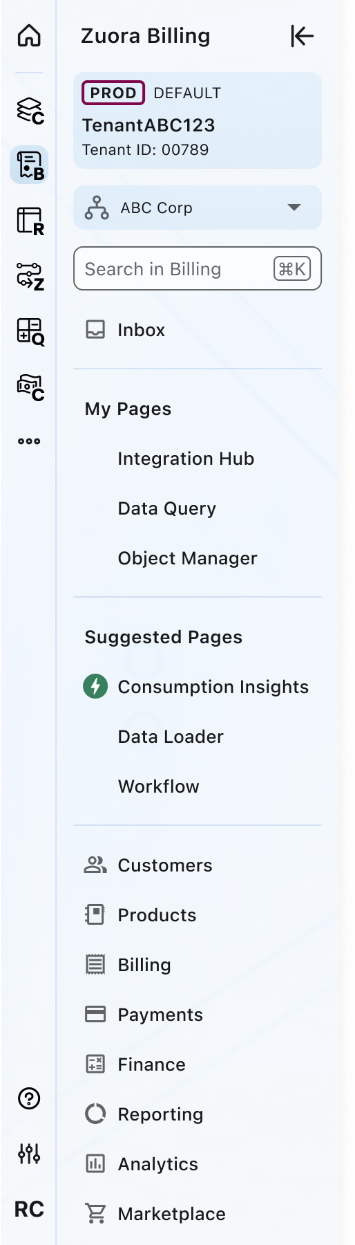
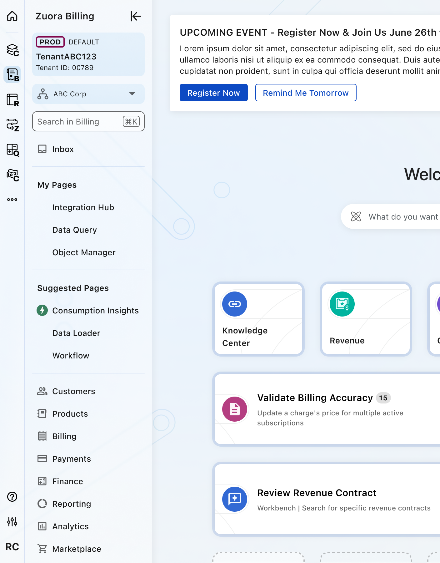
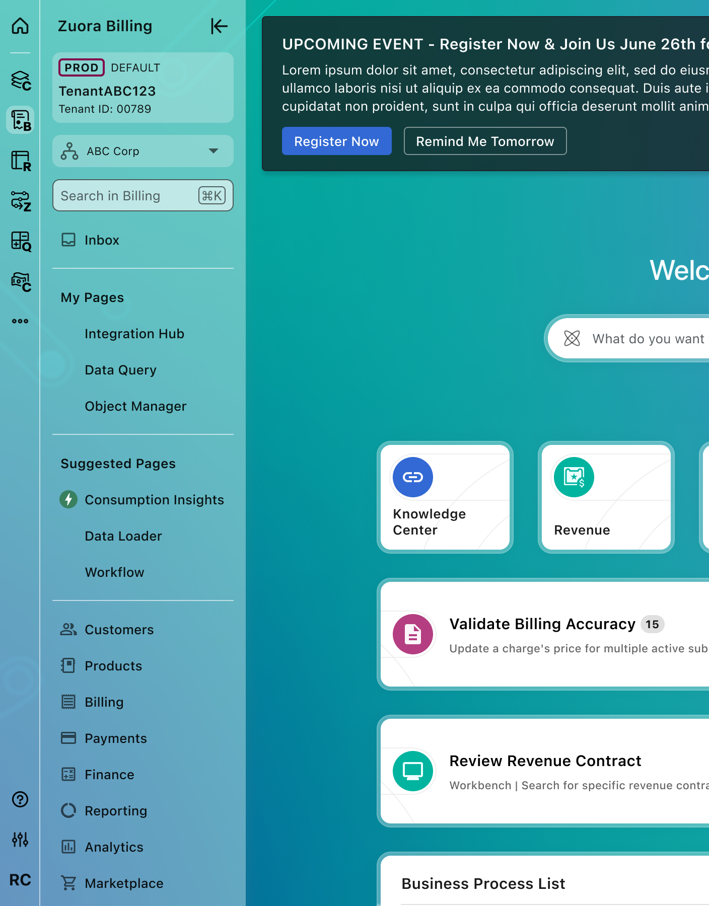
Anatomy
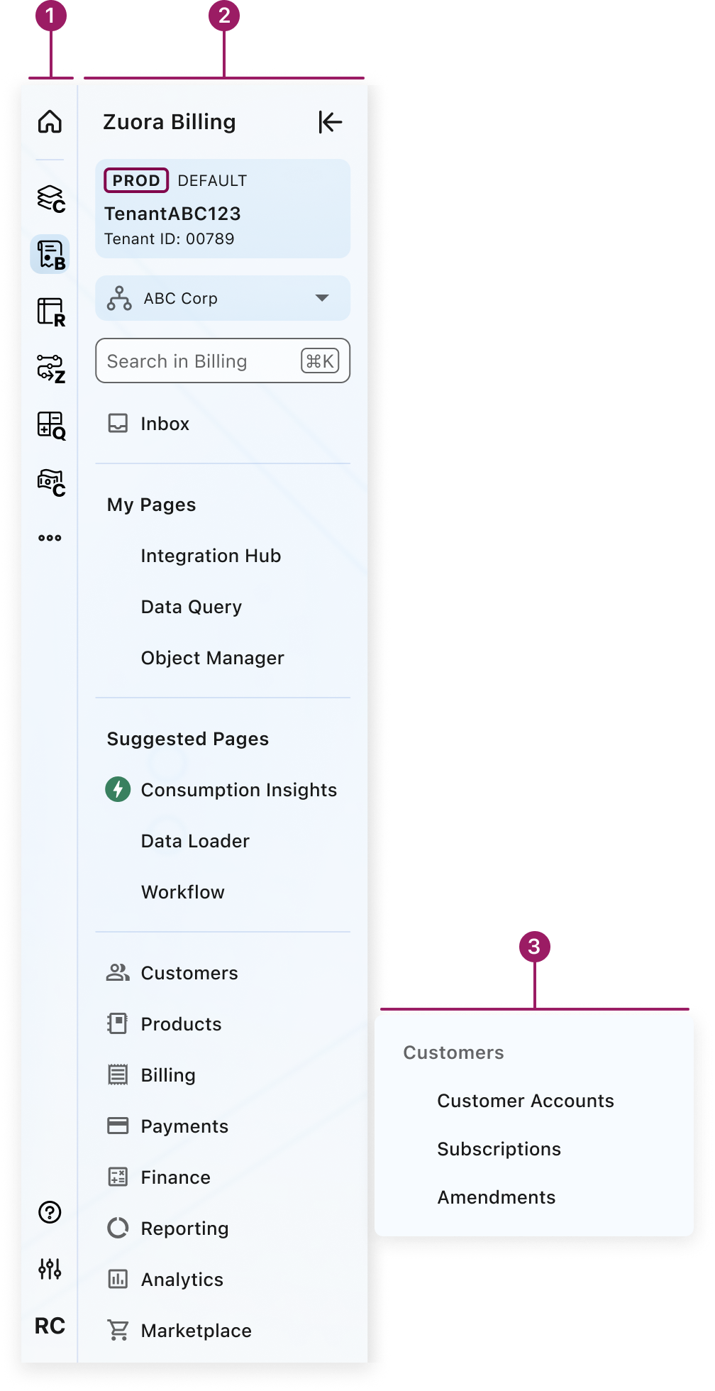
- Primary navigation
- Secondary navigation
- Tertiary/Quaternary navigation
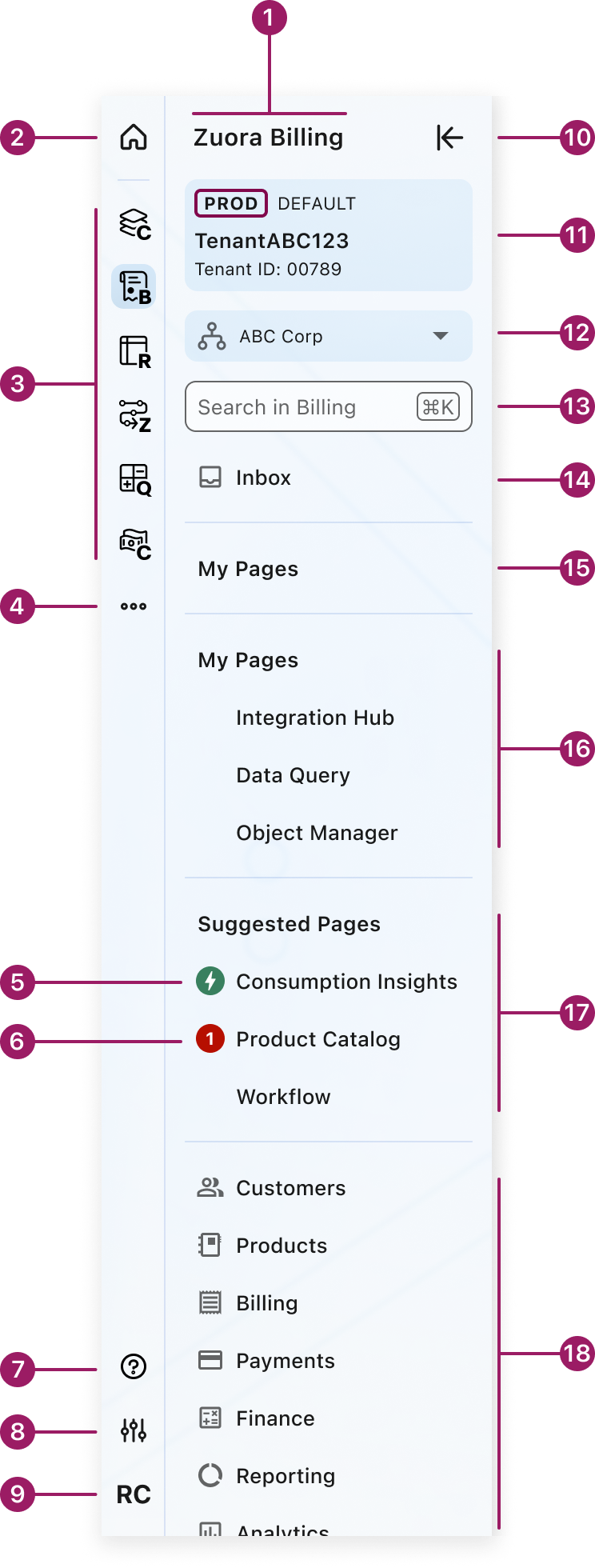
- Zuora App label
- Zuora Home
- User’s Zuora Apps
- More Apps
- New feature badge
- Alert badge
- Indicates the need for user’s attention
- Help & Support
- App Settings
- User Settings
- Focus Mode
- Tenant Badge
- Multi-Org Menu
- Applicable if provisioned in tenant
- Navigation search
- App specific
- Inbox or Notifications (optional)
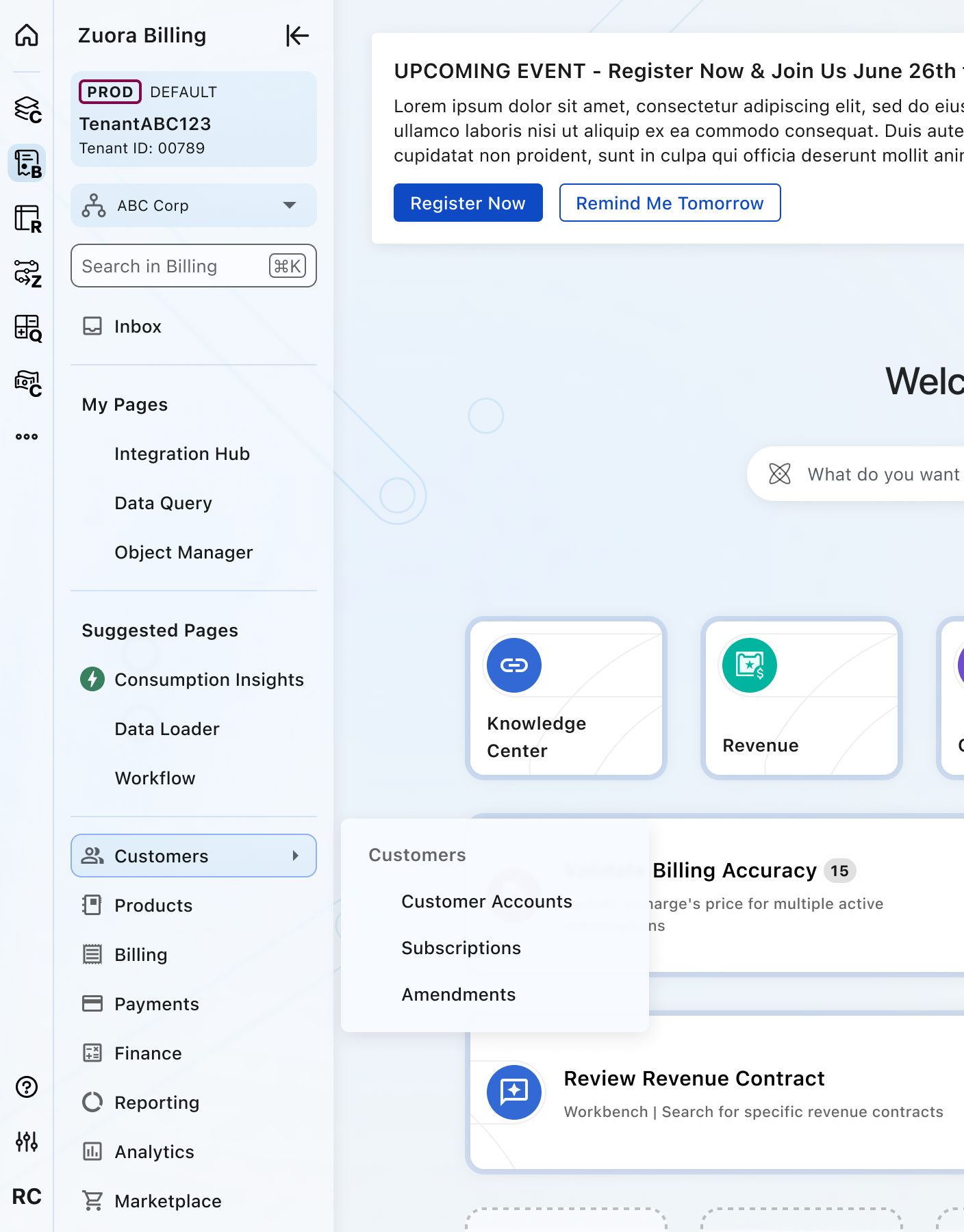
- User-defined menu section (collapsed)
- User-defined menu section (expanded)
- Suggested Pages menu section (expanded)
- Core app menu section
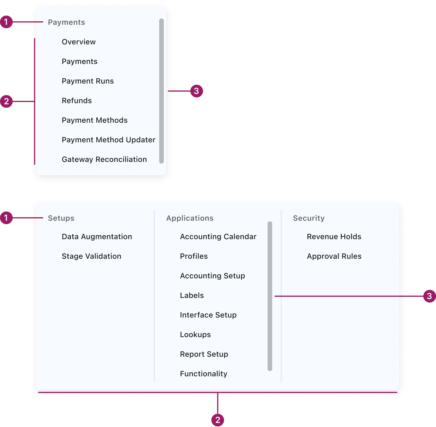
- Tertiary/Quaternary menu header
- Tertiary/Quaternary menu item
- Scroll bar (optional)
Usage Guidelines
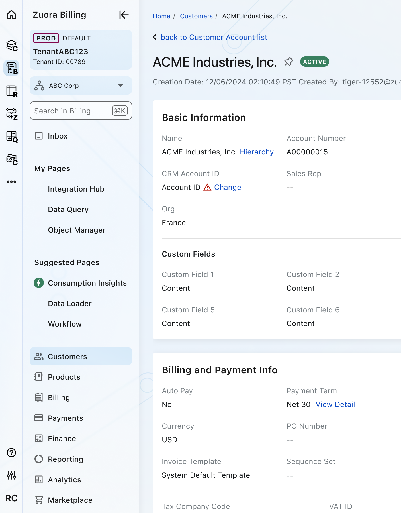
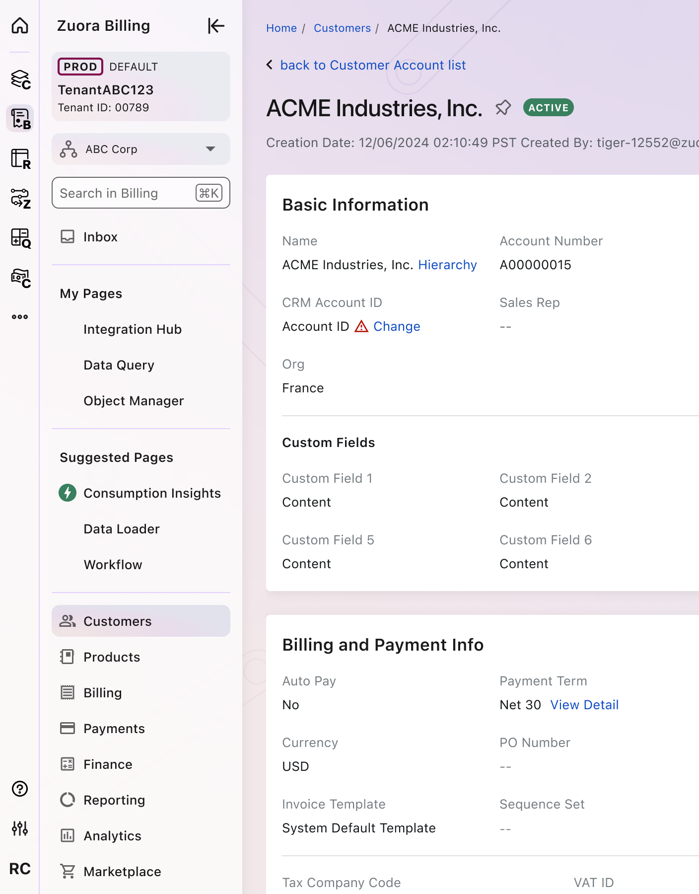
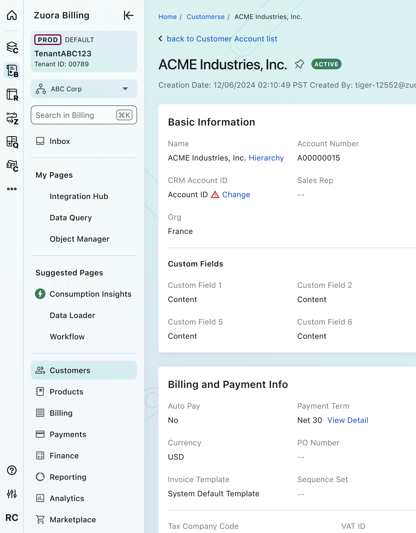
Use When
- In the Homepage, List view, or Detail view page.
- Please note: Configuration or rule builder pages like Workflow or Mediation will maintain usage of the Builder Header component.
Best Practices
- Maintain consistency across applications:
- Use versions of the global navigation that is specific to the Zuora App.
- Maintain a consistent structure and appearance throughout all Zuora applications to foster a unified and seamless experience for users.
- Ensure discoverability and provide contextual feedback:
- Use icons such as the red or the green icon within the Suggested Pages to convey alerts and misconfigurations or new features for users to explore.
- Offer customization and personalization:
- Allow users to personalize the navigation to their specific workflows. This includes the ability to pin pages into user-defined sections.
- Focus on simplicity and clarity:
- One of the primary goals of the global navigation is to provide a clean and simple interface by reducing clutter and the need for users to scroll excessively to find what they need.
Variants
ACTIVE Mode
Focus Mode

Themes
Nebula
Homepage
Other Pages
Cosmos
Homepage
Other Pages
Horizon
Homepage
Other Pages
Placement
The navigation panel should be placed against the left edge of the page.
Tertiary/quaternary menus 4px away from the right edge of the navigation panel.
Crafted with ❤️ at Zuora
© 2026 Zuora Inc.
Global Navigation
The global navigation component is a foundational element of the Zuora interface, created to unify the user experience across all Zuora applications. It provides a consistent and streamlined interface for users to effortlessly switch between apps and access their most important pages, reducing clutter and improving overall efficiency.
Overview
Code
Anatomy
- Primary navigation
- Secondary navigation
- Tertiary/Quaternary navigation
- Zuora App label
- Zuora Home
- User’s Zuora Apps
- More Apps
- New feature badge
- Alert badge
- Indicates the need for user’s attention
- Help & Support
- App Settings
- User Settings
- Focus Mode
- Tenant Badge
- Multi-Org Menu
- Applicable if provisioned in tenant
- Navigation search
- App specific
- Inbox or Notifications (optional)
- User-defined menu section (collapsed)
- User-defined menu section (expanded)
- Suggested Pages menu section (expanded)
- Core app menu section
- Tertiary/Quaternary menu header
- Tertiary/Quaternary menu item
- Scroll bar (optional)
Usage Guidelines
Use When
- In the Homepage, List view, or Detail view page.
- Please note: Configuration or rule builder pages like Workflow or Mediation will maintain usage of the Builder Header component.
Best Practices
- Maintain consistency across applications:
- Use versions of the global navigation that is specific to the Zuora App.
- Maintain a consistent structure and appearance throughout all Zuora applications to foster a unified and seamless experience for users.
- Ensure discoverability and provide contextual feedback:
- Use icons such as the red or the green icon within the Suggested Pages to convey alerts and misconfigurations or new features for users to explore.
- Offer customization and personalization:
- Allow users to personalize the navigation to their specific workflows. This includes the ability to pin pages into user-defined sections.
- Focus on simplicity and clarity:
- One of the primary goals of the global navigation is to provide a clean and simple interface by reducing clutter and the need for users to scroll excessively to find what they need.
Variants
ACTIVE Mode
Focus Mode
Themes
Nebula
Homepage
Other Pages
Cosmos
Homepage
Other Pages
Horizon
Homepage
Other Pages
Placement
The navigation panel should be placed against the left edge of the page.
Tertiary/quaternary menus 4px away from the right edge of the navigation panel.
Crafted with ❤️ at Zuora
© 2026 Zuora Inc.
On This Page
Global Navigation
The global navigation component is a foundational element of the Zuora interface, created to unify the user experience across all Zuora applications. It provides a consistent and streamlined interface for users to effortlessly switch between apps and access their most important pages, reducing clutter and improving overall efficiency.
Overview
Code
Anatomy
- Primary navigation
- Secondary navigation
- Tertiary/Quaternary navigation
- Zuora App label
- Zuora Home
- User’s Zuora Apps
- More Apps
- New feature badge
- Alert badge
- Indicates the need for user’s attention
- Help & Support
- App Settings
- User Settings
- Focus Mode
- Tenant Badge
- Multi-Org Menu
- Applicable if provisioned in tenant
- Navigation search
- App specific
- Inbox or Notifications (optional)
- User-defined menu section (collapsed)
- User-defined menu section (expanded)
- Suggested Pages menu section (expanded)
- Core app menu section
- Tertiary/Quaternary menu header
- Tertiary/Quaternary menu item
- Scroll bar (optional)
Usage Guidelines
Use When
- In the Homepage, List view, or Detail view page.
- Please note: Configuration or rule builder pages like Workflow or Mediation will maintain usage of the Builder Header component.
Best Practices
- Maintain consistency across applications:
- Use versions of the global navigation that is specific to the Zuora App.
- Maintain a consistent structure and appearance throughout all Zuora applications to foster a unified and seamless experience for users.
- Ensure discoverability and provide contextual feedback:
- Use icons such as the red or the green icon within the Suggested Pages to convey alerts and misconfigurations or new features for users to explore.
- Offer customization and personalization:
- Allow users to personalize the navigation to their specific workflows. This includes the ability to pin pages into user-defined sections.
- Focus on simplicity and clarity:
- One of the primary goals of the global navigation is to provide a clean and simple interface by reducing clutter and the need for users to scroll excessively to find what they need.
Variants
ACTIVE Mode
Focus Mode
Themes
Nebula
Homepage
Other Pages
Cosmos
Homepage
Other Pages
Horizon
Homepage
Other Pages
Placement
The navigation panel should be placed against the left edge of the page.
Tertiary/quaternary menus 4px away from the right edge of the navigation panel.
Crafted with ❤️ at Zuora
© 2026 Zuora Inc.