Dashboard View
A dashboard presents aggregated, cross-object information in a modular layout to help users monitor activity, identify trends, and take action quickly.
Overview
Code
The Dashboard View is a configurable page built on the Homepage framework. It uses the same structural layers and Widget Grid system to organize modular widgets that surface aggregated information.
It prioritizes visibility and speed, helping users quickly assess status, identify trends, and navigate to the appropriate workflow.
Anatomy
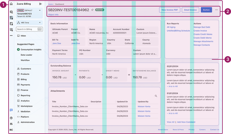
- UI Shell
- Page Header
- Widget Grid
Usage Guidelines
Use When
- Users need visibility across multiple objects or workflows.
- Monitoring key metrics, trends, or system health over time.
- Surfacing high-priority alerts or items that require attention.
- Providing quick entry points into deeper workflows.
- Summary-level insight is more valuable than detailed data.
Best Practices
- Limit widgets to what drives decisions or action.
- Establish clear visual hierarchy across widgets.
- Maintain consistent layout patterns across dashboards.
- Group related information into clear, structured widgets.
- Avoid duplicating object-level detail available elsewhere.
- Maintain consistent layout patterns across object types.
Views
Configurable
Allows users to add, remove, and rearrange widgets within the Widget Grid. The configure control appears in the top-right corner.

Fixed
Does not allow users to modify layout or widget placement.

Types
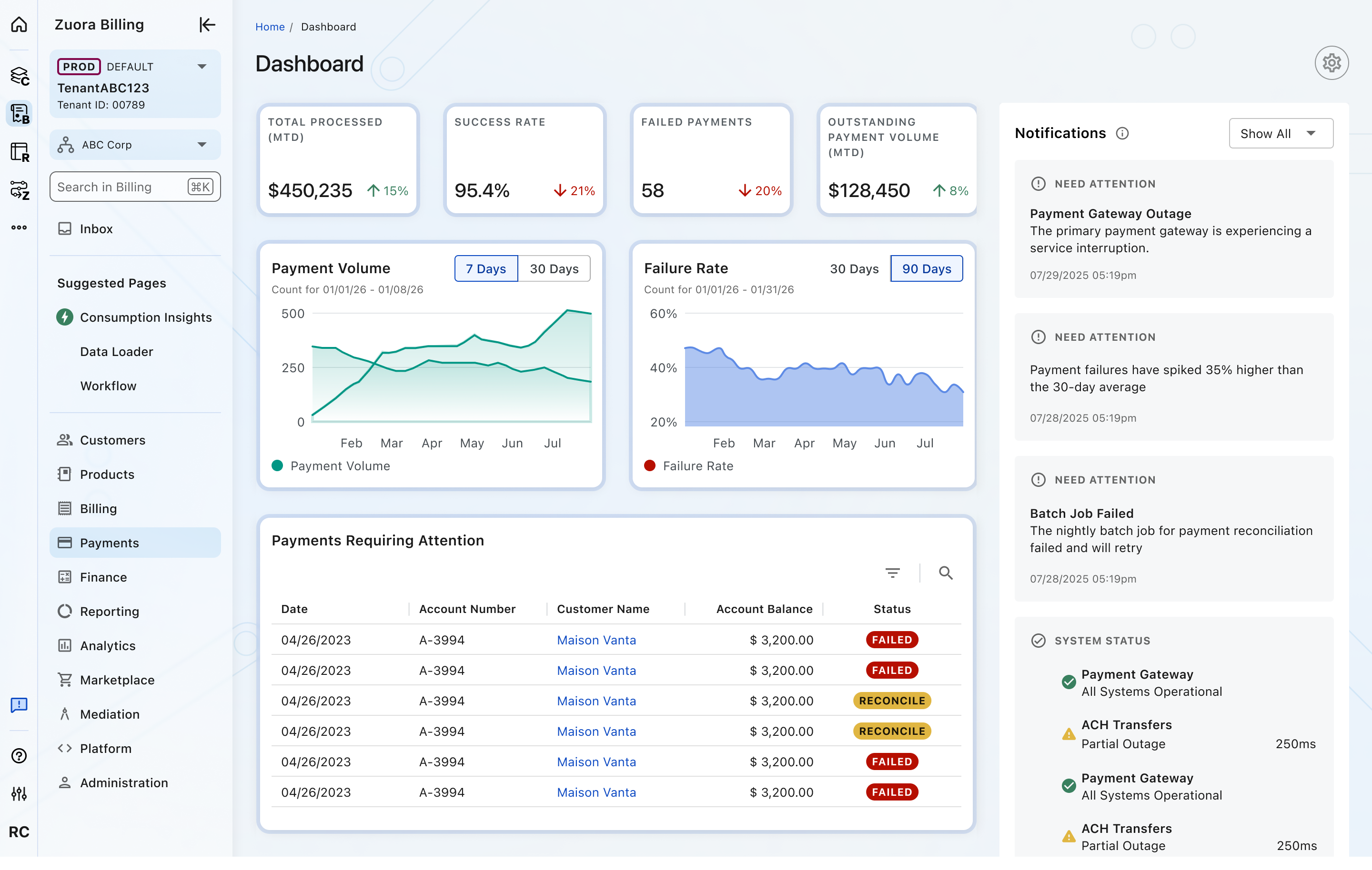
Focused dashboard
A single page composed of widgets. Tabs are not displayed.
Best suited for tightly scoped content and execution-focused workflows.
Dashboard set
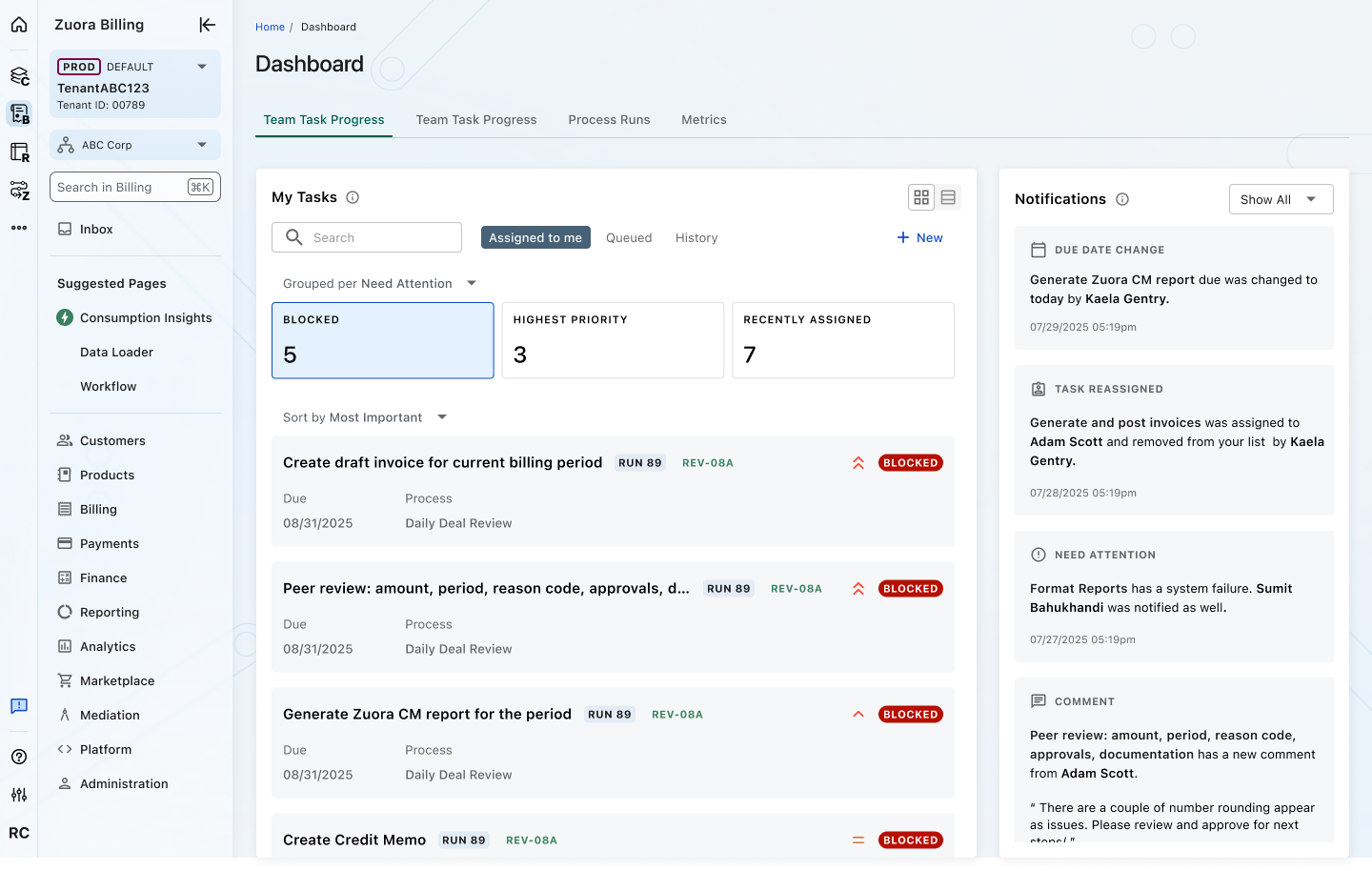
A collection of dashboards grouped under tabs. Used to separate distinct contexts or perspectives within the same functional area (for example: Tasks, Metrics, Process Runs). Each tab represents a different decision focus, not additional page space.
Tabs are displayed when a dashboard set is implemented.
Related Components
Object View is composed of the following foundational and component patterns:
- UI Shell – Provides global navigation, breadcrumbs, page framing, and footer.
- Page Header – Displays object identity, status, and primary actions.
- Widget Grid – Defines the layout structure for organizing widgets.
- Widgets – Modular containers for presenting object-specific data.
Crafted with ❤️ at Zuora
© 2026 Zuora Inc.
Dashboard View
A dashboard presents aggregated, cross-object information in a modular layout to help users monitor activity, identify trends, and take action quickly.
Overview
Code
The Dashboard View is a configurable page built on the Homepage framework. It uses the same structural layers and Widget Grid system to organize modular widgets that surface aggregated information.
It prioritizes visibility and speed, helping users quickly assess status, identify trends, and navigate to the appropriate workflow.
Anatomy
- UI Shell
- Page Header
- Widget Grid
Usage Guidelines
Use When
- Users need visibility across multiple objects or workflows.
- Monitoring key metrics, trends, or system health over time.
- Surfacing high-priority alerts or items that require attention.
- Providing quick entry points into deeper workflows.
- Summary-level insight is more valuable than detailed data.
Best Practices
- Limit widgets to what drives decisions or action.
- Establish clear visual hierarchy across widgets.
- Maintain consistent layout patterns across dashboards.
- Group related information into clear, structured widgets.
- Avoid duplicating object-level detail available elsewhere.
- Maintain consistent layout patterns across object types.
Views
Configurable
Allows users to add, remove, and rearrange widgets within the Widget Grid. The configure control appears in the top-right corner.
Fixed
Does not allow users to modify layout or widget placement.
Types
Focused dashboard
A single page composed of widgets. Tabs are not displayed.
Best suited for tightly scoped content and execution-focused workflows.
Dashboard set
A collection of dashboards grouped under tabs. Used to separate distinct contexts or perspectives within the same functional area (for example: Tasks, Metrics, Process Runs). Each tab represents a different decision focus, not additional page space.
Tabs are displayed when a dashboard set is implemented.
Related Components
Object View is composed of the following foundational and component patterns:
- UI Shell – Provides global navigation, breadcrumbs, page framing, and footer.
- Page Header – Displays object identity, status, and primary actions.
- Widget Grid – Defines the layout structure for organizing widgets.
- Widgets – Modular containers for presenting object-specific data.
Crafted with ❤️ at Zuora
© 2026 Zuora Inc.
Dashboard View
A dashboard presents aggregated, cross-object information in a modular layout to help users monitor activity, identify trends, and take action quickly.
Overview
Code
The Dashboard View is a configurable page built on the Homepage framework. It uses the same structural layers and Widget Grid system to organize modular widgets that surface aggregated information.
It prioritizes visibility and speed, helping users quickly assess status, identify trends, and navigate to the appropriate workflow.
Anatomy
- UI Shell
- Page Header
- Widget Grid
Usage Guidelines
Use When
- Users need visibility across multiple objects or workflows.
- Monitoring key metrics, trends, or system health over time.
- Surfacing high-priority alerts or items that require attention.
- Providing quick entry points into deeper workflows.
- Summary-level insight is more valuable than detailed data.
Best Practices
- Limit widgets to what drives decisions or action.
- Establish clear visual hierarchy across widgets.
- Maintain consistent layout patterns across dashboards.
- Group related information into clear, structured widgets.
- Avoid duplicating object-level detail available elsewhere.
- Maintain consistent layout patterns across object types.
Views
Configurable
Allows users to add, remove, and rearrange widgets within the Widget Grid. The configure control appears in the top-right corner.
Fixed
Does not allow users to modify layout or widget placement.
Types
Focused dashboard
A single page composed of widgets. Tabs are not displayed.
Best suited for tightly scoped content and execution-focused workflows.
Dashboard set
A collection of dashboards grouped under tabs. Used to separate distinct contexts or perspectives within the same functional area (for example: Tasks, Metrics, Process Runs). Each tab represents a different decision focus, not additional page space.
Tabs are displayed when a dashboard set is implemented.
Related Components
Object View is composed of the following foundational and component patterns:
- UI Shell – Provides global navigation, breadcrumbs, page framing, and footer.
- Page Header – Displays object identity, status, and primary actions.
- Widget Grid – Defines the layout structure for organizing widgets.
- Widgets – Modular containers for presenting object-specific data.
Crafted with ❤️ at Zuora
© 2026 Zuora Inc.
On This Page
Dashboard View
A dashboard presents aggregated, cross-object information in a modular layout to help users monitor activity, identify trends, and take action quickly.
Overview
Code
The Dashboard View is a configurable page built on the Homepage framework. It uses the same structural layers and Widget Grid system to organize modular widgets that surface aggregated information.
It prioritizes visibility and speed, helping users quickly assess status, identify trends, and navigate to the appropriate workflow.
Anatomy
- UI Shell
- Page Header
- Widget Grid
Usage Guidelines
Use When
- Users need visibility across multiple objects or workflows.
- Monitoring key metrics, trends, or system health over time.
- Surfacing high-priority alerts or items that require attention.
- Providing quick entry points into deeper workflows.
- Summary-level insight is more valuable than detailed data.
Best Practices
- Limit widgets to what drives decisions or action.
- Establish clear visual hierarchy across widgets.
- Maintain consistent layout patterns across dashboards.
- Group related information into clear, structured widgets.
- Avoid duplicating object-level detail available elsewhere.
- Maintain consistent layout patterns across object types.
Views
Configurable
Allows users to add, remove, and rearrange widgets within the Widget Grid. The configure control appears in the top-right corner.
Fixed
Does not allow users to modify layout or widget placement.
Types
Focused dashboard
A single page composed of widgets. Tabs are not displayed.
Best suited for tightly scoped content and execution-focused workflows.
Dashboard set
A collection of dashboards grouped under tabs. Used to separate distinct contexts or perspectives within the same functional area (for example: Tasks, Metrics, Process Runs). Each tab represents a different decision focus, not additional page space.
Tabs are displayed when a dashboard set is implemented.
Related Components
Object View is composed of the following foundational and component patterns:
- UI Shell – Provides global navigation, breadcrumbs, page framing, and footer.
- Page Header – Displays object identity, status, and primary actions.
- Widget Grid – Defines the layout structure for organizing widgets.
- Widgets – Modular containers for presenting object-specific data.
Crafted with ❤️ at Zuora
© 2026 Zuora Inc.
On This Page
Dashboard View
A dashboard presents aggregated, cross-object information in a modular layout to help users monitor activity, identify trends, and take action quickly.
Overview
Code
The Dashboard View is a configurable page built on the Homepage framework. It uses the same structural layers and Widget Grid system to organize modular widgets that surface aggregated information.
It prioritizes visibility and speed, helping users quickly assess status, identify trends, and navigate to the appropriate workflow.
Anatomy
- UI Shell
- Page Header
- Widget Grid
Usage Guidelines
Use When
- Users need visibility across multiple objects or workflows.
- Monitoring key metrics, trends, or system health over time.
- Surfacing high-priority alerts or items that require attention.
- Providing quick entry points into deeper workflows.
- Summary-level insight is more valuable than detailed data.
Best Practices
- Limit widgets to what drives decisions or action.
- Establish clear visual hierarchy across widgets.
- Maintain consistent layout patterns across dashboards.
- Group related information into clear, structured widgets.
- Avoid duplicating object-level detail available elsewhere.
- Maintain consistent layout patterns across object types.
Views
Configurable
Allows users to add, remove, and rearrange widgets within the Widget Grid. The configure control appears in the top-right corner.
Fixed
Does not allow users to modify layout or widget placement.
Types
Focused dashboard
A single page composed of widgets. Tabs are not displayed.
Best suited for tightly scoped content and execution-focused workflows.
Dashboard set
A collection of dashboards grouped under tabs. Used to separate distinct contexts or perspectives within the same functional area (for example: Tasks, Metrics, Process Runs). Each tab represents a different decision focus, not additional page space.
Tabs are displayed when a dashboard set is implemented.
Related Components
Object View is composed of the following foundational and component patterns:
- UI Shell – Provides global navigation, breadcrumbs, page framing, and footer.
- Page Header – Displays object identity, status, and primary actions.
- Widget Grid – Defines the layout structure for organizing widgets.
- Widgets – Modular containers for presenting object-specific data.
Crafted with ❤️ at Zuora
© 2026 Zuora Inc.