Iconography Guidelines
Icons in the Zuora platform reinforce product identity, guide users through workflows, and ensure consistency across the platform. The Occam Design System includes two types of icon libraries:
Material Icons
Used for standard UI elements, such as actions, notifications, and system statuses. These industry-standard icons provide familiarity and consistency across applications.

Zuora Custom Icons
A curated set of icons designed specifically for Zuora’s platform. This set includes:

Product Icons: Represent Zuora products in global navigation.
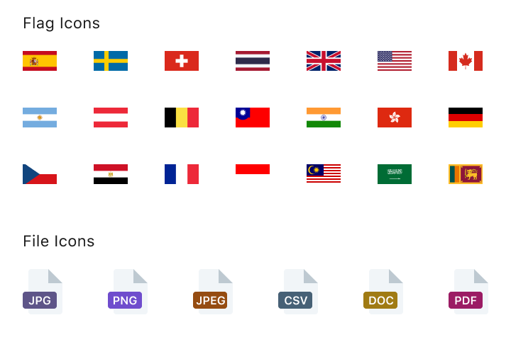
Miscellaneous Icons: Support specific use cases.
Usage Guidelines
Size & Placement
Use standard sizes to maintain readability and hierarchy:
16px: Used to support compact UI components with limited space while maintaining clarity, such as chips, input labels (info icons), alerts, etc.
20px: Used in extra-small and small icon buttons.
24px: Default size for most interactions and medium icon buttons.
32px plus: Used in larger contexts such as dashboards and navigation.

Scaling & Format Guidelines
Use SVGs to maintain sharpness at any size. Avoid resizing PNGs, as scaling causes blurriness. If a PNG is needed, export it to the correct size.

Recommended


Not Recommended

Icons & Text Spacing
Occam recommends using 4px between icons and text to ensure visual harmony and alignment. This spacing can be adjusted in specific cases to accommodate design needs. Any deviations should maintain overall clarity and alignment for a consistent user experience.
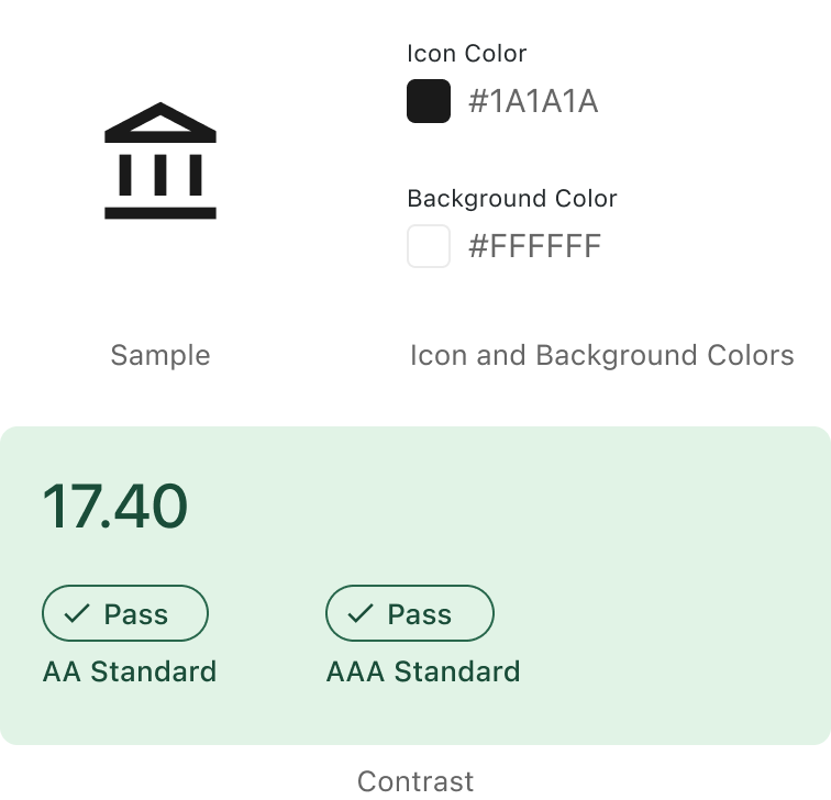
Color & Contrast
Icons must meet contrast standards for optimal visibility. They should follow accessibility guidelines to ensure sufficient contrast between the icon and its background, making them clear and easily distinguishable.
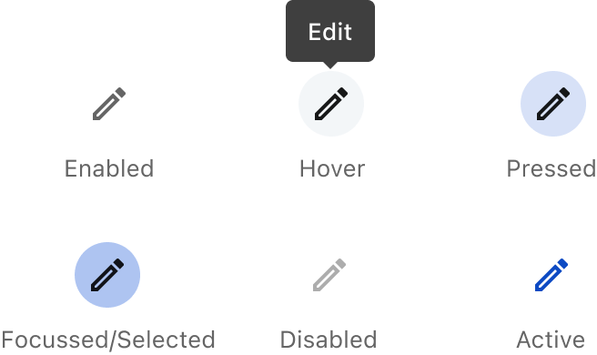
Interactive Icons
There are no standalone clickable icons in the system. If an icon requires interaction, use an icon button, which inherits all interaction behaviors, including focus states, tooltips, and accessibility support.
Icon Consultation
Consult with the Occam Design Team if you need a new icon or assistance with icon usage. They can help ensure consistency and alignment with the platform’s design standards.
Crafted with ❤️ at Zuora
© 2026 Zuora Inc.
Iconography Guidelines
Icons in the Zuora platform reinforce product identity, guide users through workflows, and ensure consistency across the platform. The Occam Design System includes two types of icon libraries:
Material Icons
Used for standard UI elements, such as actions, notifications, and system statuses. These industry-standard icons provide familiarity and consistency across applications.

Zuora Custom Icons
A curated set of icons designed specifically for Zuora’s platform. This set includes:
Product Icons: Represent Zuora products in global navigation.
Miscellaneous Icons: Support specific use cases.
Usage Guidelines
Size & Placement
Use standard sizes to maintain readability and hierarchy:
16px: Used to support compact UI components with limited space while maintaining clarity, such as chips, input labels (info icons), alerts, etc.
20px: Used in extra-small and small icon buttons.
24px: Default size for most interactions and medium icon buttons.
32px plus: Used in larger contexts such as dashboards and navigation.

Scaling & Format Guidelines
Use SVGs to maintain sharpness at any size. Avoid resizing PNGs, as scaling causes blurriness. If a PNG is needed, export it to the correct size.
Recommended
Not Recommended
Icons & Text Spacing
Occam recommends using 4px between icons and text to ensure visual harmony and alignment. This spacing can be adjusted in specific cases to accommodate design needs. Any deviations should maintain overall clarity and alignment for a consistent user experience.
Color & Contrast
Icons must meet contrast standards for optimal visibility. They should follow accessibility guidelines to ensure sufficient contrast between the icon and its background, making them clear and easily distinguishable.

Interactive Icons
There are no standalone clickable icons in the system. If an icon requires interaction, use an icon button, which inherits all interaction behaviors, including focus states, tooltips, and accessibility support.

Icon Consultation
Consult with the Occam Design Team if you need a new icon or assistance with icon usage. They can help ensure consistency and alignment with the platform’s design standards.
Crafted with ❤️ at Zuora
© 2026 Zuora Inc.
Foundations
Iconography Guidelines
Icons in the Zuora platform reinforce product identity, guide users through workflows, and ensure consistency across the platform. The Occam Design System includes two types of icon libraries:
Material Icons
Used for standard UI elements, such as actions, notifications, and system statuses. These industry-standard icons provide familiarity and consistency across applications.
Zuora Custom Icons
A curated set of icons designed specifically for Zuora’s platform. This set includes:
Product Icons: Represent Zuora products in global navigation.
Miscellaneous Icons: Support specific use cases.
Usage Guidelines
Size & Placement
Use standard sizes to maintain readability and hierarchy:
16px: Used to support compact UI components with limited space while maintaining clarity, such as chips, input labels (info icons), alerts, etc.
20px: Used in extra-small and small icon buttons.
24px: Default size for most interactions and medium icon buttons.
32px plus: Used in larger contexts such as dashboards and navigation.
Scaling & Format Guidelines
Use SVGs to maintain sharpness at any size. Avoid resizing PNGs, as scaling causes blurriness. If a PNG is needed, export it to the correct size.
Recommended
Not Recommended
Icons & Text Spacing
Occam recommends using 4px between icons and text to ensure visual harmony and alignment. This spacing can be adjusted in specific cases to accommodate design needs. Any deviations should maintain overall clarity and alignment for a consistent user experience.
Color & Contrast
Icons must meet contrast standards for optimal visibility. They should follow accessibility guidelines to ensure sufficient contrast between the icon and its background, making them clear and easily distinguishable.
Interactive Icons
There are no standalone clickable icons in the system. If an icon requires interaction, use an icon button, which inherits all interaction behaviors, including focus states, tooltips, and accessibility support.
Icon Consultation
Consult with the Occam Design Team if you need a new icon or assistance with icon usage. They can help ensure consistency and alignment with the platform’s design standards.
Crafted with ❤️ at Zuora
© 2026 Zuora Inc.
Foundations
On This Page
Iconography Guidelines
Icons in the Zuora platform reinforce product identity, guide users through workflows, and ensure consistency across the platform. The Occam Design System includes two types of icon libraries:
Material Icons
Used for standard UI elements, such as actions, notifications, and system statuses. These industry-standard icons provide familiarity and consistency across applications.
Zuora Custom Icons
A curated set of icons designed specifically for Zuora’s platform. This set includes:
Product Icons: Represent Zuora products in global navigation.
Miscellaneous Icons: Support specific use cases.
Usage Guidelines
Size & Placement
Use standard sizes to maintain readability and hierarchy:
16px: Used to support compact UI components with limited space while maintaining clarity, such as chips, input labels (info icons), alerts, etc.
20px: Used in extra-small and small icon buttons.
24px: Default size for most interactions and medium icon buttons.
32px plus: Used in larger contexts such as dashboards and navigation.
Scaling & Format Guidelines
Use SVGs to maintain sharpness at any size. Avoid resizing PNGs, as scaling causes blurriness. If a PNG is needed, export it to the correct size.
Recommended
Not Recommended
Icons & Text Spacing
Occam recommends using 4px between icons and text to ensure visual harmony and alignment. This spacing can be adjusted in specific cases to accommodate design needs. Any deviations should maintain overall clarity and alignment for a consistent user experience.
Color & Contrast
Icons must meet contrast standards for optimal visibility. They should follow accessibility guidelines to ensure sufficient contrast between the icon and its background, making them clear and easily distinguishable.
Interactive Icons
There are no standalone clickable icons in the system. If an icon requires interaction, use an icon button, which inherits all interaction behaviors, including focus states, tooltips, and accessibility support.
Icon Consultation
Consult with the Occam Design Team if you need a new icon or assistance with icon usage. They can help ensure consistency and alignment with the platform’s design standards.
Crafted with ❤️ at Zuora
© 2026 Zuora Inc.