Themes
Occam offers three carefully curated color themes—Nebula, Cosmos, and Horizon—designed to emphasize clarity, elegance, and adaptability. These themes allow users to personalize their experience while ensuring a cohesive and consistent design system.
Rather than altering functionality, each theme provides a unique visual identity that aligns with different user preferences, maintaining accessibility and usability across all touch-points.
Theme Previews
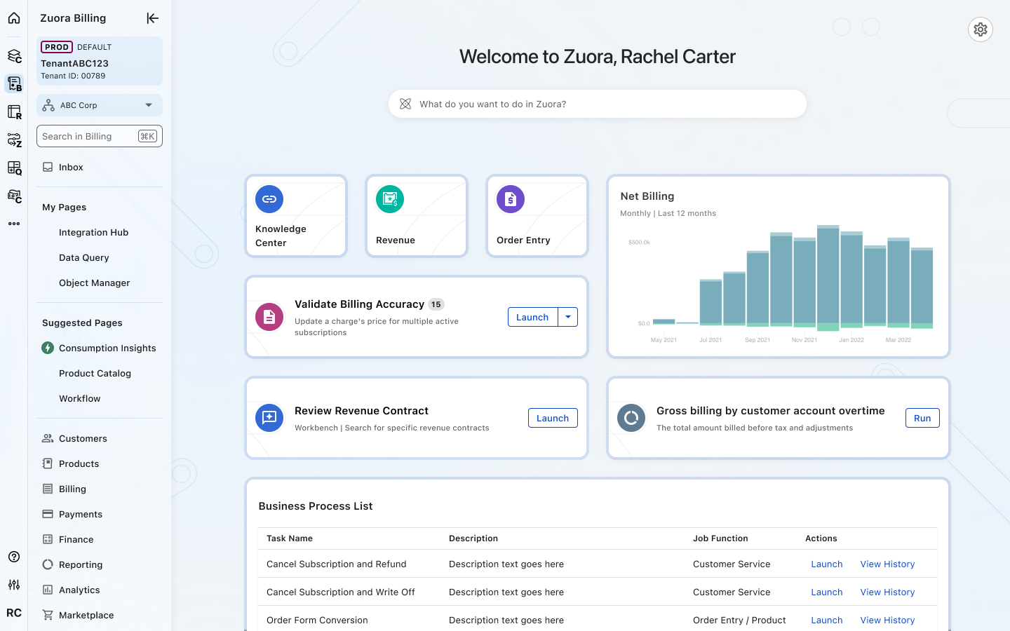
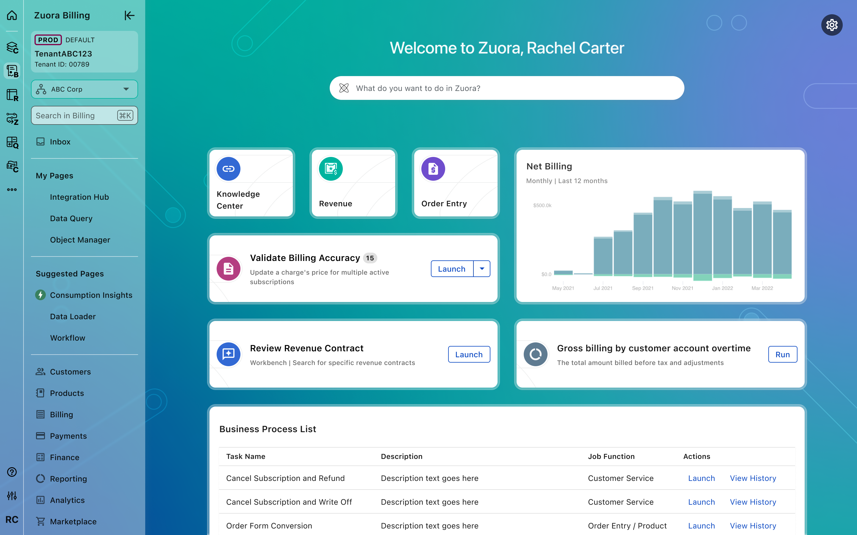
Nebula (Default theme) - Clarity Through Discovery
In Occam, Nebula represents clarity emerging from complexity, guiding users through vast information easily while sparking innovation and exploration.
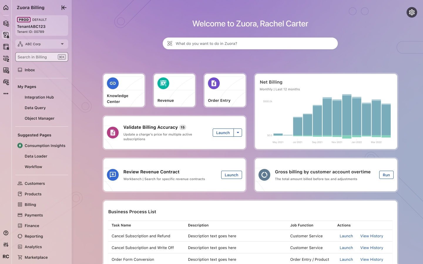
Cosmos – Elegance in Complexity
Cosmos reflects the structured elegance of our design system, ensuring that even the most intricate workflows feel seamless, intuitive, and beautifully connected.
Horizon – Adaptability in Motion
In Occam, Horizon represents the adaptability of our design system, creating a fluid and cohesive experience that remains flexible, consistent, and always evolving.
Theme Behavior & Application
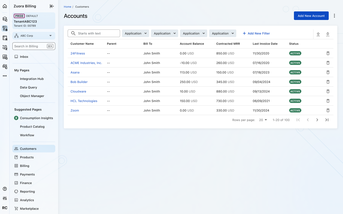
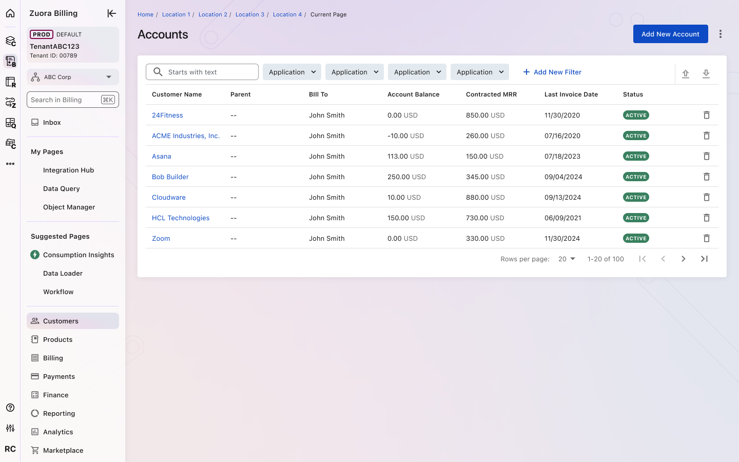
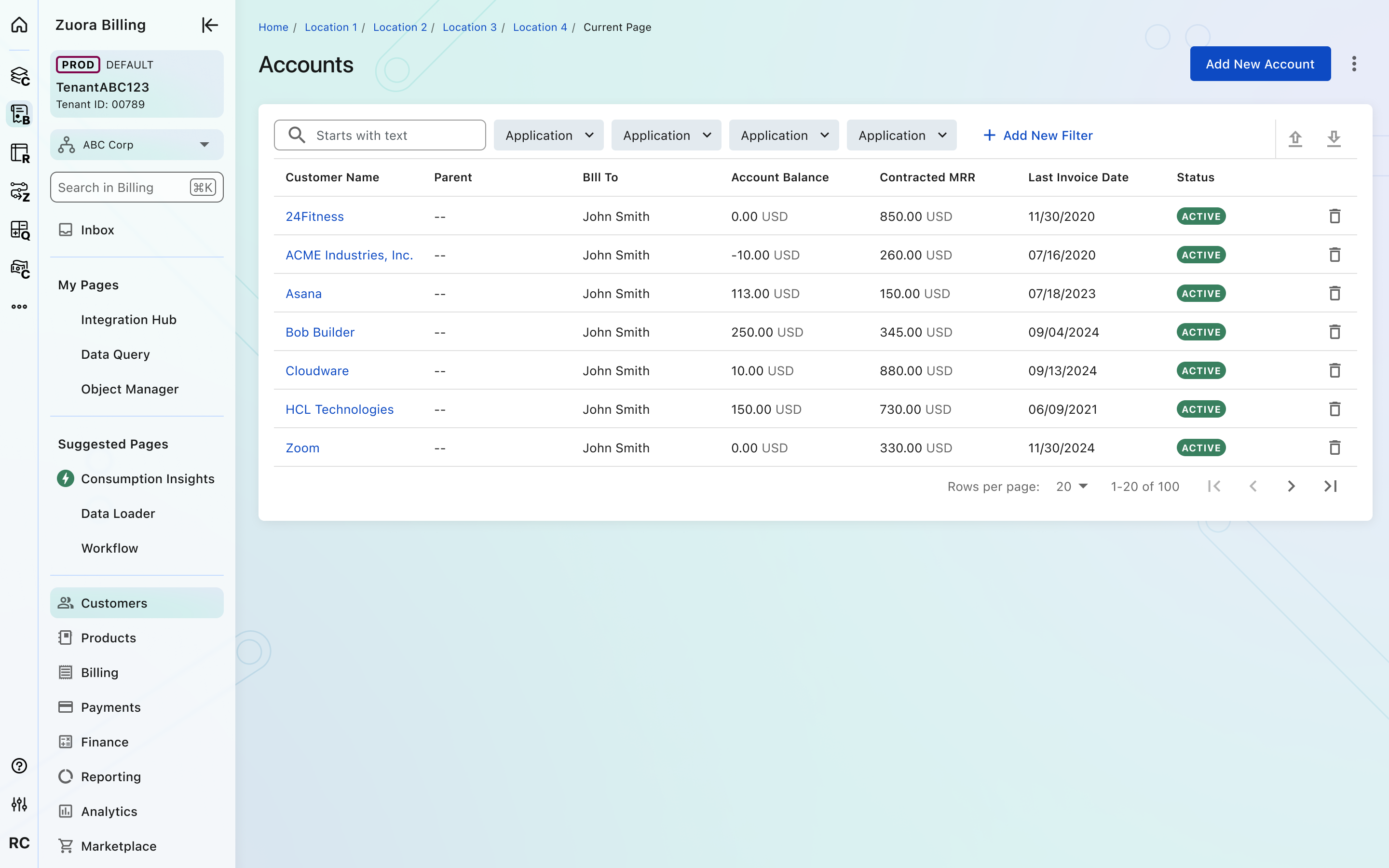
The themes follow users throughout their experience without impacting functionality or layout. Our themes maintain high contrast for better readability, with a vibrant homepage and lighter backgrounds for internal pages, adhering to standard accessibility guidelines.
Background colors change with each theme, while typography, spacing, and interactions remain consistent. All components are pre-designed to work across the provided themes, ensuring that they remain functional and the design remains uniform and reliable regardless of the chosen theme.
Crafted with ❤️ at Zuora
© 2026 Zuora Inc.
Themes
Occam offers three carefully curated color themes—Nebula, Cosmos, and Horizon—designed to emphasize clarity, elegance, and adaptability. These themes allow users to personalize their experience while ensuring a cohesive and consistent design system.
Rather than altering functionality, each theme provides a unique visual identity that aligns with different user preferences, maintaining accessibility and usability across all touch-points.
Theme Previews
Nebula (Default theme) - Clarity Through Discovery
In Occam, Nebula represents clarity emerging from complexity, guiding users through vast information easily while sparking innovation and exploration.
Cosmos – Elegance in Complexity
Cosmos reflects the structured elegance of our design system, ensuring that even the most intricate workflows feel seamless, intuitive, and beautifully connected.
Horizon – Adaptability in Motion
In Occam, Horizon represents the adaptability of our design system, creating a fluid and cohesive experience that remains flexible, consistent, and always evolving.
Theme Behavior & Application
The themes follow users throughout their experience without impacting functionality or layout. Our themes maintain high contrast for better readability, with a vibrant homepage and lighter backgrounds for internal pages, adhering to standard accessibility guidelines.
Background colors change with each theme, while typography, spacing, and interactions remain consistent. All components are pre-designed to work across the provided themes, ensuring that they remain functional and the design remains uniform and reliable regardless of the chosen theme.
Crafted with ❤️ at Zuora
© 2026 Zuora Inc.
Foundations
On This Page
Themes
Occam offers three carefully curated color themes—Nebula, Cosmos, and Horizon—designed to emphasize clarity, elegance, and adaptability. These themes allow users to personalize their experience while ensuring a cohesive and consistent design system.
Rather than altering functionality, each theme provides a unique visual identity that aligns with different user preferences, maintaining accessibility and usability across all touch-points.
Theme Previews
Nebula (Default theme) - Clarity Through Discovery
In Occam, Nebula represents clarity emerging from complexity, guiding users through vast information easily while sparking innovation and exploration.
Cosmos – Elegance in Complexity
Cosmos reflects the structured elegance of our design system, ensuring that even the most intricate workflows feel seamless, intuitive, and beautifully connected.
Horizon – Adaptability in Motion
In Occam, Horizon represents the adaptability of our design system, creating a fluid and cohesive experience that remains flexible, consistent, and always evolving.
Theme Behavior & Application
The themes follow users throughout their experience without impacting functionality or layout. Our themes maintain high contrast for better readability, with a vibrant homepage and lighter backgrounds for internal pages, adhering to standard accessibility guidelines.
Background colors change with each theme, while typography, spacing, and interactions remain consistent. All components are pre-designed to work across the provided themes, ensuring that they remain functional and the design remains uniform and reliable regardless of the chosen theme.
Crafted with ❤️ at Zuora
© 2026 Zuora Inc.