Shapes and Styling
Shapes define the visual language of Occam’s interface, ensuring consistency, clarity, and usability. Occam primarily consists of rectangles with subtle rounding, fully rounded elements, and strokes that reinforce interactions.
Shape System
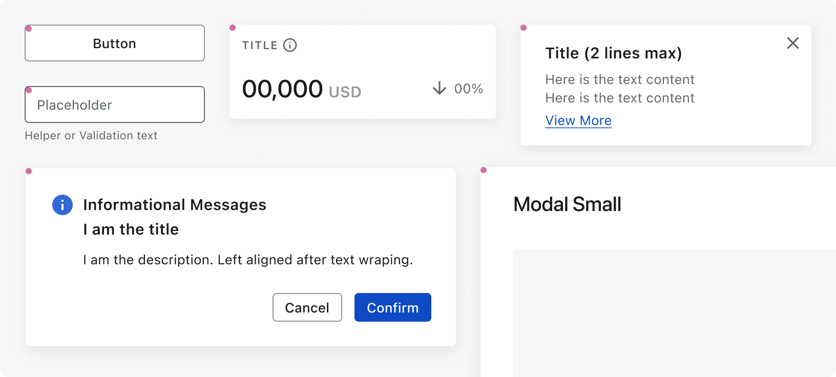
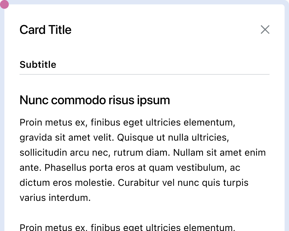
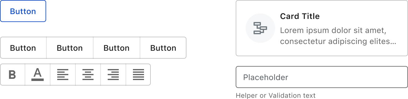
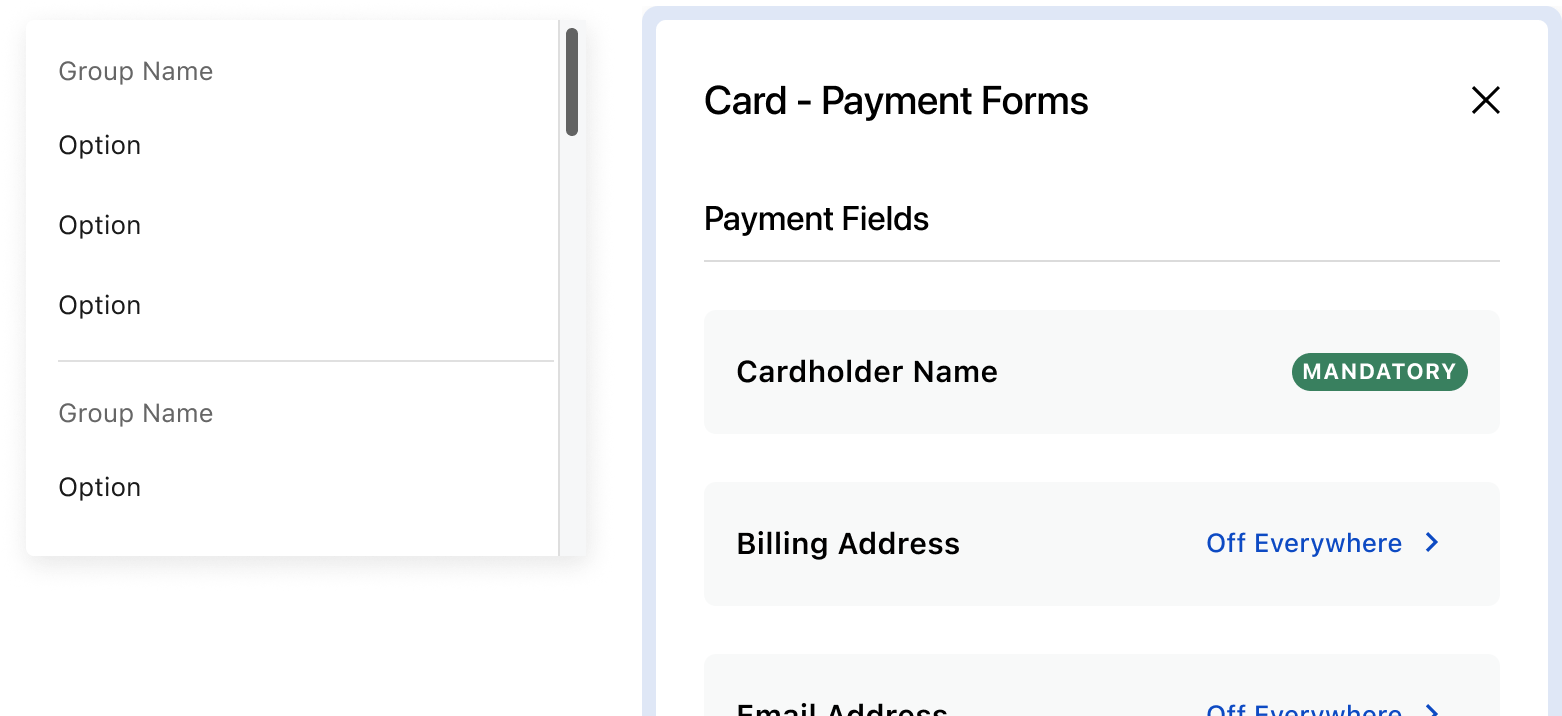
Default Radius (4px): Most components, including buttons, inputs, cards, popovers, dialogs, and modals, use a 4px border radius.
Exceptions: The Card Drawer has an 8px radius, creating a slight distinction from other containers.
chips
chips
chips
chips
chips
chips

Fully Rounded Elements: Chips feature a 100% border radius for a pill-like appearance.
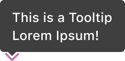
Pointers: These are used in tooltips, providing directional affordance.
Stroke & Interaction
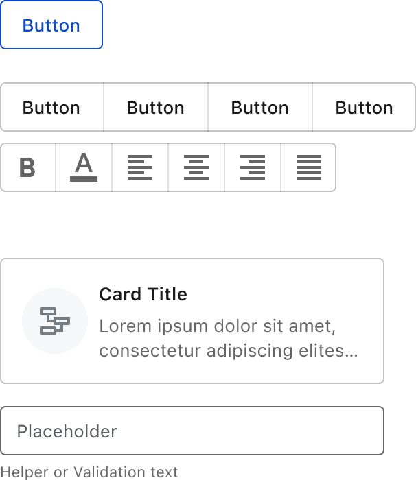
Default States: A 1px stroke delineates the boundaries of most components, providing a consistent and clean look across the interface.
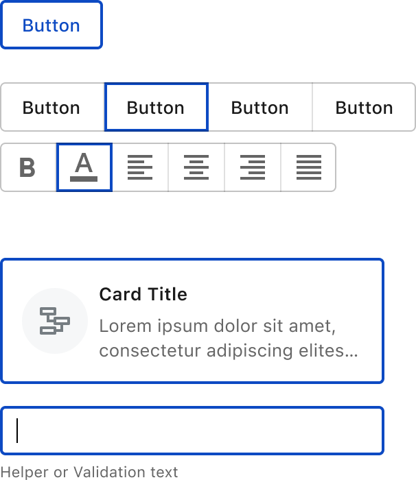
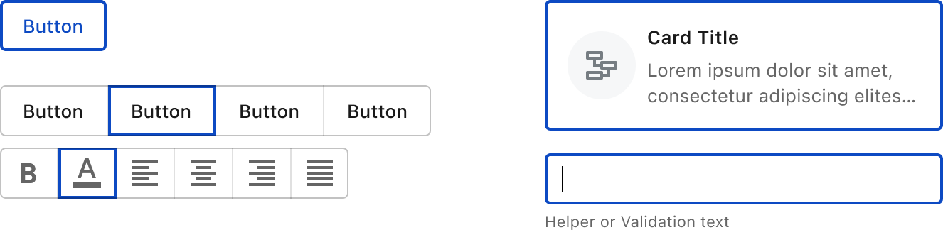
Focused States: A 2px stroke highlights interactive elements like buttons, tabs, and chips, enhancing accessibility and clarity.
Dividers: A 1px stroke provides clear visual separation between sections or elements without overwhelming the design.
Crafted with ❤️ at Zuora
© 2026 Zuora Inc.
Shapes and Styling
Shapes define the visual language of Occam’s interface, ensuring consistency, clarity, and usability. Occam primarily consists of rectangles with subtle rounding, fully rounded elements, and strokes that reinforce interactions.
Shape System
Default Radius (4px): Most components, including buttons, inputs, cards, popovers, dialogs, and modals, use a 4px border radius.
Exceptions: The Card Drawer has an 8px radius, creating a slight distinction from other containers.
chips
chips
chips
chips
chips
chips
Fully Rounded Elements: Chips feature a 100% border radius for a pill-like appearance.
Pointers: These are used in tooltips, providing directional affordance.
Stroke & Interaction
Default States: A 1px stroke delineates the boundaries of most components, providing a consistent and clean look across the interface.
Focused States: A 2px stroke highlights interactive elements like buttons, tabs, and chips, enhancing accessibility and clarity.
Dividers: A 1px stroke provides clear visual separation between sections or elements without overwhelming the design.
Crafted with ❤️ at Zuora
© 2026 Zuora Inc.
On This Page
Shapes and Styling
Shapes define the visual language of Occam’s interface, ensuring consistency, clarity, and usability. Occam primarily consists of rectangles with subtle rounding, fully rounded elements, and strokes that reinforce interactions.
Shape System
Default Radius (4px): Most components, including buttons, inputs, cards, popovers, dialogs, and modals, use a 4px border radius.
Exceptions: The Card Drawer has an 8px radius, creating a slight distinction from other containers.
chips
chips
chips
chips
chips
chips
Fully Rounded Elements: Chips feature a 100% border radius for a pill-like appearance.
Pointers: These are used in tooltips, providing directional affordance.
Stroke & Interaction
Default States: A 1px stroke delineates the boundaries of most components, providing a consistent and clean look across the interface.
Focused States: A 2px stroke highlights interactive elements like buttons, tabs, and chips, enhancing accessibility and clarity.
Dividers: A 1px stroke provides clear visual separation between sections or elements without overwhelming the design.
Crafted with ❤️ at Zuora
© 2026 Zuora Inc.