Typography
Typography is key to maintaining visual consistency across our platform. By using variations in font size and weight, Occam’s typography system creates a clear hierarchy, highlighting important content and organizing pages in an easy-to-navigate way.
Typefaces
We use system fonts to ensure optimal performance and consistency across devices. On macOS, this defaults to SF Pro, which serves as our mockup design reference. However, browsers may render text in different fonts depending on the operating system (e.g., Times New Roman, Arial, or Verdana on Windows).
SF Pro Display: A modern, screen-optimized typeface for accessibility and adaptability across devices and languages. Used as our design standard.
Download SF Pro Display

IBM Plex Mono: A clean, modern font that displays code in technical content and development environments.
Download IBM Plex Mono
Type Ramp
Style
Display
Headline Large
Headline Medium
Headline Small
Title Large
Title Medium
Title Small
Body Large
Body Large Italic
Body Large Bold
Body Large Underline
Body Medium
Body Medium Italic
Body Medium Bold
Body Medium Underline
Label
Tab
Button
Label Header
Code
Code Italic
Code Bold
Surtitle
Overline
Chip
Caption
Caption Italic
Caption Bold
Caption Underline
Size
30px
28px
24px
20px
17px
15px
13px
15px
15px
15px
15px
13px
13px
13px
13px
13px
13px
13px
12px
12px
12px
12px
12px
11px
11px
11px
11px
11px
11px
Weight
300
500
500
500
600
600
600
400
400
500
400
400
400
500
400
400
500
500
600
400
400
500
400
500
700
400
400
500
400
Line Height
44px
40px
36px
32px
28px
24px
20px
24px
24px
24px
24px
18px
18px
18px
18px
18px
20px
20px
16px
18px
18px
18px
17px
16px
14px
16px
16px
16px
16px
Letter Spacing
0px
0px
0px
0px
0.1px
0.15px
0.25px
0px
0px
0px
0px
0.2px
0.2px
0.2px
0.2px
0.1px
0.1px
0.1px
0.2px
0px
0px
0px
0px
1px
0.6px
0.2px
0.2px
0.2px
0.2px
Text Color & Contrast
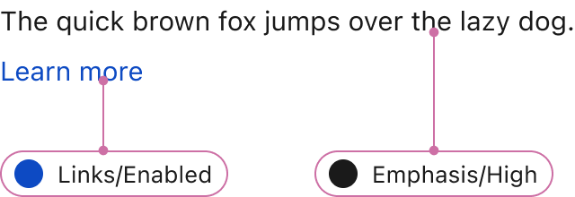
Light Backbround: Use designated light text colors for clarity and contrast.
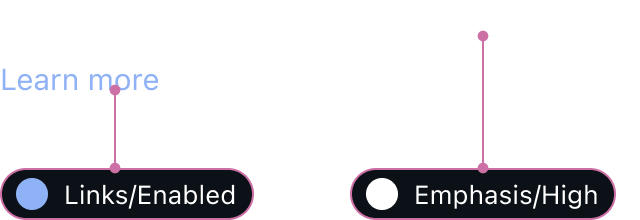
Dark Backbround: Use designated dark text colors to maintain contrast and legibility.
Crafted with ❤️ at Zuora
© 2026 Zuora Inc.
Typography
Typography is key to maintaining visual consistency across our platform. By using variations in font size and weight, Occam’s typography system creates a clear hierarchy, highlighting important content and organizing pages in an easy-to-navigate way.
Typefaces
We use system fonts to ensure optimal performance and consistency across devices. On macOS, this defaults to SF Pro, which serves as our mockup design reference. However, browsers may render text in different fonts depending on the operating system (e.g., Times New Roman, Arial, or Verdana on Windows).
SF Pro Display: A modern, screen-optimized typeface for accessibility and adaptability across devices and languages. Used as our design standard.
Download SF Pro Display
IBM Plex Mono: A clean, modern font that displays code in technical content and development environments.
Download IBM Plex Mono
Type Ramp
Style
Display
Headline Large
Headline Medium
Headline Small
Title Large
Title Medium
Title Small
Body Large
Body Large Italic
Body Large Bold
Body Large Underline
Body Medium
Body Medium Italic
Body Medium Bold
Body Medium Underline
Label
Tab
Button
Label Header
Code
Code Italic
Code Bold
Surtitle
Overline
Chip
Caption
Caption Italic
Caption Bold
Caption Underline
Size
30px
28px
24px
20px
17px
15px
13px
15px
15px
15px
15px
13px
13px
13px
13px
13px
13px
13px
12px
12px
12px
12px
12px
11px
11px
11px
11px
11px
11px
Weight
300
500
500
500
600
600
600
400
400
500
400
400
400
500
400
400
500
500
600
400
400
500
400
500
700
400
400
500
400
Line Height
44px
40px
36px
32px
28px
24px
20px
24px
24px
24px
24px
18px
18px
18px
18px
18px
20px
20px
16px
18px
18px
18px
17px
16px
14px
16px
16px
16px
16px
Letter Spacing
0px
0px
0px
0px
0.1px
0.15px
0.25px
0px
0px
0px
0px
0.2px
0.2px
0.2px
0.2px
0.1px
0.1px
0.1px
0.2px
0px
0px
0px
0px
1px
0.6px
0.2px
0.2px
0.2px
0.2px
Text Color & Contrast
Light Backbround: Use designated light text colors for clarity and contrast.
Dark Backbround: Use designated dark text colors to maintain contrast and legibility.
Crafted with ❤️ at Zuora
© 2026 Zuora Inc.
Foundations
On This Page
Typography
Typography is key to maintaining visual consistency across our platform. By using variations in font size and weight, Occam’s typography system creates a clear hierarchy, highlighting important content and organizing pages in an easy-to-navigate way.
Typefaces
We use system fonts to ensure optimal performance and consistency across devices. On macOS, this defaults to SF Pro, which serves as our mockup design reference. However, browsers may render text in different fonts depending on the operating system (e.g., Times New Roman, Arial, or Verdana on Windows).
SF Pro Display: A modern, screen-optimized typeface for accessibility and adaptability across devices and languages. Used as our design standard.
Download SF Pro Display
IBM Plex Mono: A clean, modern font that displays code in technical content and development environments.
Download IBM Plex Mono
Type Ramp
Style
Display
Headline Large
Headline Medium
Headline Small
Title Large
Title Medium
Title Small
Body Large
Body Large Italic
Body Large Bold
Body Large Underline
Body Medium
Body Medium Italic
Body Medium Bold
Body Medium Underline
Label
Tab
Button
Label Header
Code
Code Italic
Code Bold
Surtitle
Overline
Chip
Caption
Caption Italic
Caption Bold
Caption Underline
Size
30px
28px
24px
20px
17px
15px
13px
15px
15px
15px
15px
13px
13px
13px
13px
13px
13px
13px
12px
12px
12px
12px
12px
11px
11px
11px
11px
11px
11px
Weight
300
500
500
500
600
600
600
400
400
500
400
400
400
500
400
400
500
500
600
400
400
500
400
500
700
400
400
500
400
Line Height
44px
40px
36px
32px
28px
24px
20px
24px
24px
24px
24px
18px
18px
18px
18px
18px
20px
20px
16px
18px
18px
18px
17px
16px
14px
16px
16px
16px
16px
Letter Spacing
0px
0px
0px
0px
0.1px
0.15px
0.25px
0px
0px
0px
0px
0.2px
0.2px
0.2px
0.2px
0.1px
0.1px
0.1px
0.2px
0px
0px
0px
0px
1px
0.6px
0.2px
0.2px
0.2px
0.2px
Text Color & Contrast
Light Backbround: Use designated light text colors for clarity and contrast.
Dark Backbround: Use designated dark text colors to maintain contrast and legibility.
Crafted with ❤️ at Zuora
© 2026 Zuora Inc.